EduNatives
EduNatives
EduNatives
Audience Clarity Refresh
Audience Clarity Refresh
Audience Clarity Refresh
Refined EduNatives’ promotional experience around clearer audience paths for students, academics, and companies, improving how each group understands the platform’s value.
Refined EduNatives’ promotional experience around clearer audience paths for students, academics, and companies, improving how each group understands the platform’s value.
Refined EduNatives’ promotional experience around clearer audience paths for students, academics, and companies, improving how each group understands the platform’s value.
My role
My role
UX Designer
Timeline
Timeline
2 Weeks (3/2023)
The story behind
The story behind
The Spark That Started It All
The Spark That Started It All
How did it start?
How did it start?
It began with a message from Ahmed Bahgat, founder of EduNatives, after he came across my work on LinkedIn. A few hours later, we were on a call. He shared his vision, reshaping the platform’s old promotional site into something that truly reflects the ambition behind the product. Clean. Modern. Confident. As we spoke, I asked about the business, the market, and the people it serves. His answers painted a clear picture. That’s when it clicked, this wasn’t just about a visual refresh, but about designing a presence that speaks to EduNatives’ audience, and more, to the future.
It began with a message from Ahmed Bahgat, founder of EduNatives, after he came across my work on LinkedIn. A few hours later, we were on a call. He shared his vision, reshaping the platform’s old promotional site into something that truly reflects the ambition behind the product. Clean. Modern. Confident. As we spoke, I asked about the business, the market, and the people it serves. His answers painted a clear picture. That’s when it clicked, this wasn’t just about a visual refresh, but about designing a presence that speaks to EduNatives’ audience, and more, to the future.
It began with a message from Ahmed Bahgat, founder of EduNatives, after he came across my work on LinkedIn. A few hours later, we were on a call. He shared his vision, reshaping the platform’s old promotional site into something that truly reflects the ambition behind the product. Clean. Modern. Confident. As we spoke, I asked about the business, the market, and the people it serves. His answers painted a clear picture. That’s when it clicked, this wasn’t just about a visual refresh, but about designing a presence that speaks to EduNatives’ audience, and more, to the future.
The challenge
The challenge
At the time, visual design wasn’t exactly my strongest skill—it wasn’t where I felt most confident. But here I was, tasked with creating a promotional site meant to attract and convert users, where visuals play a huge role in grabbing attention and building trust. So I treated it like a challenge worth solving. I immersed myself in visual references, broke down patterns that worked, sketched constantly, and studied what made certain designs effective. It wasn’t instant, but through deliberate practice and visual analysis, I built the clarity and confidence I needed to bring this site to life.
At the time, visual design wasn’t exactly my strongest skill—it wasn’t where I felt most confident. But here I was, tasked with creating a promotional site meant to attract and convert users, where visuals play a huge role in grabbing attention and building trust. So I treated it like a challenge worth solving. I immersed myself in visual references, broke down patterns that worked, sketched constantly, and studied what made certain designs effective. It wasn’t instant, but through deliberate practice and visual analysis, I built the clarity and confidence I needed to bring this site to life.
At the time, visual design wasn’t exactly my strongest skill—it wasn’t where I felt most confident. But here I was, tasked with creating a promotional site meant to attract and convert users, where visuals play a huge role in grabbing attention and building trust. So I treated it like a challenge worth solving. I immersed myself in visual references, broke down patterns that worked, sketched constantly, and studied what made certain designs effective. It wasn’t instant, but through deliberate practice and visual analysis, I built the clarity and confidence I needed to bring this site to life.
Project summary
Project summary
A focused look at the problem, process, solution, and results.
A focused look at the problem, process, solution, and results.
Problem to be solved
Problem to be solved
Problem to be solved
The old website lacked clear hierarchy, compelling messaging, and a focused value proposition. Visually, it leaned on generic design patterns with little brand personality, while the layout struggled to guide attention or communicate value. Also, the landing page didn’t segment audiences or highlight differentiated benefits. As well as missing the key conversion drivers, like trust signals, strong CTAs, or persuasive copy to turn visitors into leads.
Process
Process
Process
I started with some visual inspiration and self brainstorming sessions, then digitally framed out four quick visual directions for the new landing page. I presented each one to Ahmed, walking him through the rationale and value behind them. We aligned on the direction that felt the most visually striking yet balanced and convincing. From there, I moved on to designing the rest of the site.
Problem Solved!
Problem Solved!
Problem Solved!
The new design brings clarity, focus, and purpose to the site. It introduces structured messaging for each audience type, sharper visual hierarchy, and cleaner UI components. Key benefits are clearly communicated, CTAs are more actionable, and product features are presented in a way that supports both engagement and conversion—turning the site into a more effective business tool.
Behind final
Behind final
A quick look at the initial visual directions proposed to help decide the best path forward.
A quick look at the initial visual directions proposed to help decide the best path forward.
Classic & Professional
Classic & Professional
A safe, minimal layout, structured spacing, and a commonly recognized structure. Clean and reliable, but less expressive in personality.
A safe, minimal layout, structured spacing, and a commonly recognized structure. Clean and reliable, but less expressive in personality.
Bold & Playful
Bold & Playful
A colorful, high-contrast approach full of energy and edge. Visually striking, but risks overwhelming and less confidence and professional vibes.
A colorful, high-contrast approach full of energy and edge. Visually striking, but risks overwhelming and less confidence and professional vibes.
Fresh & Familiar
Fresh & Familiar
Balanced and intuitive, this version follows modern promotional sites patterns with a welcoming vibe and good readability. Ideal for trust and clarity.
Balanced and intuitive, this version follows modern promotional sites patterns with a welcoming vibe and good readability. Ideal for trust and clarity.
Minimal & Visionary
Minimal & Visionary
A light, elegant direction with strong typography and clean white space. Feels premium and forward-thinking, but less dynamic for youngers.
A light, elegant direction with strong typography and clean white space. Feels premium and forward-thinking, but less dynamic for youngers.
Final Direction
Final Direction
A clean, focused design that captures the brand’s vision and drives engagement through clarity, structure, and visual impact.
A clean, focused design that captures the brand’s vision and drives engagement through clarity, structure, and visual impact.
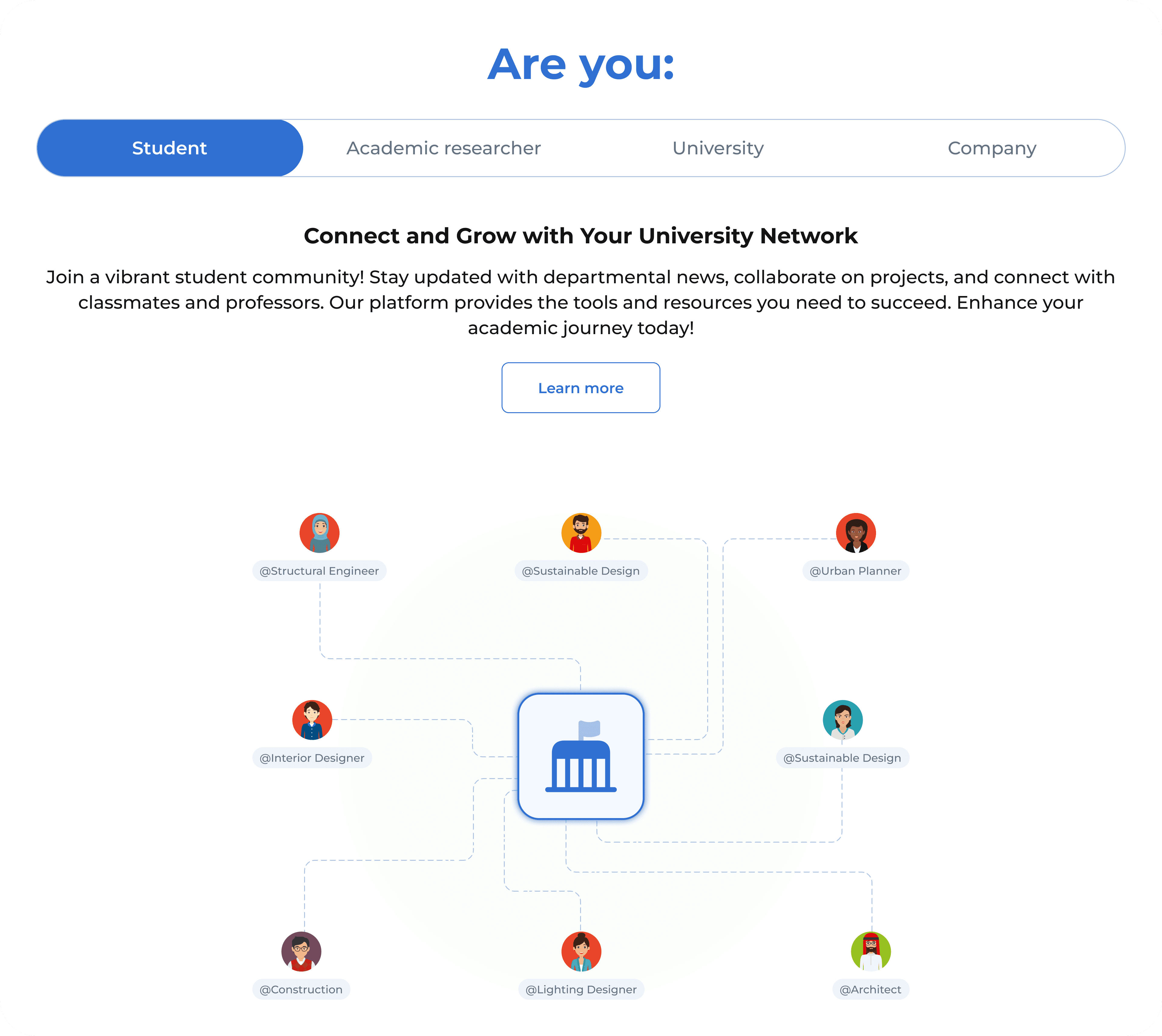
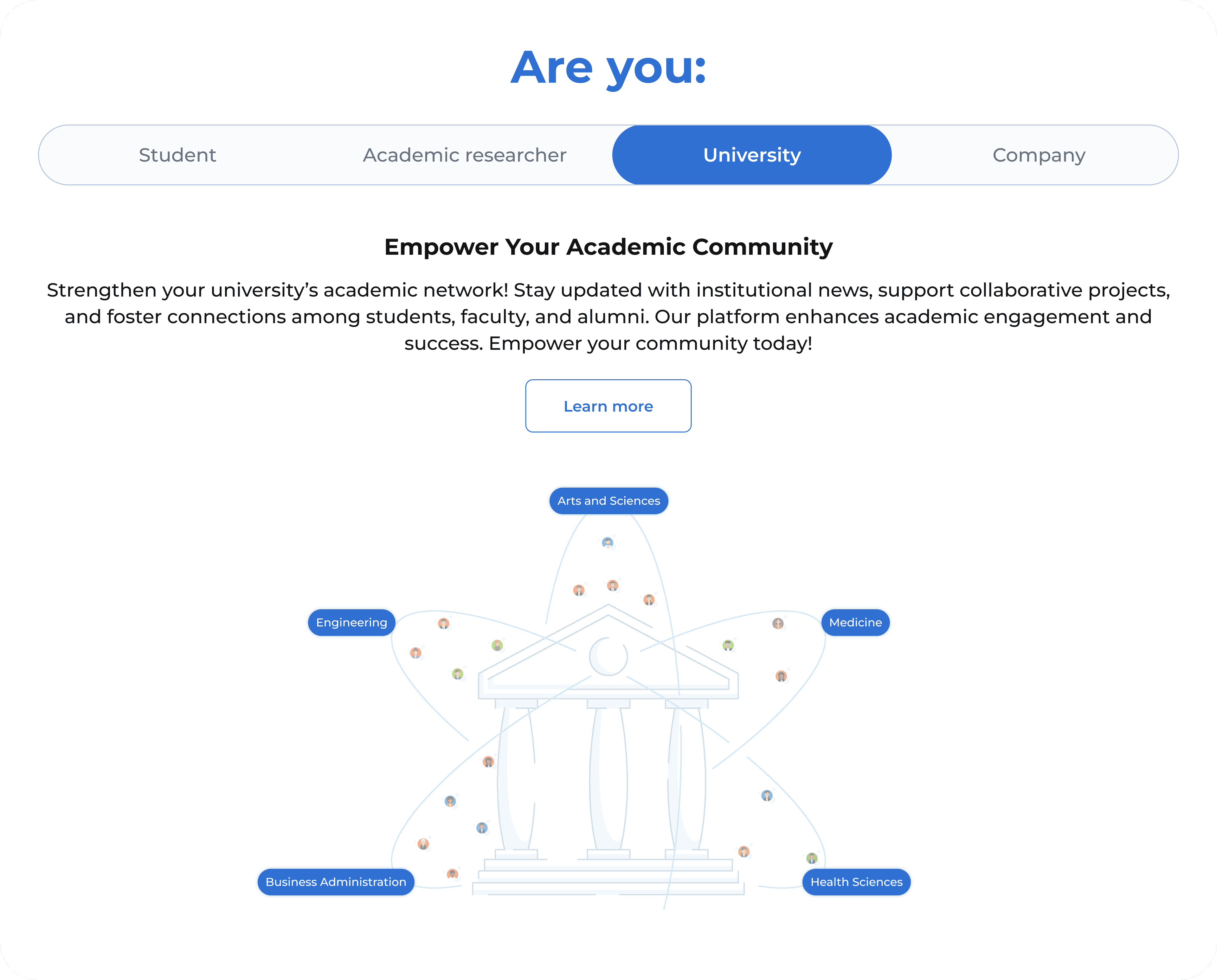
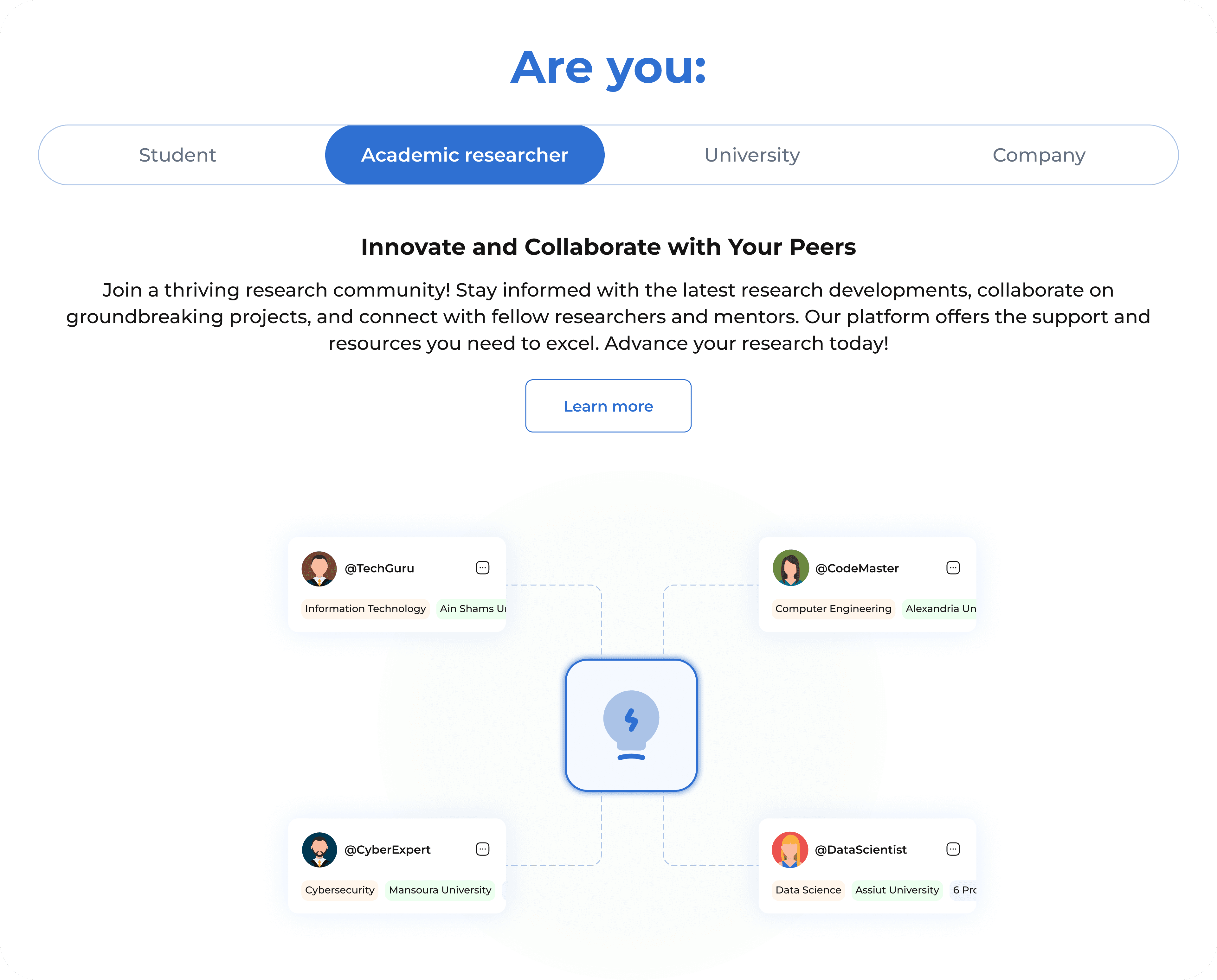
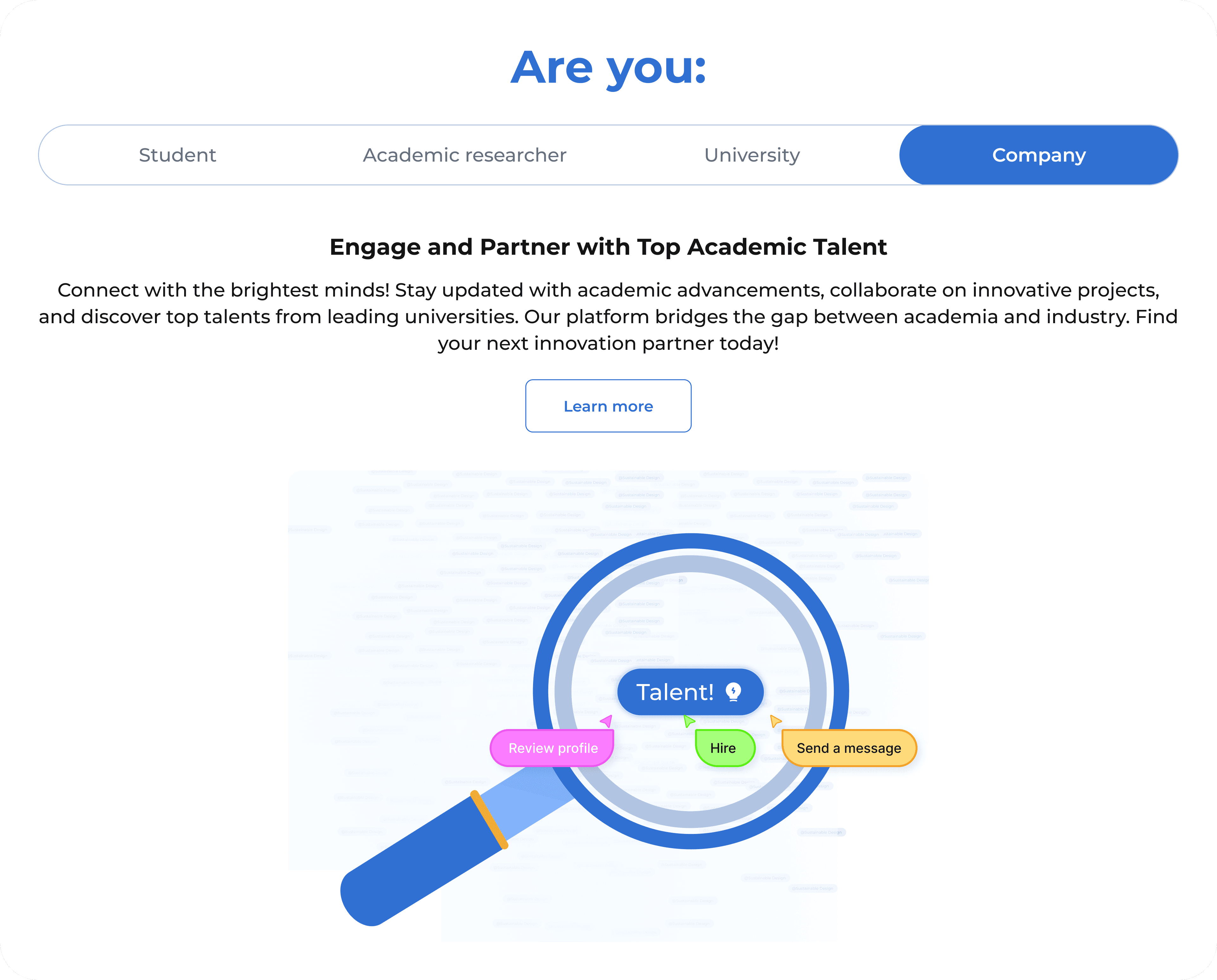
Audience targeting
Audience targeting
To deliver the right message to each user segment, I used horizontal tabs—each tailored to a specific persona with custom animated visuals to enhance clarity and engagement.
To deliver the right message to each user segment, I used horizontal tabs—each tailored to a specific persona with custom animated visuals to enhance clarity and engagement.
Student
Build your profile, collaborate, and discover opportunities.
University
Showcase departments, engage students, and grow visibility.
Student
Build your profile, collaborate, and discover opportunities.
University
Showcase departments, engage students, and grow visibility.
Academic
Connect with peers, publish research, and mentor students.
Company
Find talent, post opportunities, and partner with academia.
Academic
Connect with peers, publish research, and mentor students.
Company
Find talent, post opportunities, and partner with academia.
Learnings
Learnings
Reflections, takeaways, and what I’d do differently.
Reflections, takeaways, and what I’d do differently.
What did I learn?
What did I learn?
What did I learn?
This project taught me how much audience clarity matters in early-stage promotional experiences. The challenge was not only making the platform look better; it was helping different groups understand why EduNatives mattered to them and what action they should take next.
This project taught me how much audience clarity matters in early-stage promotional experiences. The challenge was not only making the platform look better; it was helping different groups understand why EduNatives mattered to them and what action they should take next.
This project taught me how much audience clarity matters in early-stage promotional experiences. The challenge was not only making the platform look better; it was helping different groups understand why EduNatives mattered to them and what action they should take next.
What went well?
What went well?
What went well?
The strongest part was the close business alignment. Conversations with Ahmed helped clarify the platform’s audiences, tone, and promise, so the visual system and page structure could support the message instead of decorating around it.
The strongest part was the close business alignment. Conversations with Ahmed helped clarify the platform’s audiences, tone, and promise, so the visual system and page structure could support the message instead of decorating around it.
The strongest part was the close business alignment. Conversations with Ahmed helped clarify the platform’s audiences, tone, and promise, so the visual system and page structure could support the message instead of decorating around it.
What could be improved?
What could be improved?
What could be improved?
If I revisited it, I would define the audience journeys earlier, set clearer success signals for each persona, and test the messaging before polishing the visual layer. That would make the design direction less dependent on taste and more connected to user intent.
If I revisited it, I would define the audience journeys earlier, set clearer success signals for each persona, and test the messaging before polishing the visual layer. That would make the design direction less dependent on taste and more connected to user intent.
If I revisited it, I would define the audience journeys earlier, set clearer success signals for each persona, and test the messaging before polishing the visual layer. That would make the design direction less dependent on taste and more connected to user intent.
Keep Exploring
Keep Exploring
More projects, more perspective—see what else is shaping the way I design.
More projects, more perspective—see what else is shaping the way I design.
More projects, more perspective—see what else is shaping the way I design.
Let's Connect
I work with ambitious teams and founders to build digital products that are genuinely useful, and that grow with the business.
Let’s Talk!

Let's Connect
I work with ambitious teams and founders to build digital products that are genuinely useful, and that grow with the business.
Let’s Talk!