UX Auditor & Designer
1 Month (5/2022)
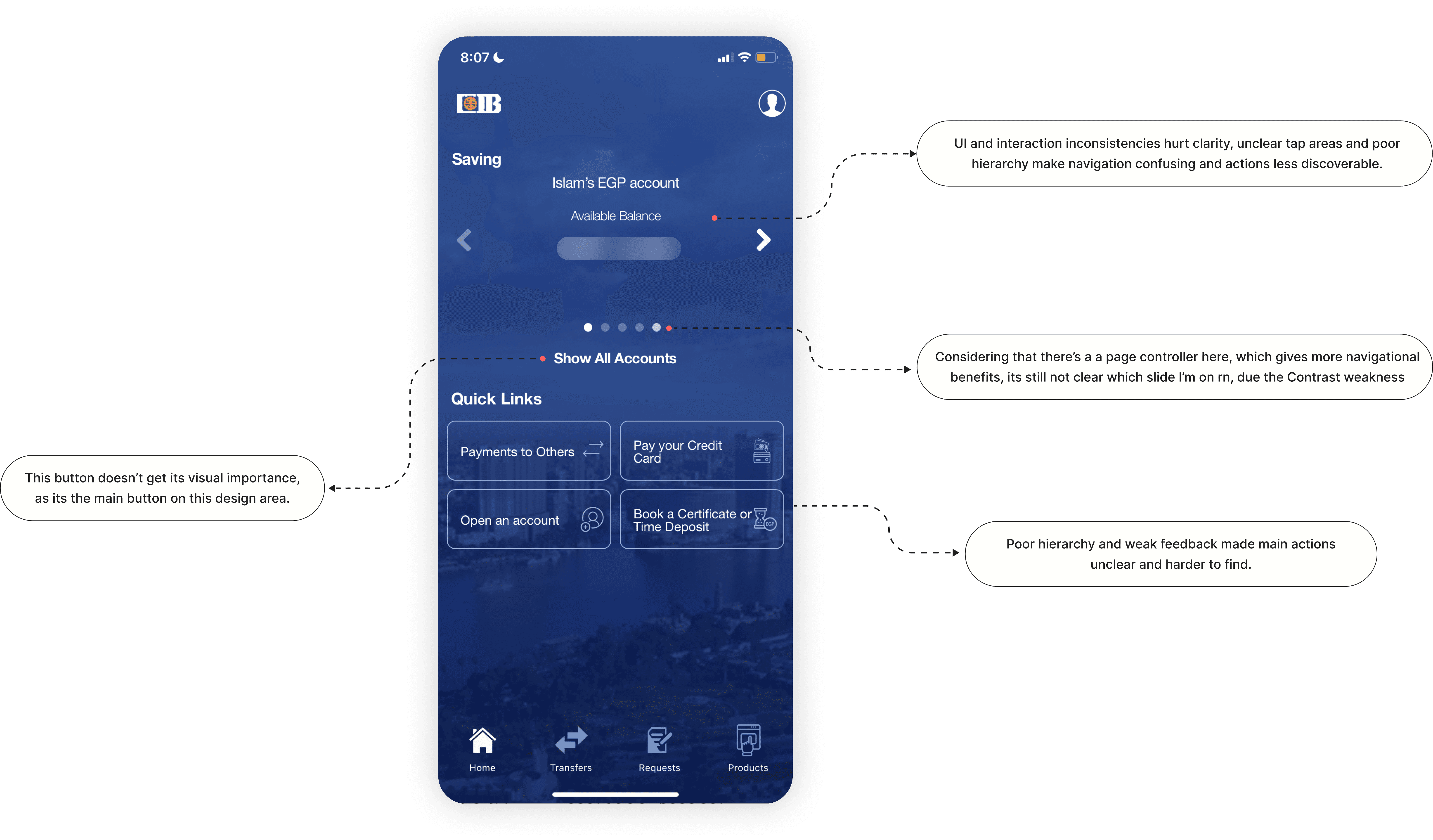
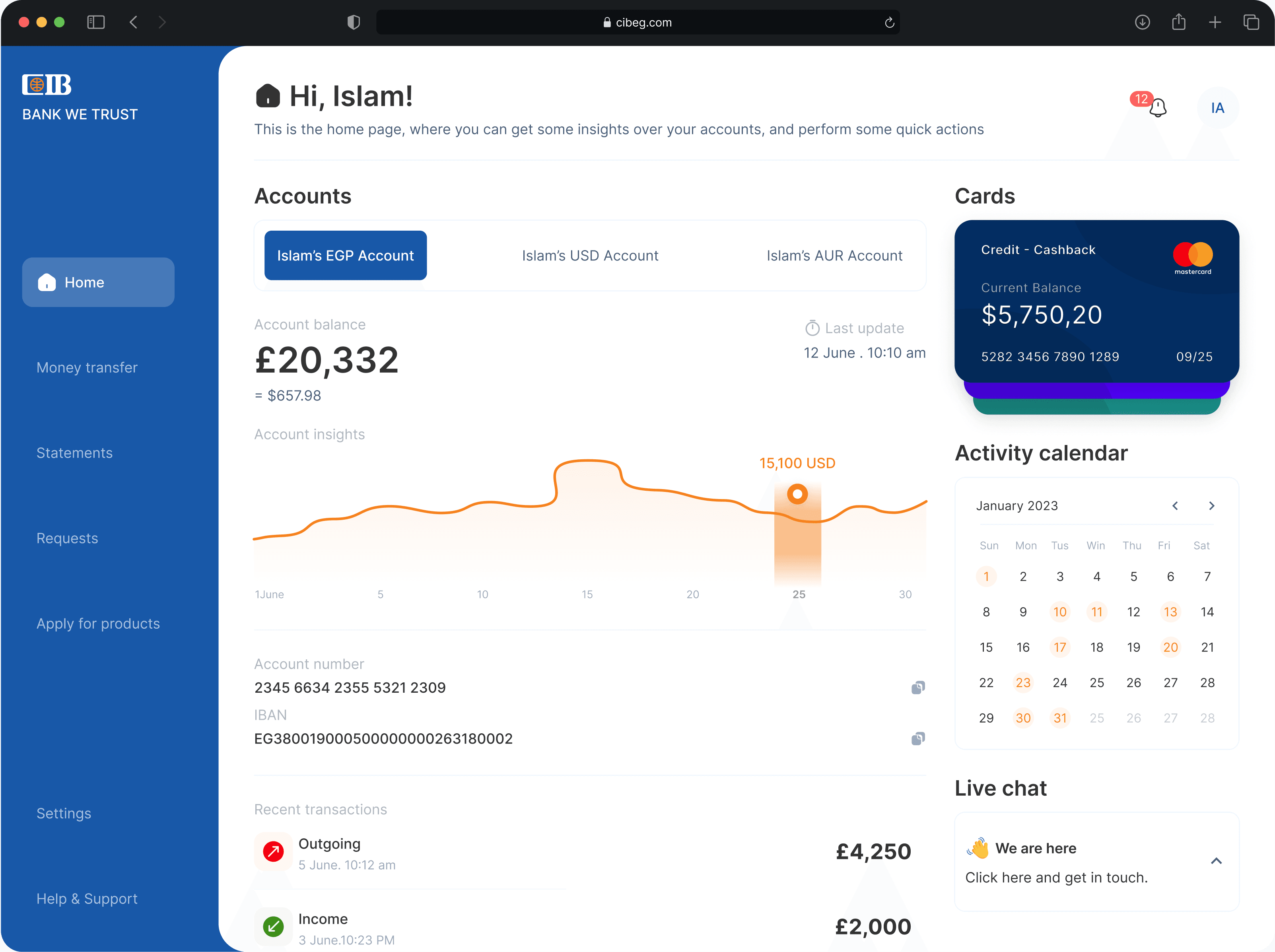
The audit found friction across interaction feedback, navigation, visual hierarchy, and UX writing. Core banking tasks, such as browsing services, transferring money, checking statements, or applying for products, required more interpretation than they should. The problem was task confidence: users needed clearer paths, clearer states, and fewer moments of uncertainty.
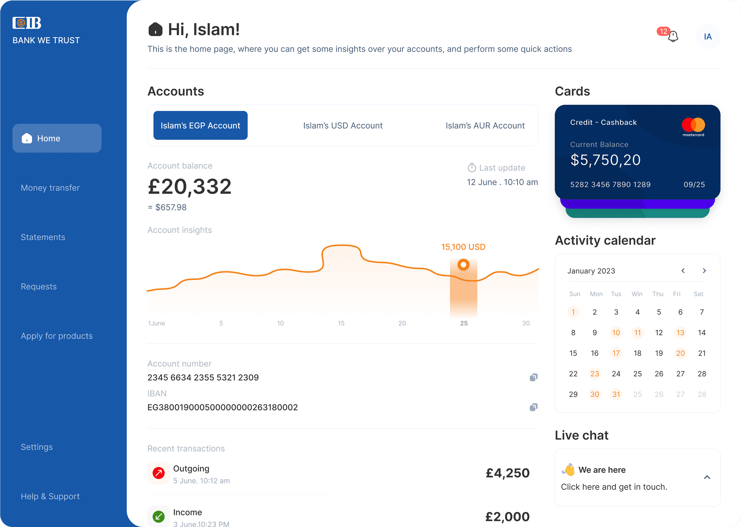
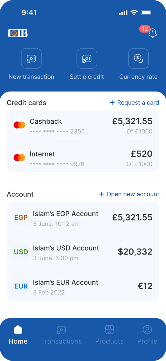
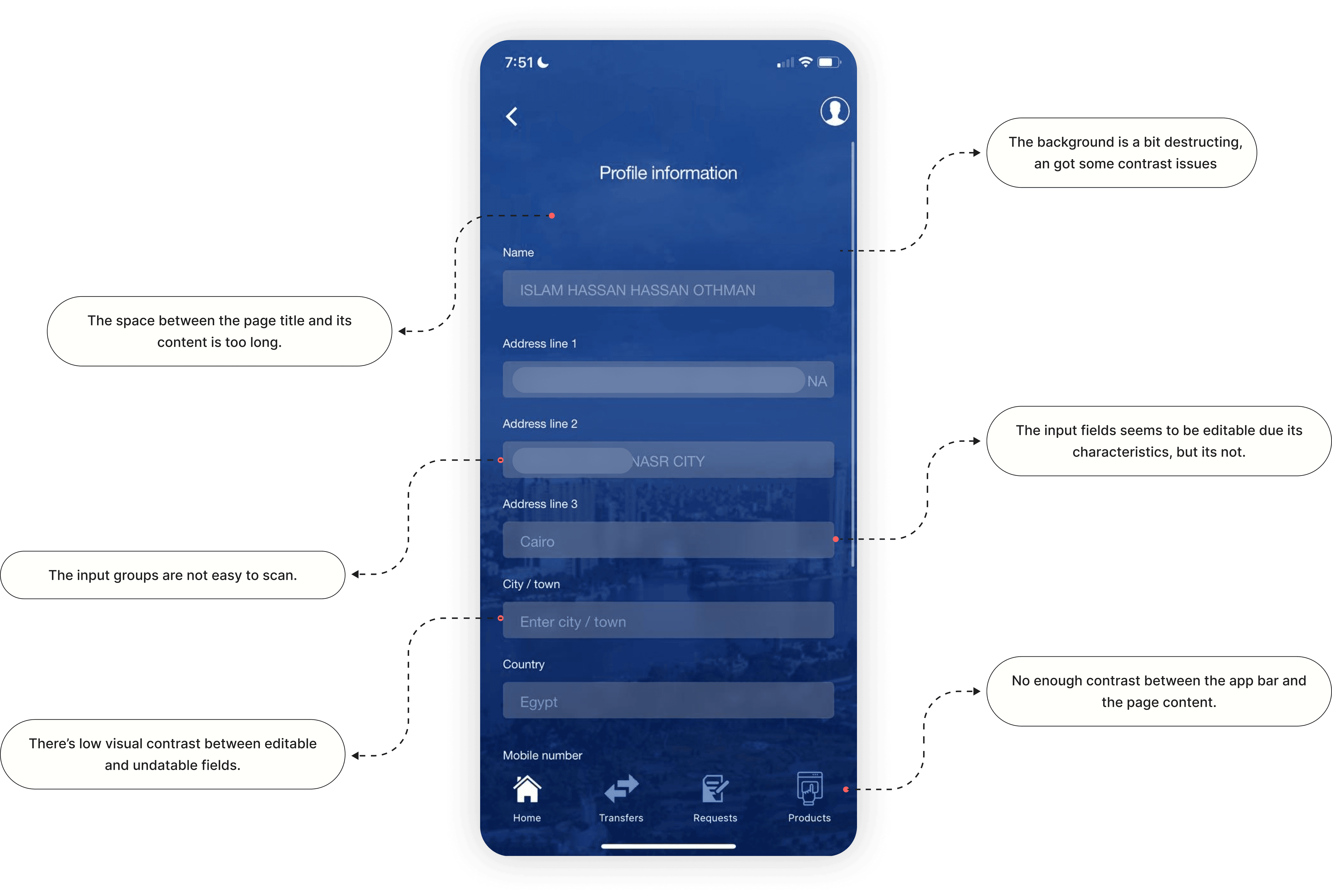
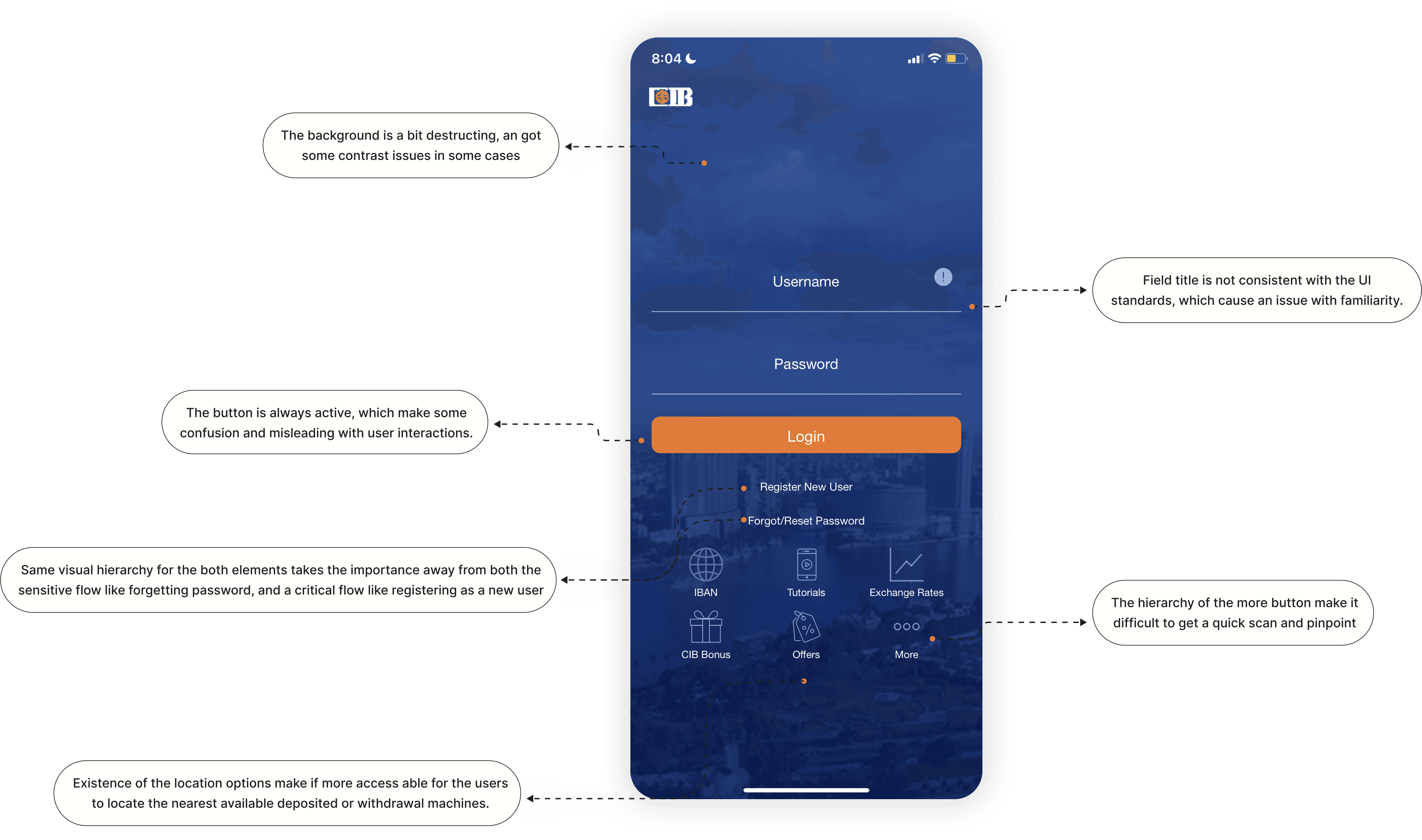
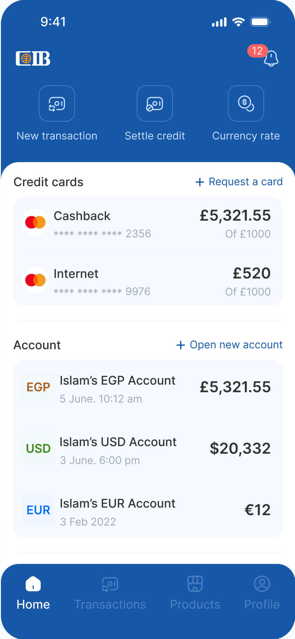
The visual layer was creating task friction. Background imagery competed with key information, icons were not always self-explanatory, contrast dropped in important areas, and inconsistent spacing weakened scan efficiency. The goal was not to make the app prettier, but to make each screen easier to read and act on.
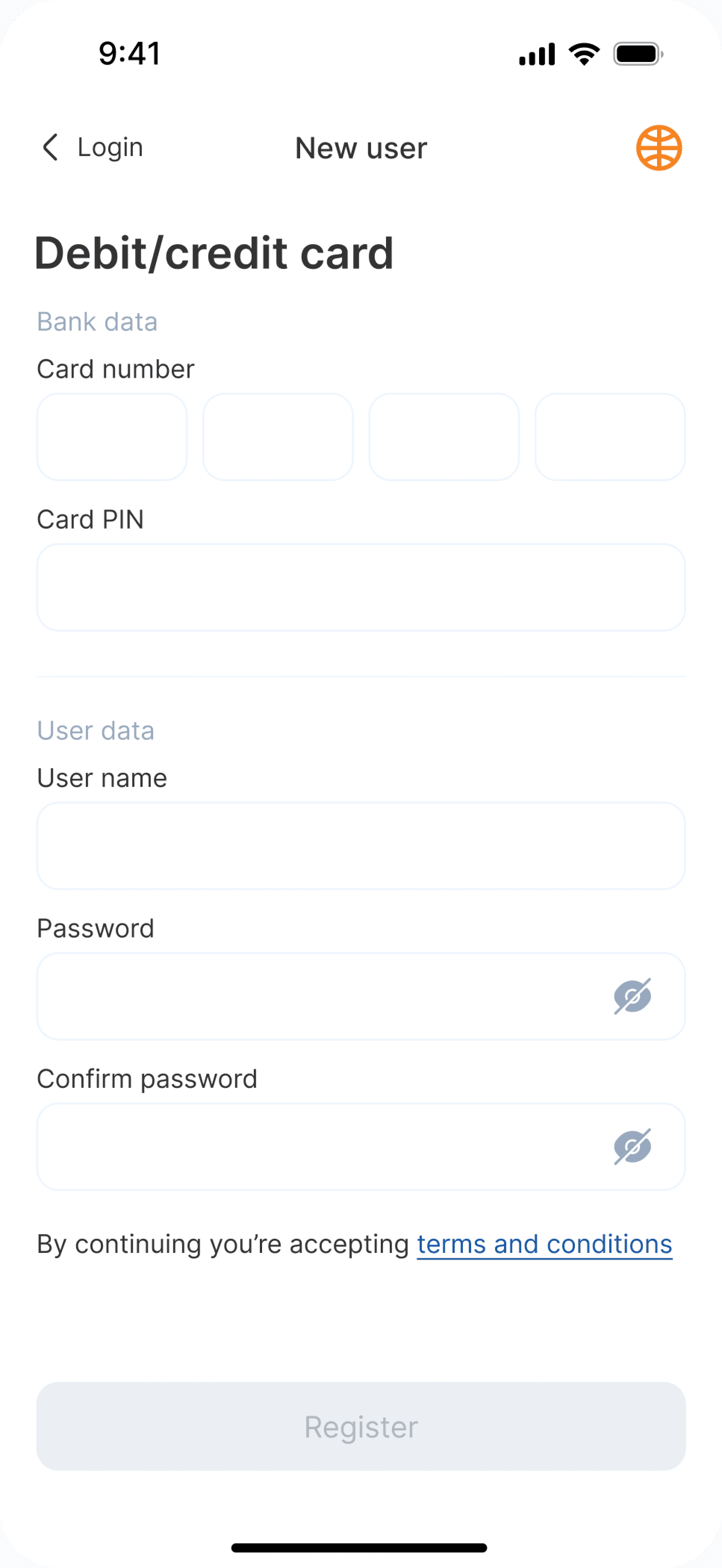
The app did not always confirm what happened after a tap, form entry, or swipe. Some errors described the problem without helping users recover. In a banking context, that missing feedback matters: uncertainty can quickly become hesitation or loss of trust.
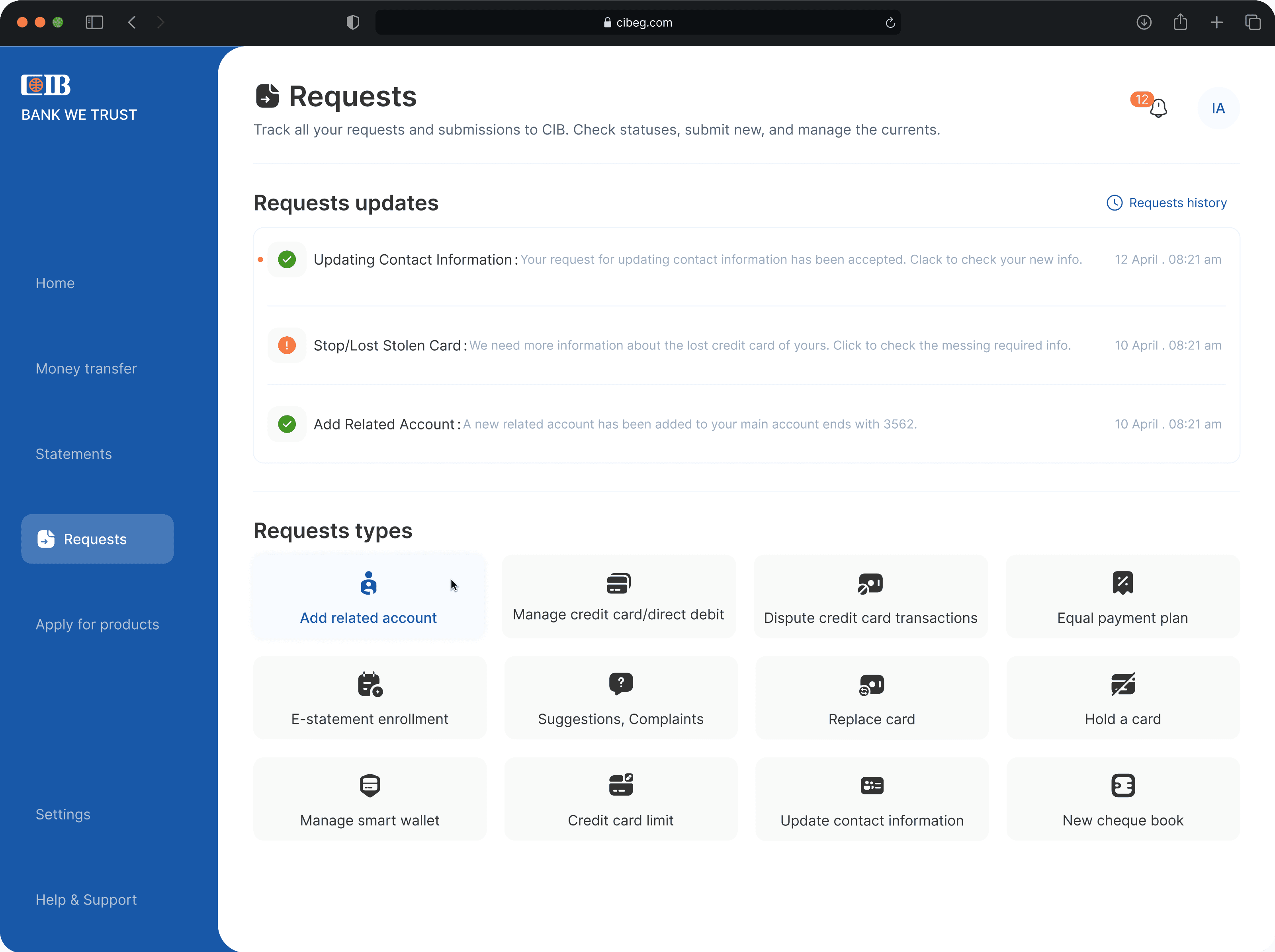
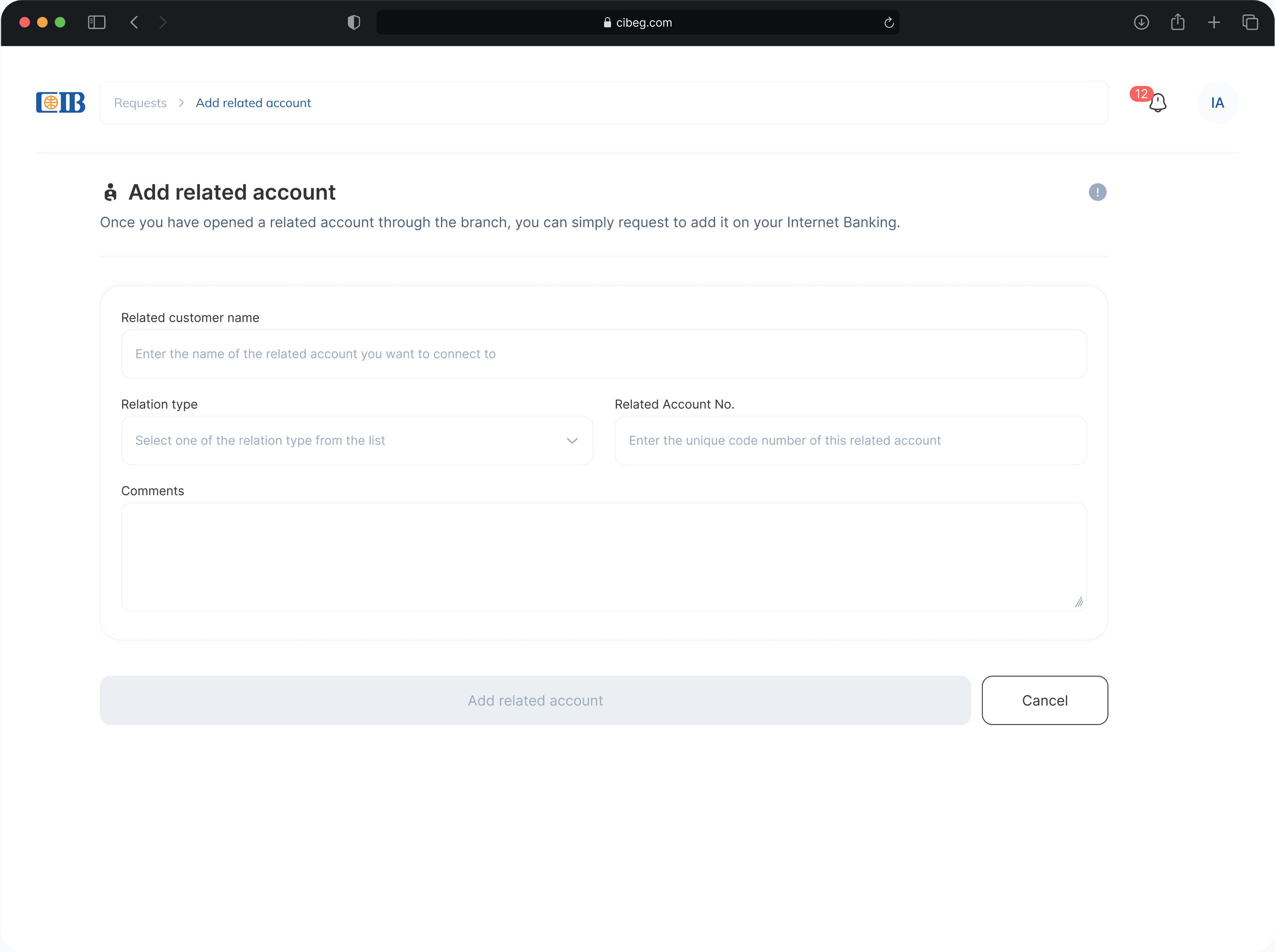
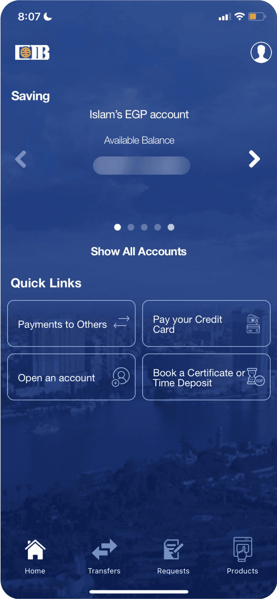
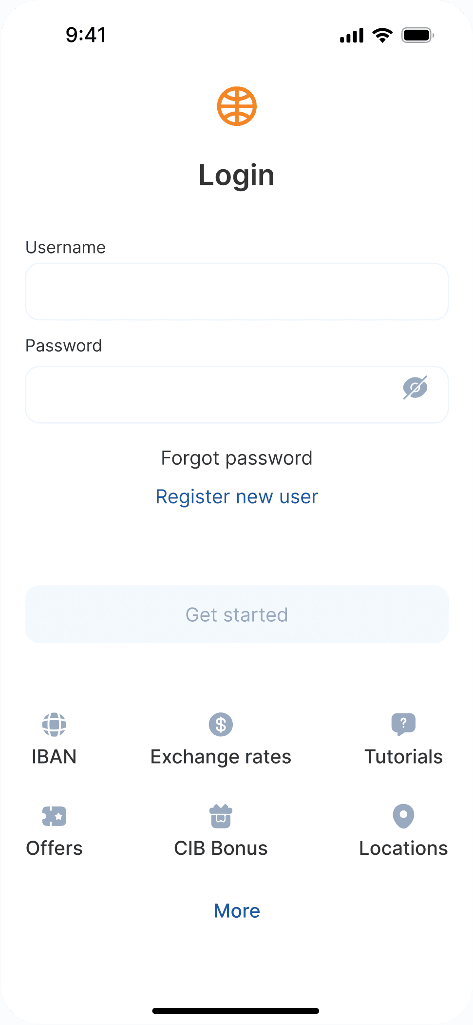
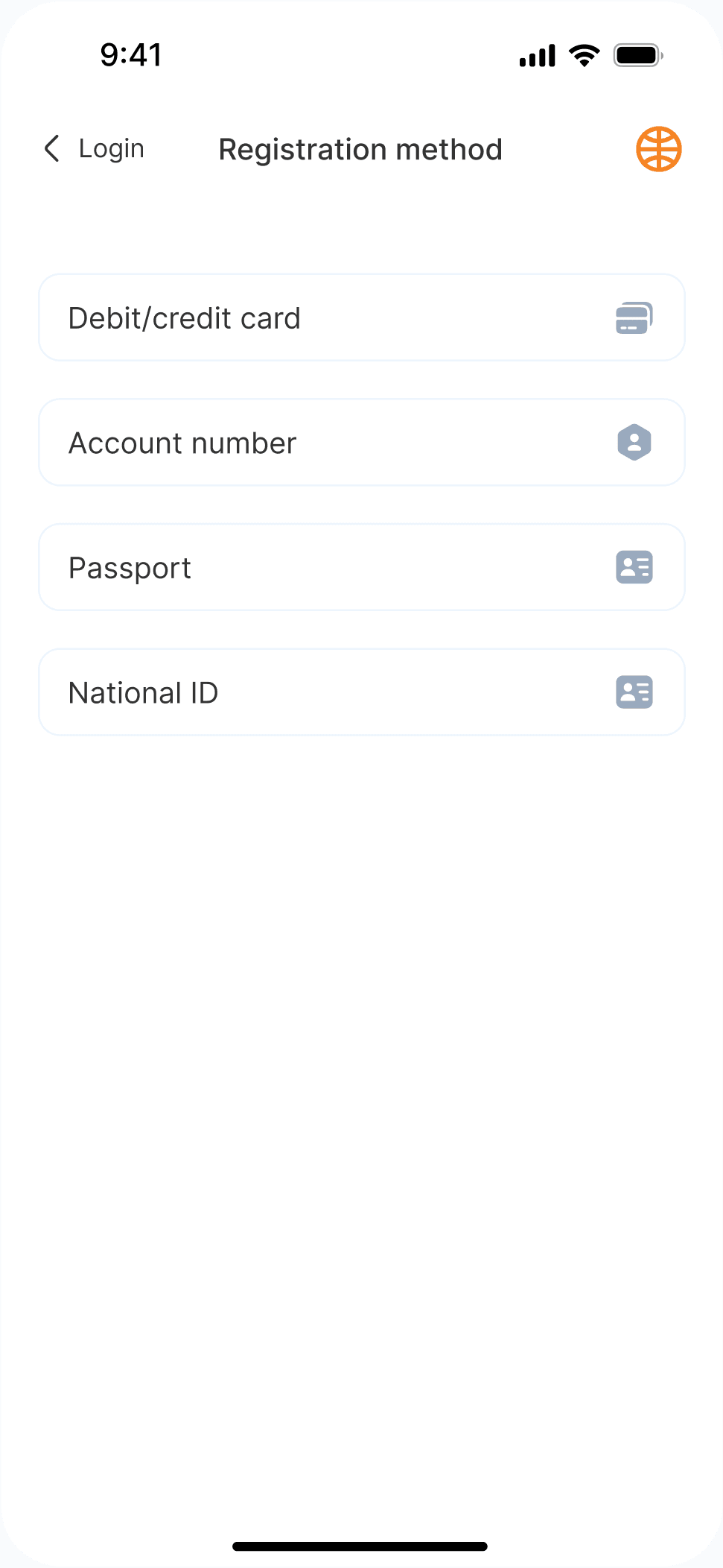
The app structure made some tasks harder to predict. Onboarding gave limited guidance, key actions were not always where users expected them, and content grouping did not consistently match the task. I focused on making navigation feel more learnable, with clearer entry points and stronger task grouping.
I ran the redesign as a structured UX audit, reviewing navigation, visual hierarchy, interaction feedback, accessibility, and microcopy. The redesign decisions focused on making everyday banking tasks easier to predict and complete, especially for users who may not be comfortable with complex financial interfaces.
Miro
Figma
Notion
X-Mind
User interviews
UX Audit
Information Architecture
HMW

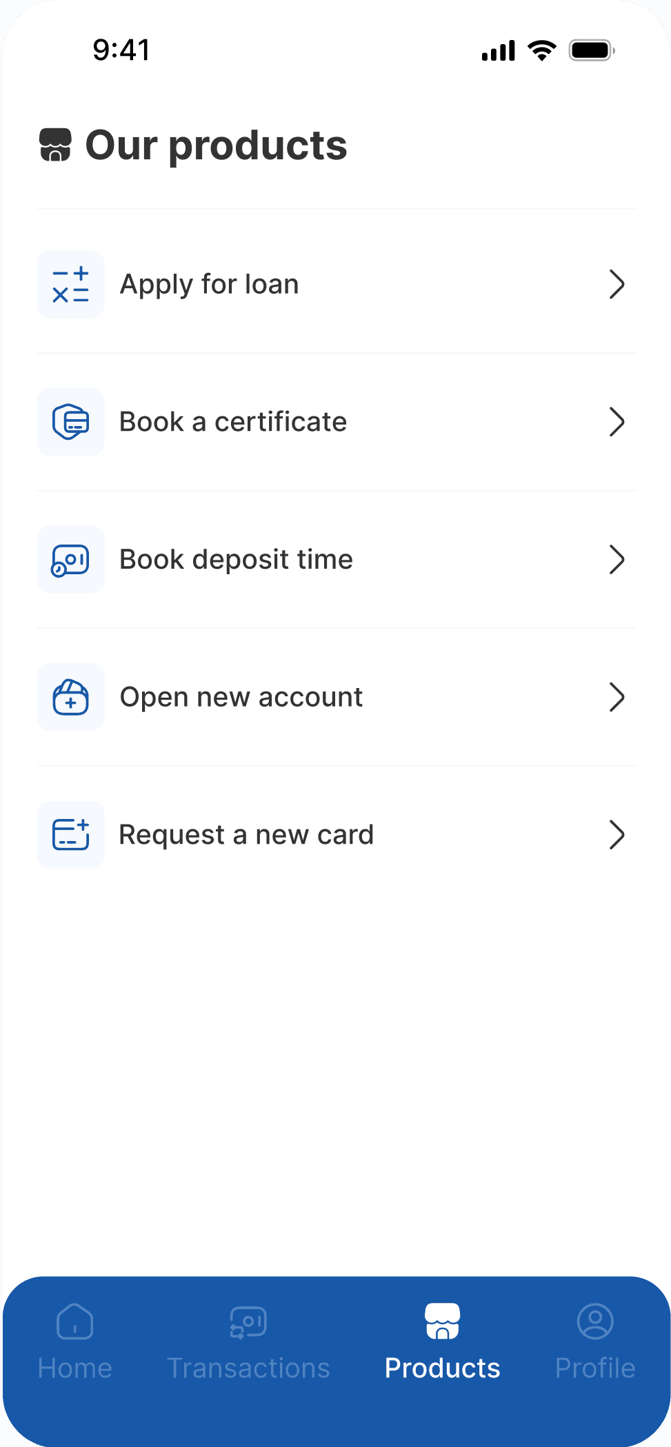
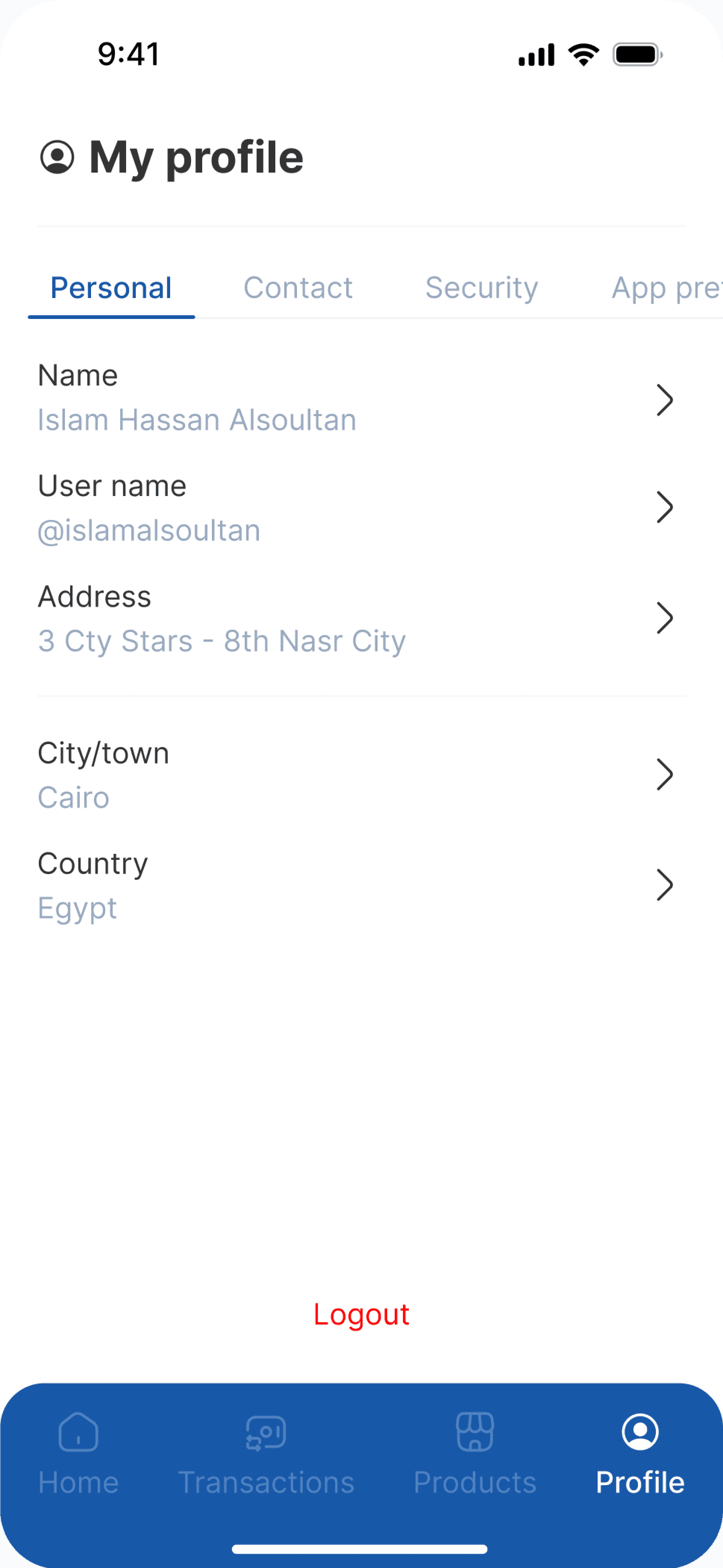
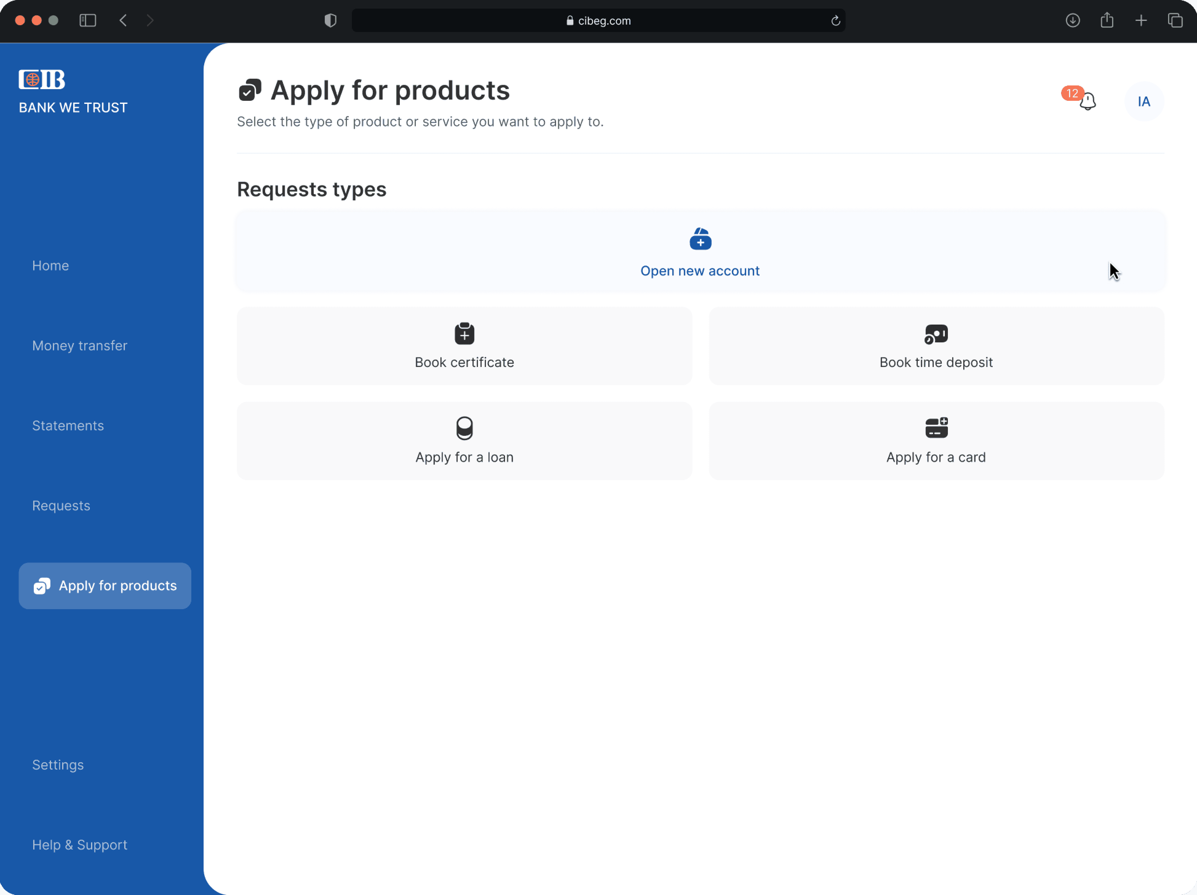
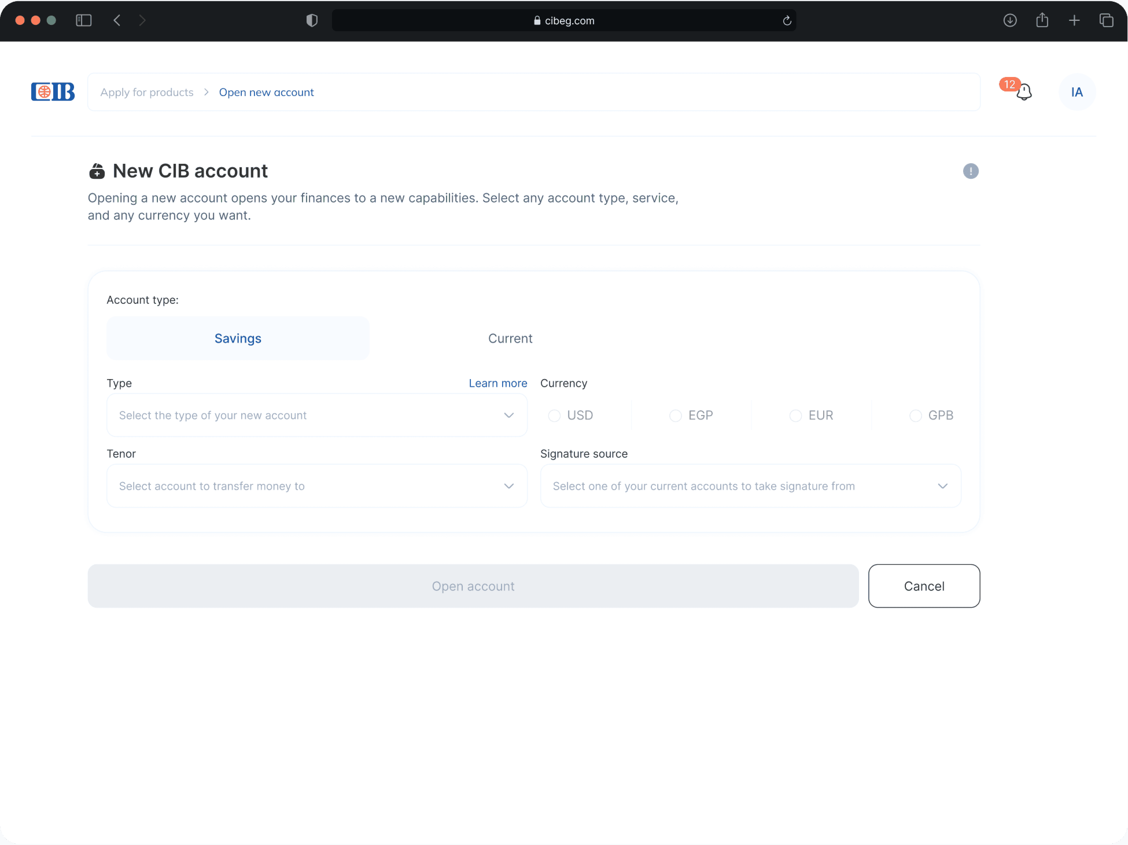
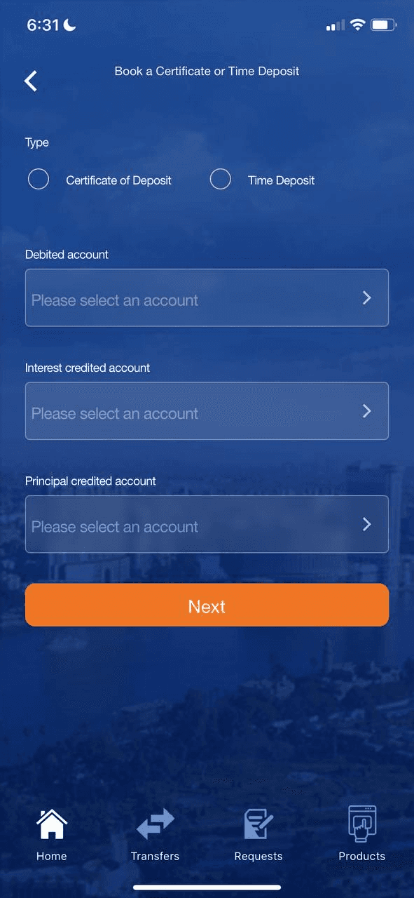
Other screens
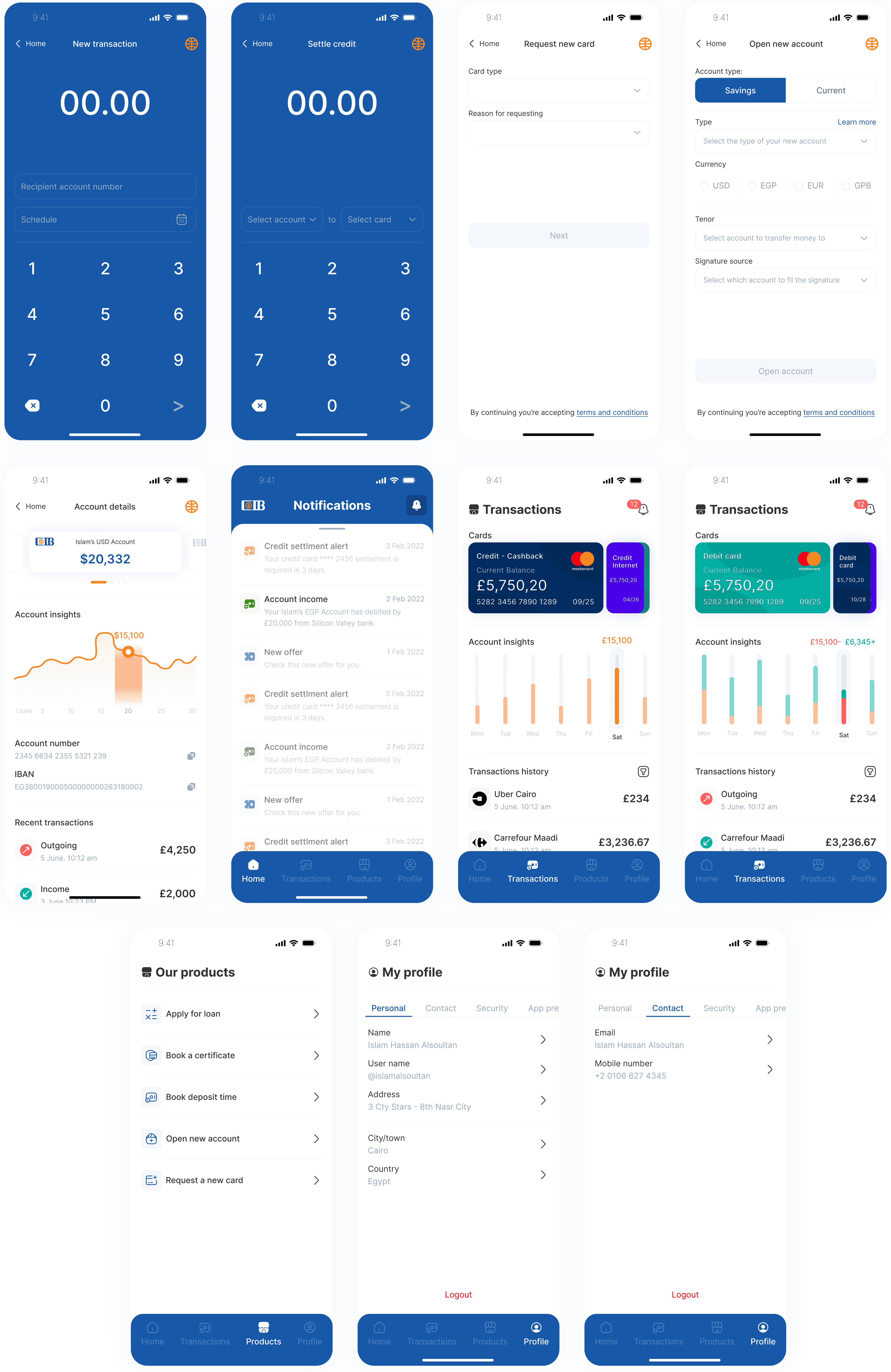
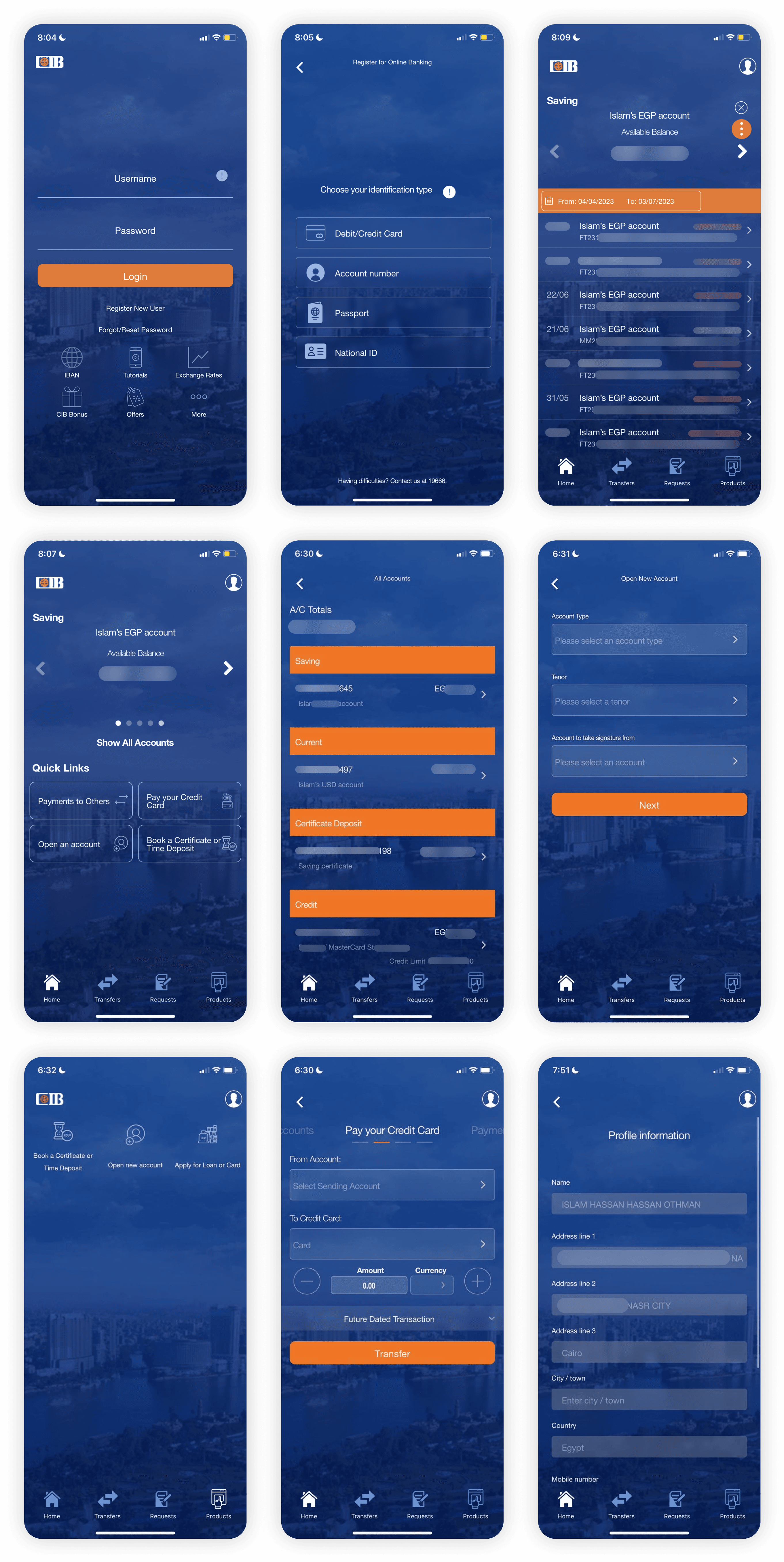
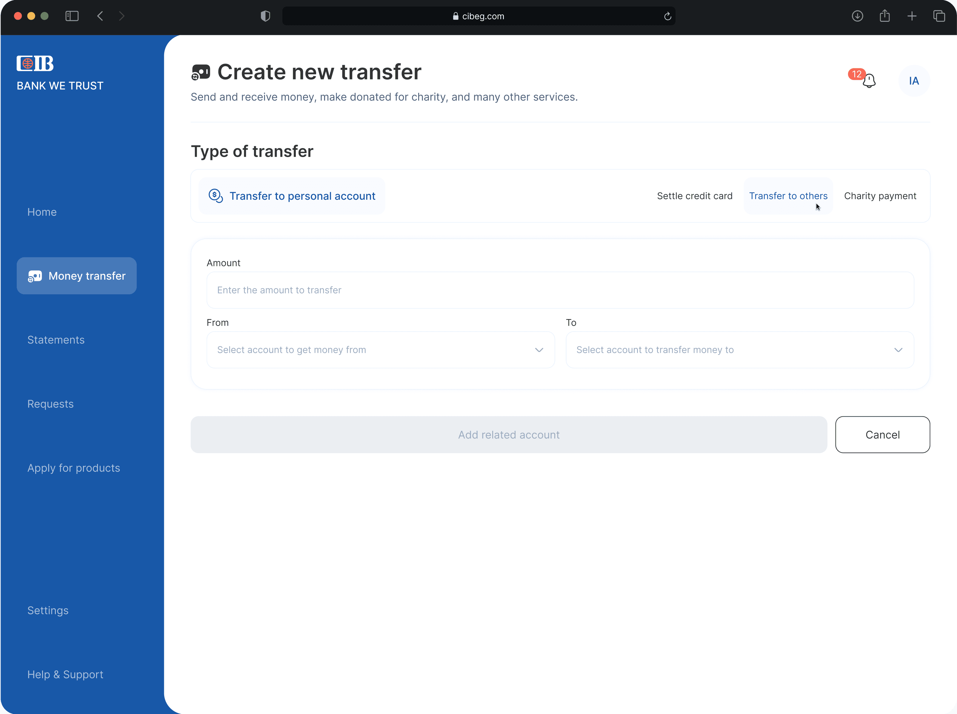
A simple yet efficient screen for transferring money between accounts. I used a custom tab component to handle multiple transfer types with more flexibility and speed.
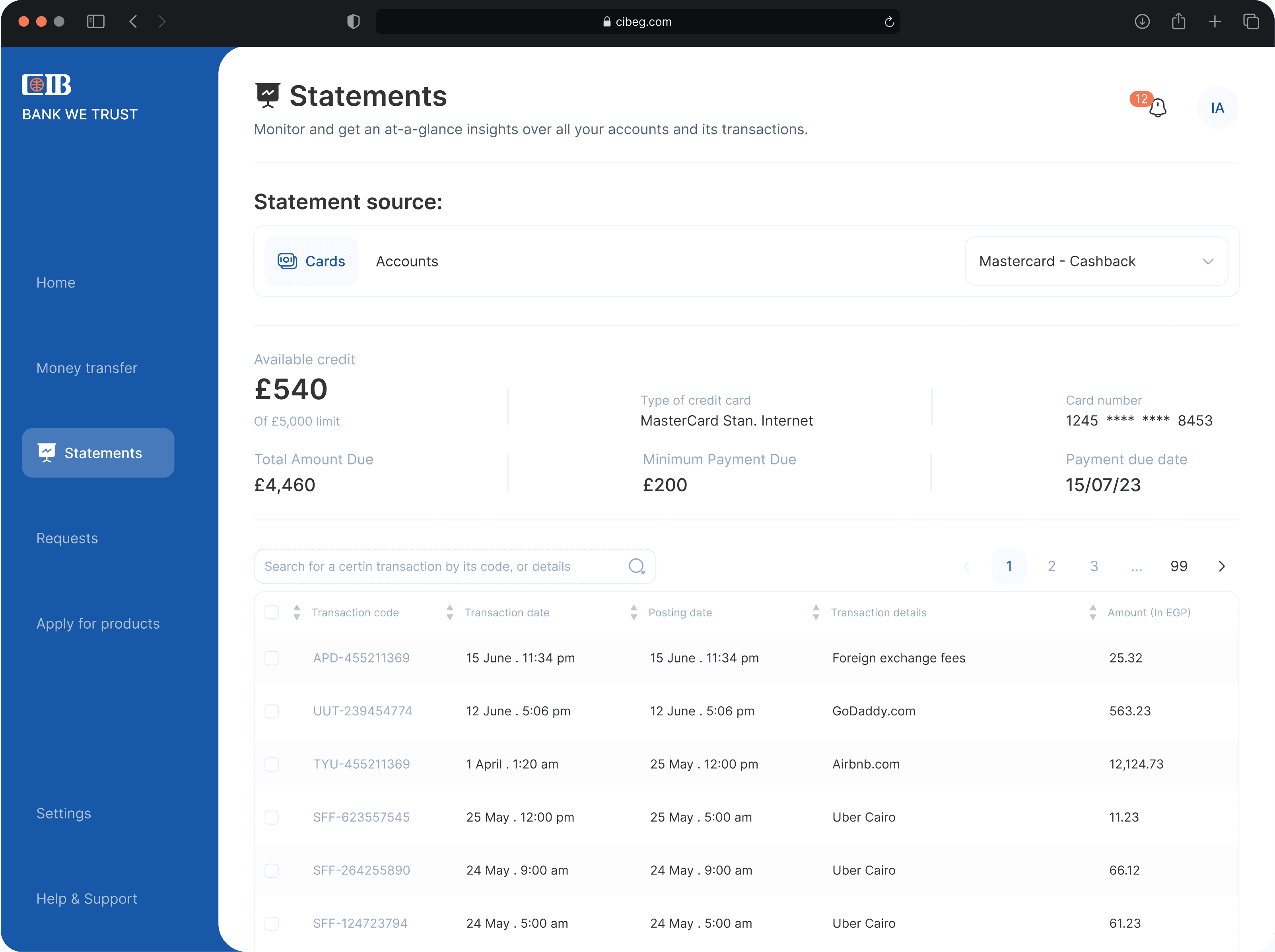
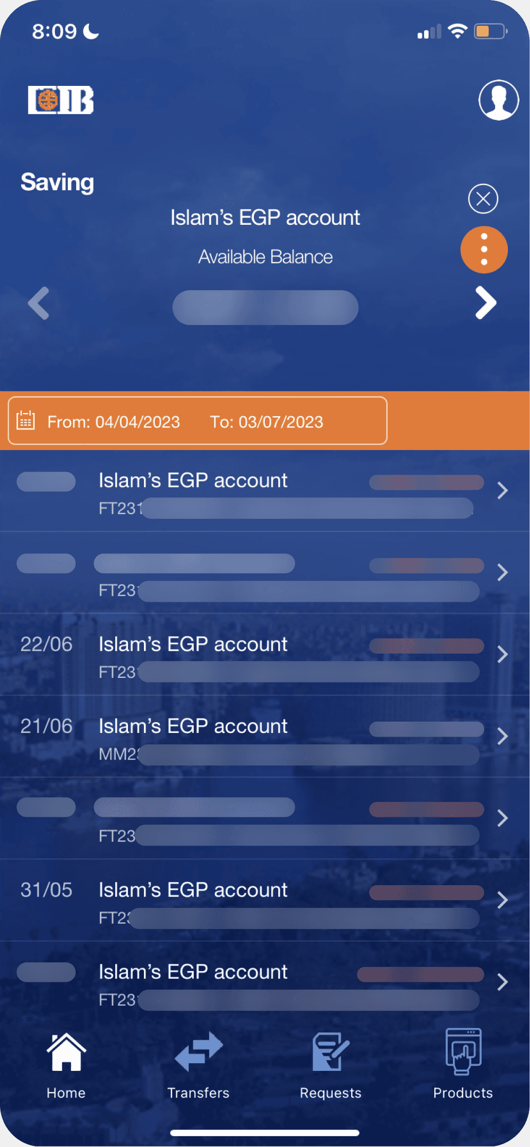
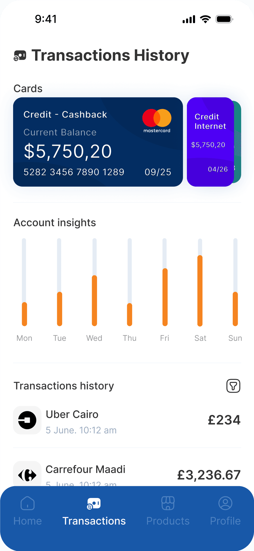
The Statements page offers a clear view of all transactions across accounts and cards. While it may exceed current banking limitations, I chose to prioritize a better customer experience over strict constraints.