Axis V3: one financial home for paying, saving and growing
A concept for growing Axis, Egypt’s third most-used mobile wallet, into one home for paying, saving and investing, without slowing down everyday payments.
- My role
- Senior Product Designer, self-initiated
- Product
- Axis wallet, Egypt
- Languages
- Arabic first, English
- Status
- Concept and recommendation
This is a self-initiated concept. No research was run, and every number on screen is illustrative.
The challenge
Axis is Egypt’s third most-used mobile wallet. It now needs to hold savings and investments as well, without slowing down the payments people rely on every day.
- Wallet, available todayPeople send money, pay bills, use a virtual card, and cash in and out.
- Savings, coming nextA place to set money aside for a goal.
- Axis Invest, coming nextFunds, stocks and gold in one place.
How might Axis widen what people can do with their money without making everyday payments any harder?
Where V2 stands
V2 works well for everyday payments, but its tab bar wasn’t built to hold more products.
Keep
What already works
- Balance firstThe balance is the biggest thing on Home, with Cash in right beside it.
- Quick actionsCash out, transfer money, pay a bill and scan a QR code are one tap away.
- BillsEveryday Egyptian bills are grouped by category.
- CashCash in and cash out suit a market that still runs on cash.
- Look and voiceThe teal and mint look and the friendly, colloquial Arabic feel familiar.
- TrustA Central Bank of Egypt license, Meeza and Visa stand behind it.
Fix
What will not scale
- TabsThe tabs mix places, money sources and cards, so every new product wants a tab of its own.
- BalancesThere is nowhere to show saved or invested money.
- PromotionAds compete with everyday tasks for the same space.
Starting from assumptions
There was no research to draw on, so I started from two clear assumptions.
- Payments come firstWhatever changes, sending money and paying bills must not get slower.
- Saving and investing are newMost people have never set a savings goal or invested through an app.
Models I set aside
Product-led
Wallet · Savings · Invest
- Gain
- Mirrors how the business is organized.
- Risk
- Every new product needs its own tab.
Need-led only
Pay · Save · Grow
- Gain
- Simple, and it lasts as products change.
- Risk
- One verb can hide real differences between products.
Unified Home
One overview with side hubs
- Gain
- Familiar, with everything on one screen.
- Risk
- Home turns into a crowded dashboard.
The direction I chose
Chosen · Need-led tabs
Tabs follow the need; products keep their names inside
- Pay
- Wallet: send money and pay bills
- Save
- Savings: set money aside for a goal
- Grow
- Axis Invest: grow money over time
The mental model
I designed for one person, and around one idea that runs through the whole app: the wallet balance.
Proto-persona, based on assumptions
A man in Minya with an old Android phone
“I just want to send money to my cousin, as simply and quickly as possible.”
- Phone
- An older Android phone with little storage and a patchy data connection.
- Language
- Reads colloquial Arabic, right to left.
- Needs
- Send money and pay bills, then see clearly that it worked.
- New to
- Savings goals and investing.
Everything starts from the balance
Money in · Home
- Cash in at an agent or ATM
- Money from any other wallet
- Salary paid into the wallet
Wallet balance
The money I can spend right nowMoney out · Pay tab
- Send money to anyone
- Pay a bill
- Cash out
- Pay online or by QR
Save
Savings goalsThe Save tab. Kept apart from spending until the goal is met.Set aside from the balance, never added back into it
Grow
Axis InvestThe Grow tab. Its value rises and falls with the market.Three kinds of money
Each need holds a different kind of money. Money can move between them, but the three are never added together.
Pay
Wallet
Money ready to spend
- Used for
- Sending money and paying bills
- Time frame
- Today
- Its value
- Stays the same
Save
Savings
Money set aside
- Used for
- Reaching a goal you set
- Time frame
- Weeks to months
- Its value
- Stays the same, kept apart from spending
Grow
Investments
Money invested
- Used for
- Building wealth over time
- Time frame
- Years
- Its value
- Rises and falls with the market
Rules that follow
- Never added togetherHome never shows one total that hides what you can actually spend.
- Plain verbsMoney is added, moved or withdrawn, and the screen always says which.
- Cards are toolsA card is a way to pay, not a place to keep money.
- Goals organize savingsGoals group saved money; they are not separate products.
Structure and journeys
Home gives the summary; each tab owns its own details.
- HomeComposed view
- Financial position
- Frequent actions
- Activity and next step
- PaySend money and pay bills
- Send and receive
- Bills and services
- One payment history
- SaveMoney set aside
- Savings overview
- Goals
- Move money
- GrowAxis Invest gateway
- Portfolio
- Explore Stocks, Funds, Gold
- Investment flow
- MoreAccount and support
- Account and access
- Control
- Help and settings
Underneath: how value and records move
- Wallet ledgerFunds Pay, Save and Grow, never merged
- Domain recordsEach domain owns its history and states
- Home summariesRead only, deep-link to the owner
- Shared servicesIdentity, authentication, notifications
The journeys
New
- Number and code
- Account setup
- Intent questions
- Activate now or later
- Active Home
Returning
- Biometrics or code
- Resume where they stopped
- Active Home
Every money action
- Choose action
- Details and review
- Authenticate
- Outcome and recovery
The walkthrough
From the first time someone opens the app to their first investment.
First open
A tour, offered but never forced
- The tour is optional and can be skipped at any step.
- The first step explains that money is grouped by how you use it.
Home
Orient, act, move on
- Spendable money is the largest number on the screen.
- Saved and invested money sit below it and are never added in.
- A single banner sits under the actions, not above them.
Pay
Send and pay, fast
- Send money, pay a bill, request money and scan sit at the top.
- The people you pay most often are one tap away.
- Transfers and bills share one history, with filters.
Save
Money with a purpose
- Saved money shows as assigned to goals or not yet assigned.
- Each goal shows its progress.
- While you save, the wallet balance stays in view.
Grow
Confidence before commitment
- Current value and the amount invested are shown separately.
- Three short questions help first-time investors start.
- Stocks, funds and gold are compared side by side.
After feedback: Home, again
Feedback asked for a Home that looks more inviting and works better for every kind of user, so I explored four directions.
Before and after
Wallet first gives spendable money its own card, with payments right below it.
Easier for every user
- One clear figureThe spendable balance is large and easy to read, even on small, older phones.
- A label on every iconNo action depends on recognizing an icon alone.
- Never color aloneEvery state also shows an icon, a sign or a word.
- Arabic firstColloquial Arabic, designed right to left rather than flipped.
My recommendation: go with Wallet first, confirm that people understand their balance, then connect investments.
Risks and how I would test them
Every screen is a bet. Each one gets a risk, a test and a clear bar to pass.
| RiskWhat could go wrong | TestHow I would check it | PassWhen it is good enough | |
|---|---|---|---|
| Home | The banner grows into an ad space. | A five-second test on Home. | People name their spendable balance first. |
| Pay | “Pay” reads as bills only, not transfers. | A first-click test comparing Pay, Spend and Send. | First clicks land on Pay for both transfers and bills. |
| Save | The savings rules are not yet known. | Confirm the rules with compliance, then run a concept test. | People can tell saved money from spendable money. |
| Grow | A simple screen hides risk and fees. | A comprehension test before any purchase. | People can explain the risk and fees in their own words. |
Guardrails
- Payments never get slower
- Understanding comes before conversion
- No dark patterns
- Arabic, English and accessibility ship together
How I would roll it out
Release in small steps. Each step is watched and tested before the next one opens.
Phase 0
Groundwork
Nobody yet- What ships
- Savings rules, baselines and tracking are set up.
- What I watch and test
- Today’s payment times and error rates, plus tree and first-click tests on the new tabs.
- Move on when
- Baselines and guardrails are agreed.
Phase 1
New tabs
Staff, then a small group- What ships
- Home and Pay in the new tabs, behind feature flags.
- What I watch and test
- Payment time, errors and support contacts, compared with V2.
- Move on when
- Nothing gets worse.
Phase 2
Save pilot
A pilot group- What ships
- Savings goals, with support and a way to roll back.
- What I watch and test
- Goals started and kept, plus a check that people understand saved money.
- Move on when
- People can tell saved money from spendable money.
Phase 3
Grow
Pilot users who opt in- What ships
- Learning and comparison, before anyone can buy.
- What I watch and test
- A comprehension test before any purchase, and every complaint.
- Move on when
- People can explain the risk and fees.
Phase 4
Scale
Everyone, in steps- What ships
- A smarter Home and more products.
- What I watch and test
- Every guardrail by region and device, plus regular usability checks.
- Move on when
- The guardrails keep holding.
Working on something like this?
If your product has to grow without slowing down what people already rely on, tell me where it strains and I’ll help you find the model that holds.

More work
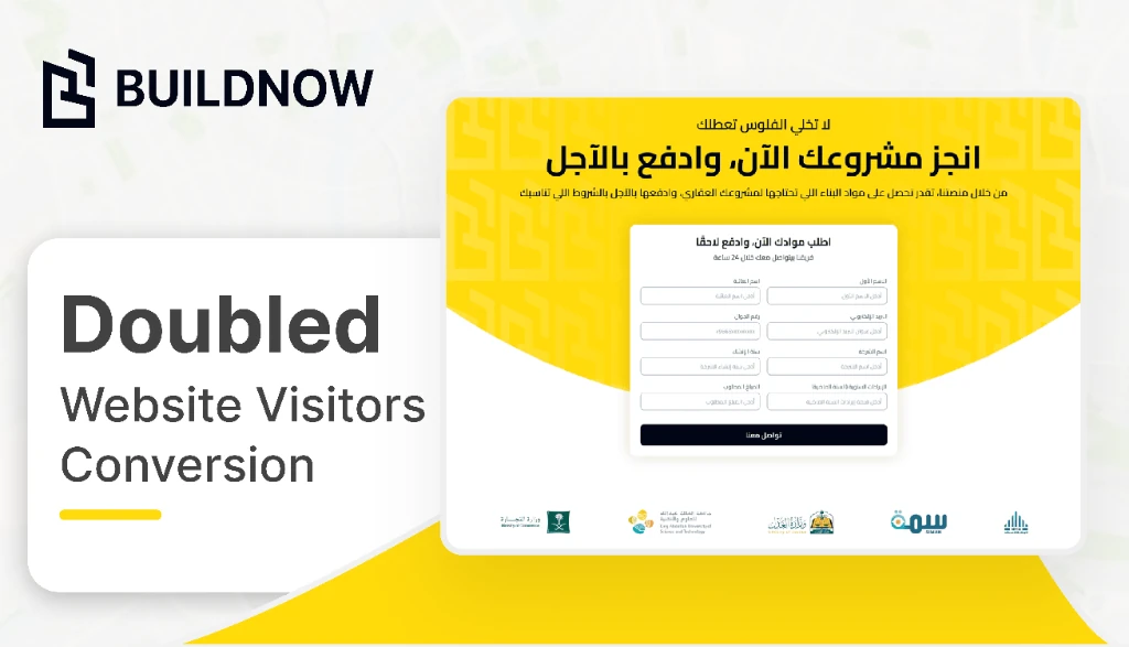
Buildnow (Aajil): a one-week redesign that doubled lead-form conversion
Redesigning Buildnow’s site to deliver sharper messaging, clearer value, and better conversion across its core audiences.
Read case study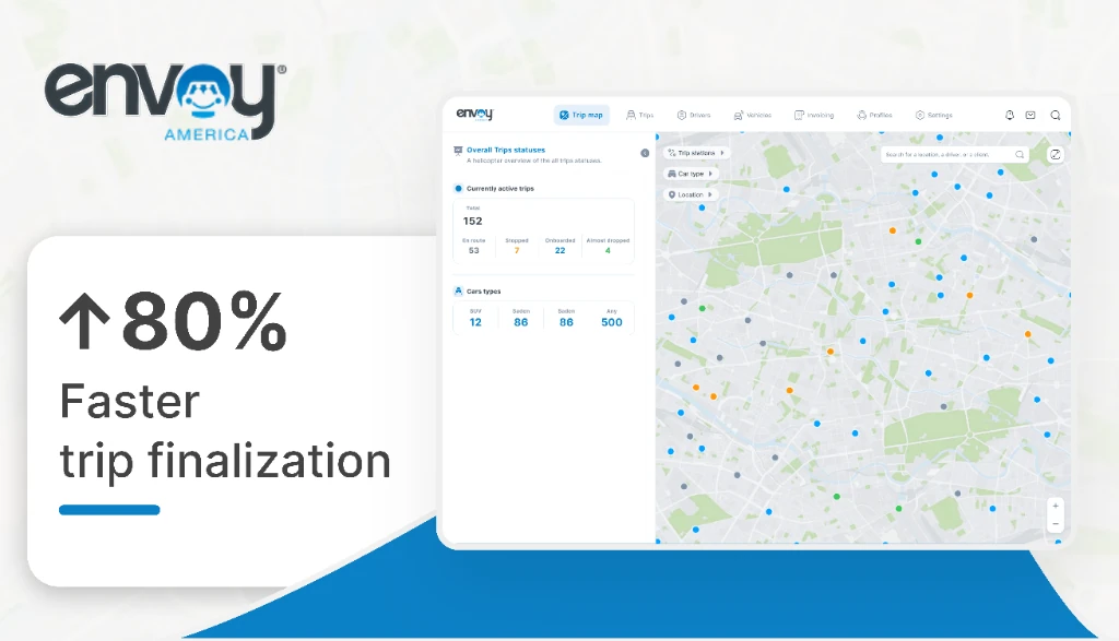
Envoy America: trip operations rebuilt from a 15-year-old system
Redesigning how the team tracks and finalizes trips.
Read case study