CIB Bank
CIB Bank
CIB Bank
UX Audit & Digital Banking Refresh
UX Audit & Digital Banking Refresh
UX Audit & Digital Banking Refresh
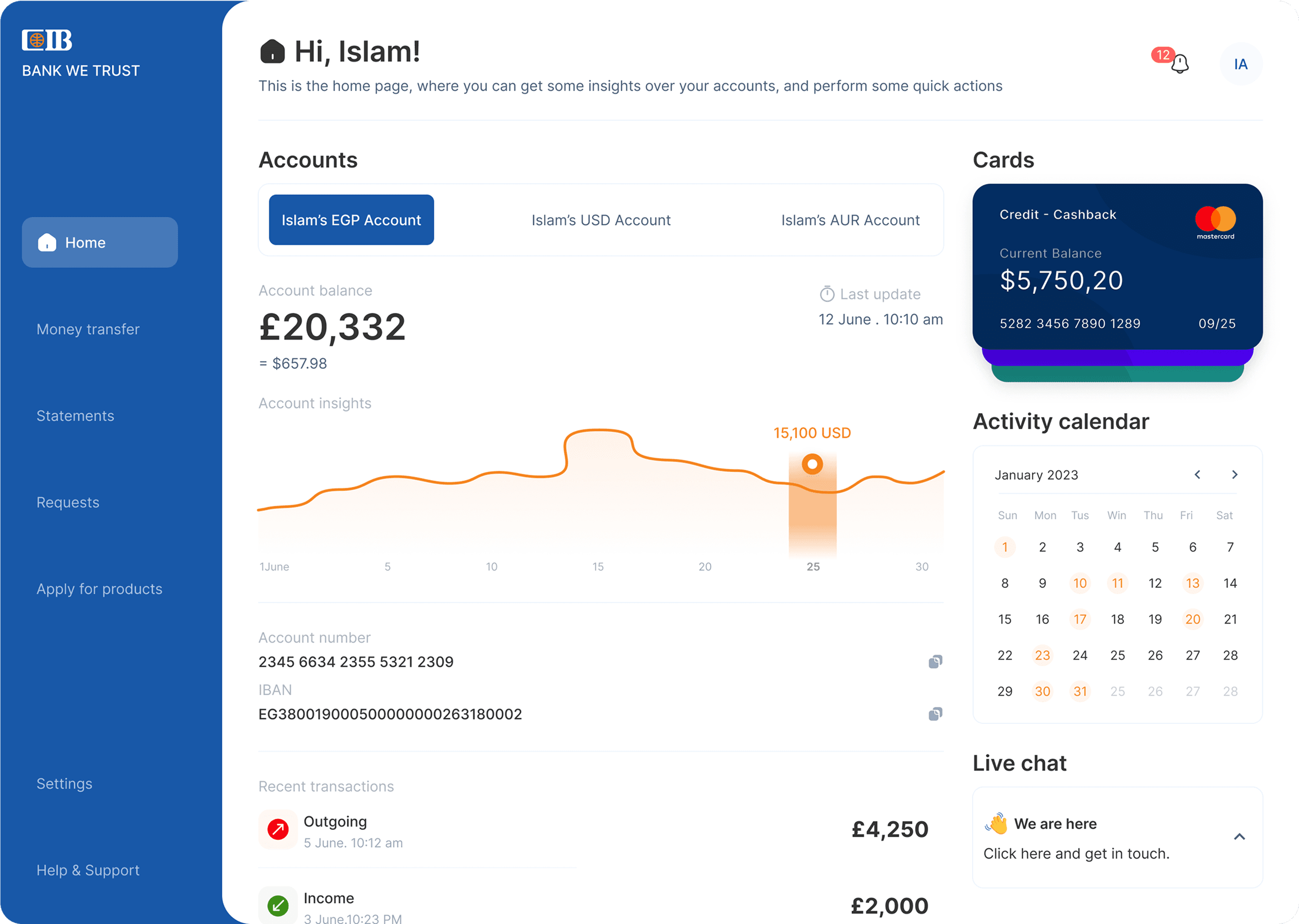
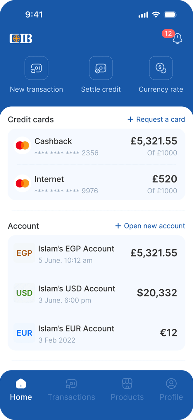
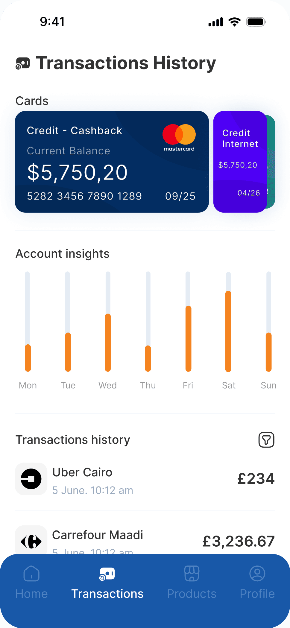
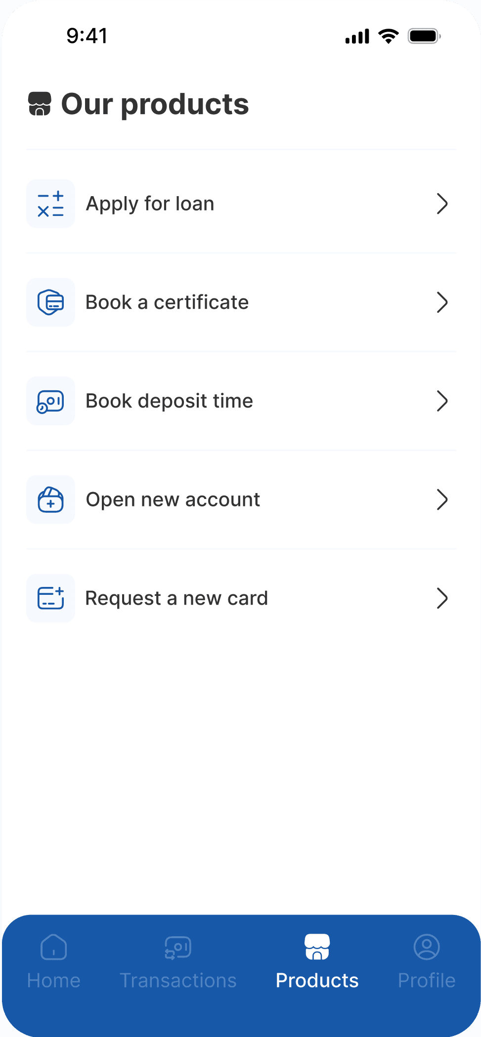
Conducted a full UX audit and interface redesign for CIB’s website and mobile app, simplifying complex banking workflows, improving accessibility, and laying the groundwork for a modern digital experience.
Conducted a full UX audit and interface redesign for CIB’s website and mobile app, simplifying complex banking workflows, improving accessibility, and laying the groundwork for a modern digital experience.
Conducted a full UX audit and interface redesign for CIB’s website and mobile app, simplifying complex banking workflows, improving accessibility, and laying the groundwork for a modern digital experience.
My role
My role
UX Auditor & Designer
Timeline
Timeline
1 Month (5/2022)
Project Overview
Project Overview
A concise view of the problem, my role, the product decisions, and the outcome.
A concise view of the problem, my role, the product decisions, and the outcome.
1. The Challenge
1. The Challenge
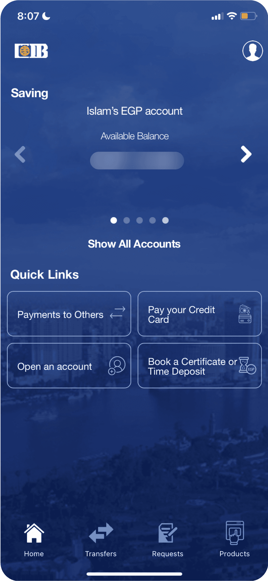
CIB’s app felt heavy and outdated, with unclear navigation and visual clutter that made simple tasks, like transfers or checking balances, harder than they should be. I wanted to simplify things and make the experience feel effortless.
CIB’s app felt heavy and outdated, with unclear navigation and visual clutter that made simple tasks, like transfers or checking balances, harder than they should be. I wanted to simplify things and make the experience feel effortless.
2. My Role
2. My Role
I studied the existing app, mapped the main flows, and redesigned the interface with usability and accessibility in mind, making it cleaner, lighter, and more intuitive.
I studied the existing app, mapped the main flows, and redesigned the interface with usability and accessibility in mind, making it cleaner, lighter, and more intuitive.
3. The Solution
3. The Solution
The redesign focused on structure, clarity, and motion. Simplified navigation, better hierarchy, and accessible visuals made the experience easier to follow and more human.
The redesign focused on structure, clarity, and motion. Simplified navigation, better hierarchy, and accessible visuals made the experience easier to follow and more human.
4. The Outcome
4. The Outcome
The audit identified the core friction points: cluttered navigation, visual overload, and inaccessible flows. The redesign concept showed what a simpler, faster banking experience looks like once those problems are actually addressed.
The audit identified the core friction points: cluttered navigation, visual overload, and inaccessible flows. The redesign concept showed what a simpler, faster banking experience looks like once those problems are actually addressed.
Let's Connect
Have a similar problem? I’d like to hear about it.
Let’s Talk!
Let's Connect
Have a similar problem? I’d like to hear about it.
Let’s Talk!