Optimizing Property Discovery
Optimizing Property Discovery
Optimizing Property Discovery
How Behavioral Map Redesign Increased Property Interactions By 60%
How Behavioral Map Redesign Increased Property Interactions By 60%
How Behavioral Map Redesign Increased Property Interactions By 60%
A redesigned property discovery flow that improved how users scan listings, switch between map and list views, and act on the right property with less friction.
A redesigned property discovery flow that improved how users scan listings, switch between map and list views, and act on the right property with less friction.
A redesigned property discovery flow that improved how users scan listings, switch between map and list views, and act on the right property with less friction.
My role
My role
Product designer
Timeline
Timeline
2 Months (8/2023)
Team
Team
6
Project Overview
Project Overview
A concise view of the problem, my role, the product decisions, and the outcome.
A concise view of the problem, my role, the product decisions, and the outcome.
1. The Challenge
1. The Challenge
Home seekers and agents were struggling to scan, compare, and act on listings inside the map. Weak controls, unclear filters, and too many dead ends made discovery slower and lowered engagement.
Home seekers and agents were struggling to scan, compare, and act on listings inside the map. Weak controls, unclear filters, and too many dead ends made discovery slower and lowered engagement.
2. My Role
2. My Role
I took lead on mapping out user journeys, designing multiple map interaction concepts, and validating approaches with stakeholders. I translated what agents and clients mentally expected into interface options, balancing speed, clarity, and visual appeal — then iterated based on feedback and data.
3. The Solution
3. The Solution
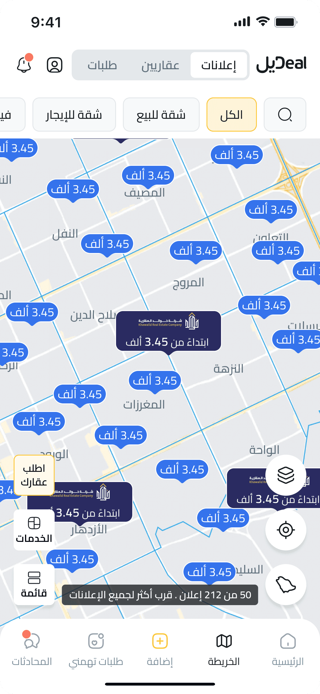
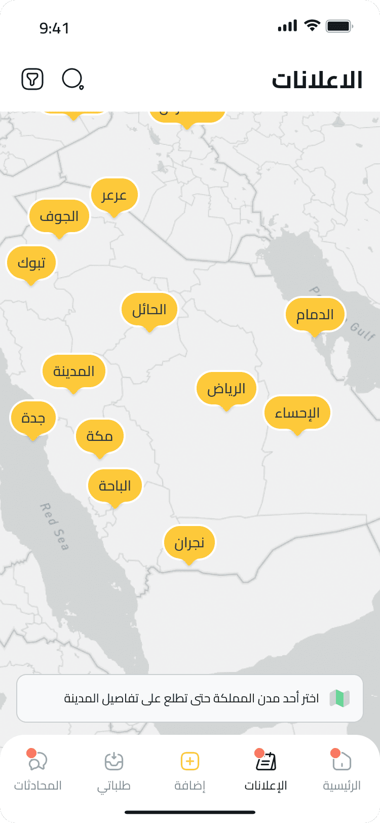
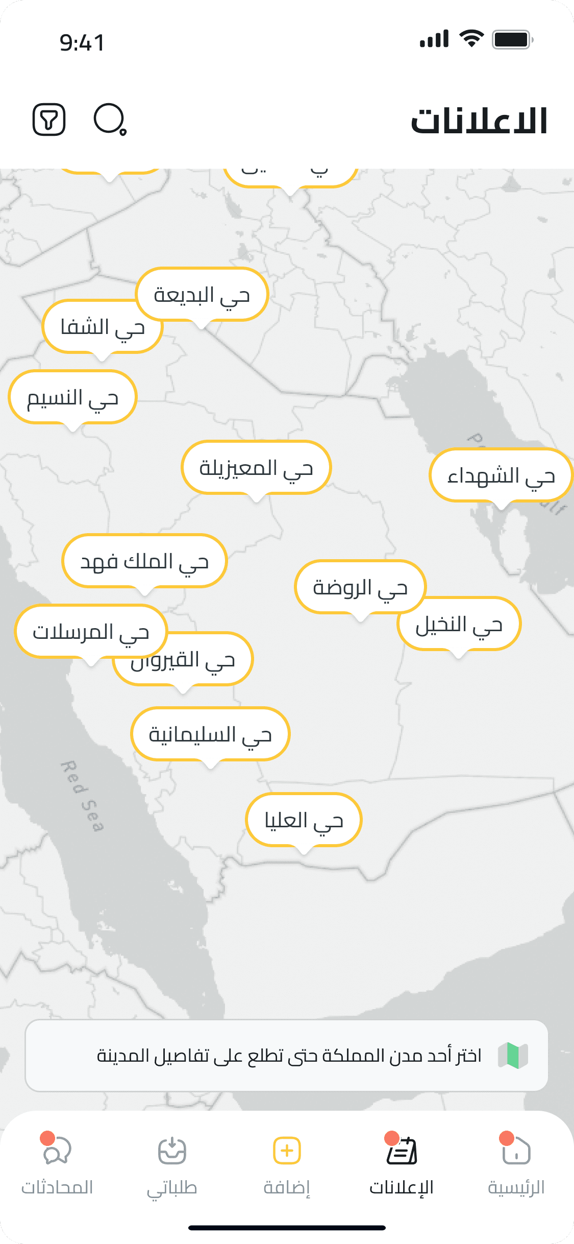
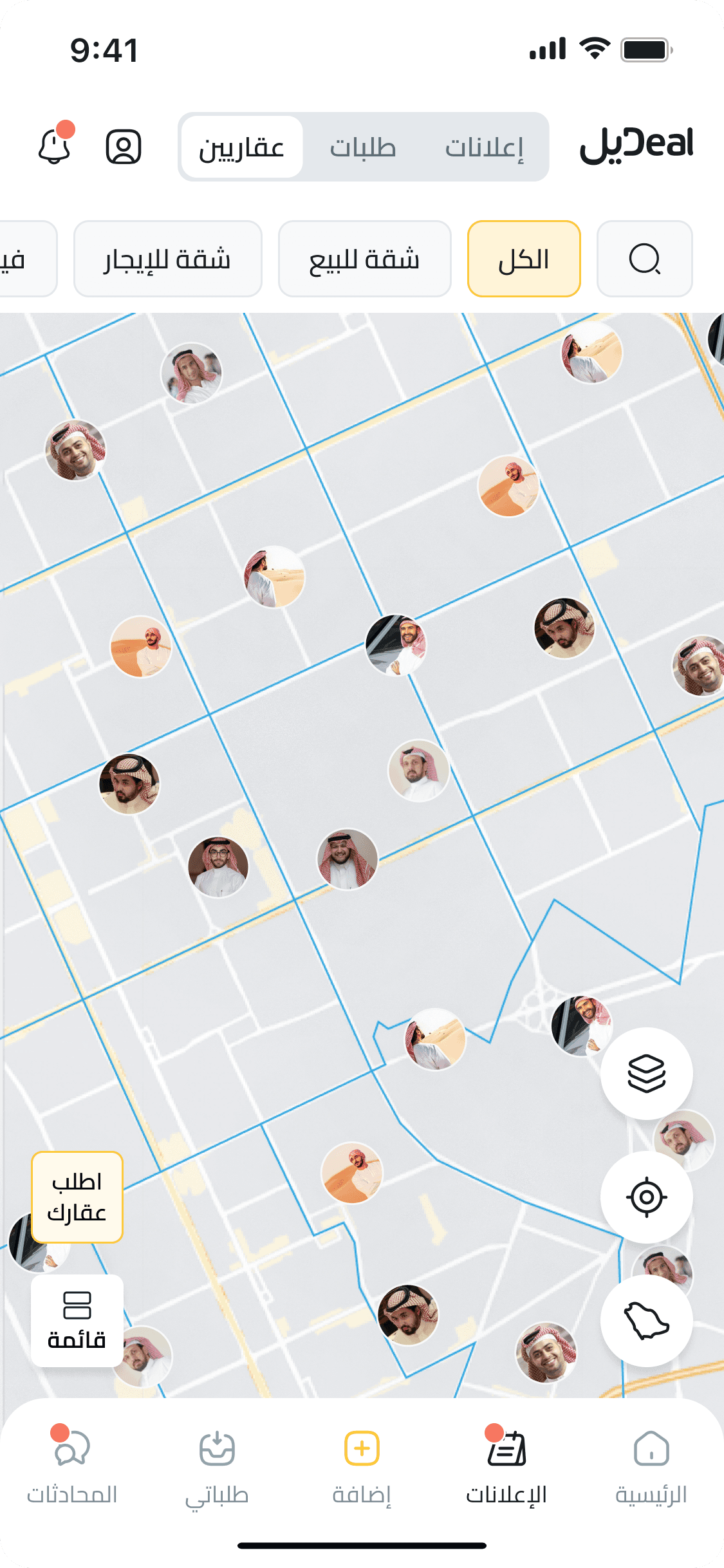
We introduced a fluid, touch-optimized map interface where users could scroll, zoom, and filter seamlessly. Interactive pins expanded into cards with key property details. The overlay visuals were redesigned to feel clean yet dynamic. The redesign also adapted across mobile screen sizes, preserving usability at every form factor.
We introduced a fluid, touch-optimized map interface where users could scroll, zoom, and filter seamlessly. Interactive pins expanded into cards with key property details. The overlay visuals were redesigned to feel clean yet dynamic. The redesign also adapted across mobile screen sizes, preserving usability at every form factor.
4. The Outcome
4. The Outcome
The revamped map experience drove a 60 % increase in map interactions and helped boost overall user satisfaction by 35 %. The cleaner, more intuitive flow led to longer sessions, deeper engagement, and clearer pathways from browsing to action.
The revamped map experience drove a 60 % increase in map interactions and helped boost overall user satisfaction by 35 %. The cleaner, more intuitive flow led to longer sessions, deeper engagement, and clearer pathways from browsing to action.
Let's Connect
Have a similar problem? I’d like to hear about it.
Let’s Talk!
Let's Connect
Have a similar problem? I’d like to hear about it.
Let’s Talk!