EduNatives
EduNatives
EduNatives
Clarifying what an EdTech Learning platform can offer.
Clarifying what an EdTech Learning platform can offer.
Clarifying what an EdTech Learning platform can offer.
Refined EduNatives’ promotional experience around clearer audience paths for students, academics, and companies, improving how each group understands the platform’s value.
Refined EduNatives’ promotional experience around clearer audience paths for students, academics, and companies, improving how each group understands the platform’s value.
Refined EduNatives’ promotional experience around clearer audience paths for students, academics, and companies, improving how each group understands the platform’s value.
My role
My role
UX Designer
Timeline
Timeline
2 Weeks (3/2023)
Project Overview
Project Overview
A concise view of the problem, my role, the product decisions, and the outcome.
A concise view of the problem, my role, the product decisions, and the outcome.
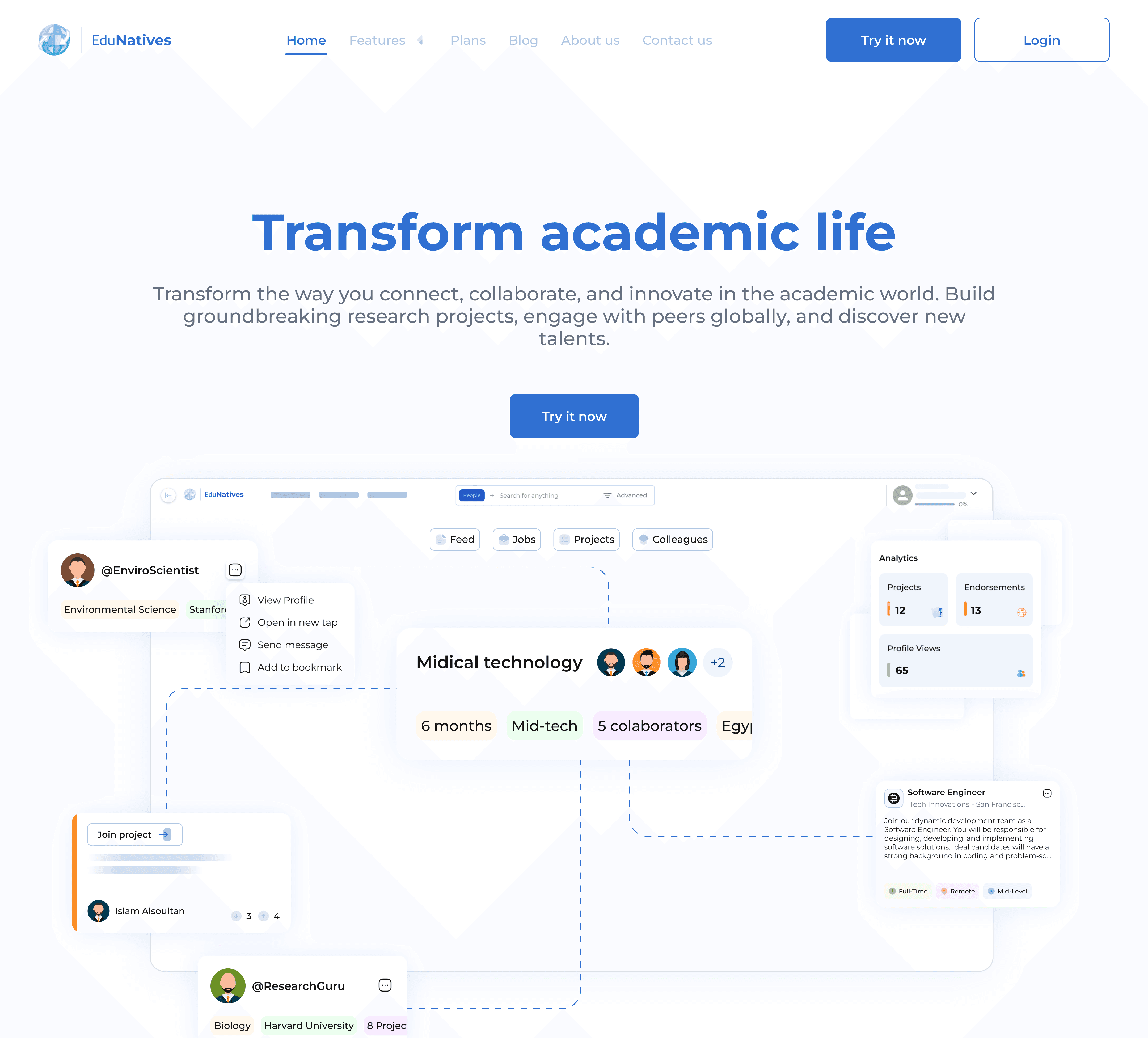
1. The Challenge
The existing site did not make the platform’s value clear enough for its different audiences. Students, educators, and industry partners needed faster orientation and more relevant entry points.
1. The Challenge
The existing site did not make the platform’s value clear enough for its different audiences. Students, educators, and industry partners needed faster orientation and more relevant entry points.
2. My Role
2. My Role
I mapped the audience needs, clarified the message hierarchy, and redesigned the interface around simpler paths for each group.
I mapped the audience needs, clarified the message hierarchy, and redesigned the interface around simpler paths for each group.
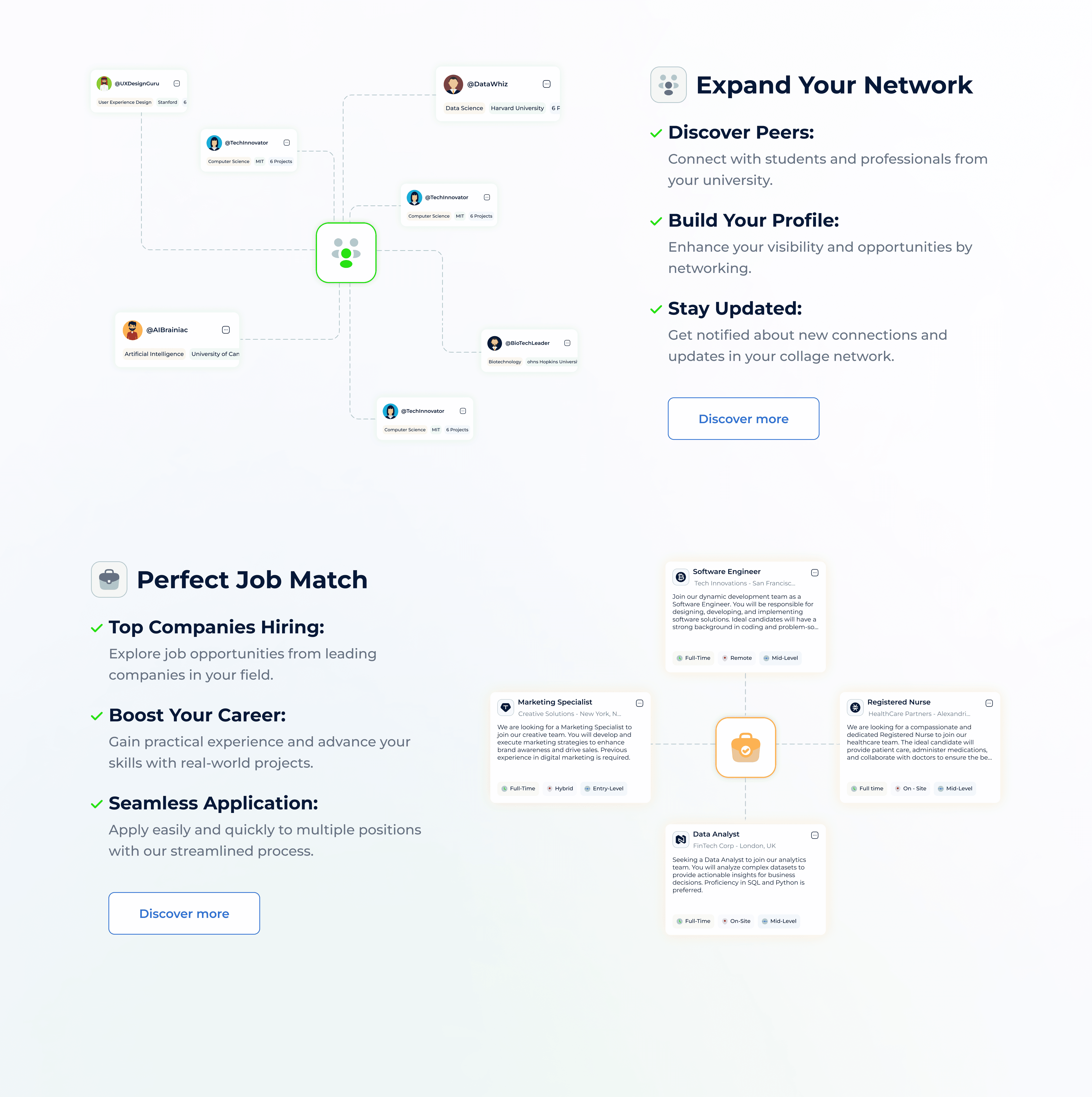
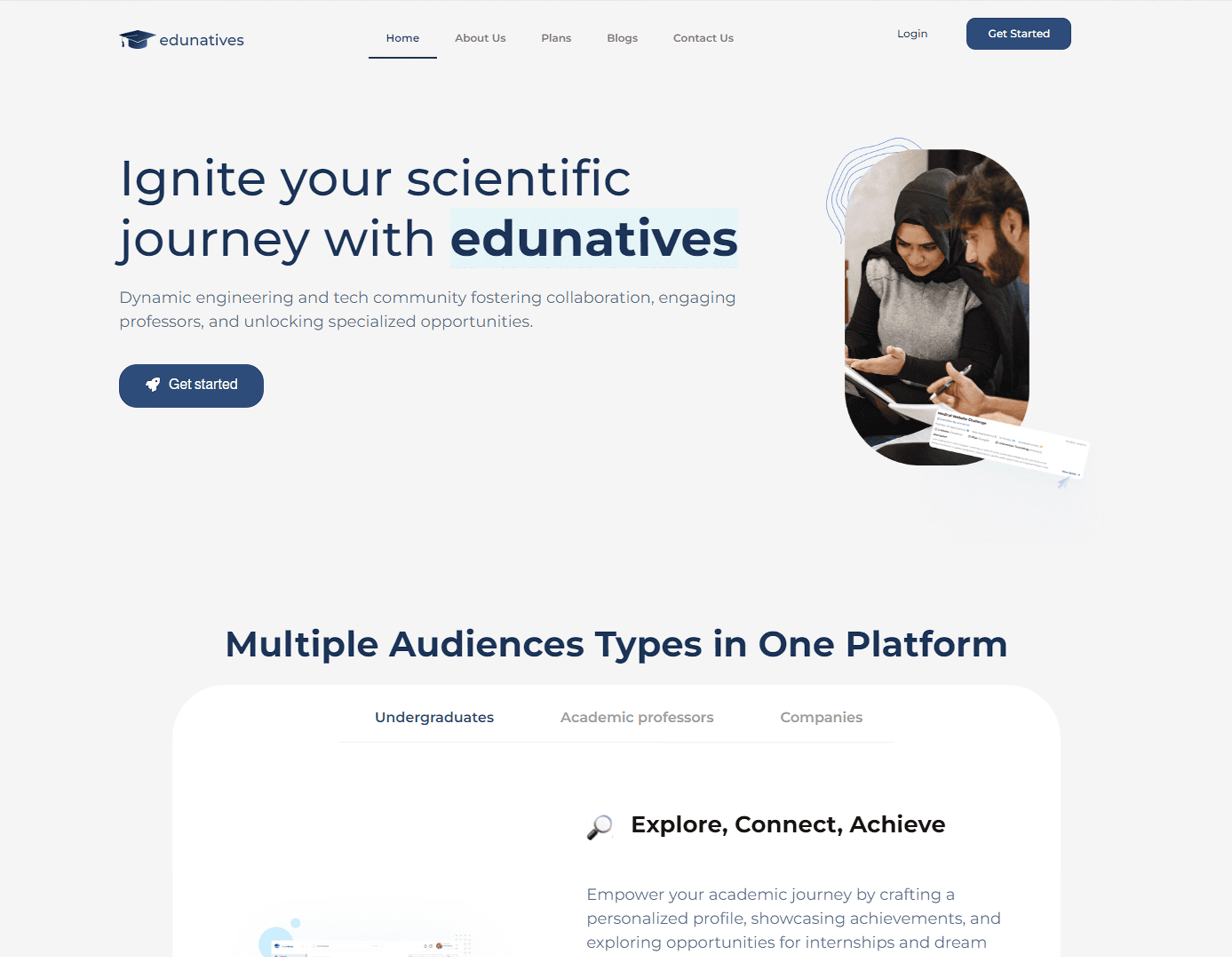
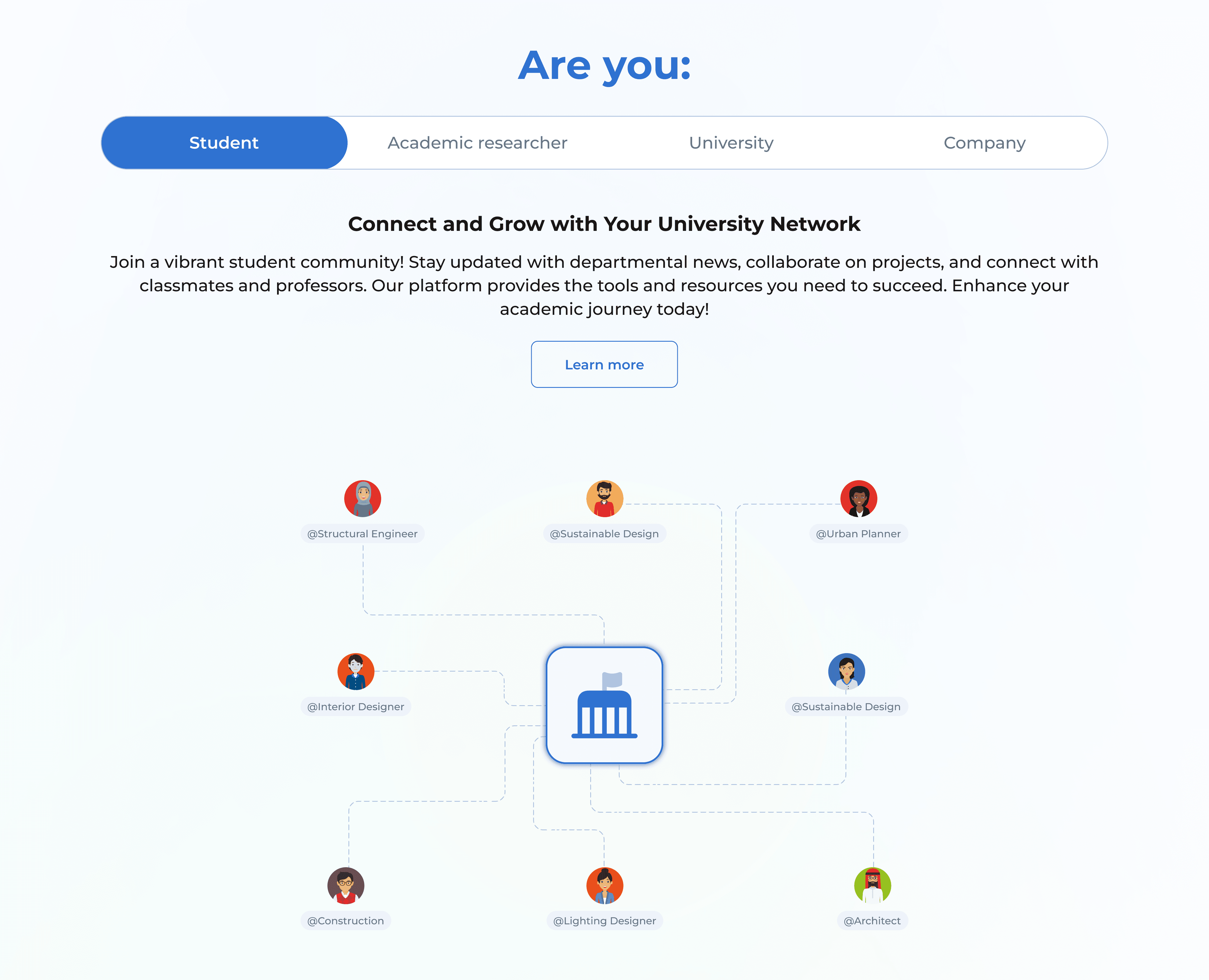
3. The Solution
3. The Solution
A refreshed layout and streamlined navigation aligned each audience with its relevant path. I optimized visuals, copy, and interactive elements for quick discovery and clear conversion.
A refreshed layout and streamlined navigation aligned each audience with its relevant path. I optimized visuals, copy, and interactive elements for quick discovery and clear conversion.
4. The Outcome
4. The Outcome
The redesign gave the platform a clearer story, stronger structure, and a smoother path from first impression to next step. Instead of asking visitors to decode the offer, the site made the value easier to understand, compare, and act on.
The redesign gave the platform a clearer story, stronger structure, and a smoother path from first impression to next step. Instead of asking visitors to decode the offer, the site made the value easier to understand, compare, and act on.
Let's Connect
Have a similar problem? I’d like to hear about it.
Let’s Talk!

Let's Connect
Have a similar problem? I’d like to hear about it.
Let’s Talk!