UX Auditor & Designer
1 Month (5/2022)
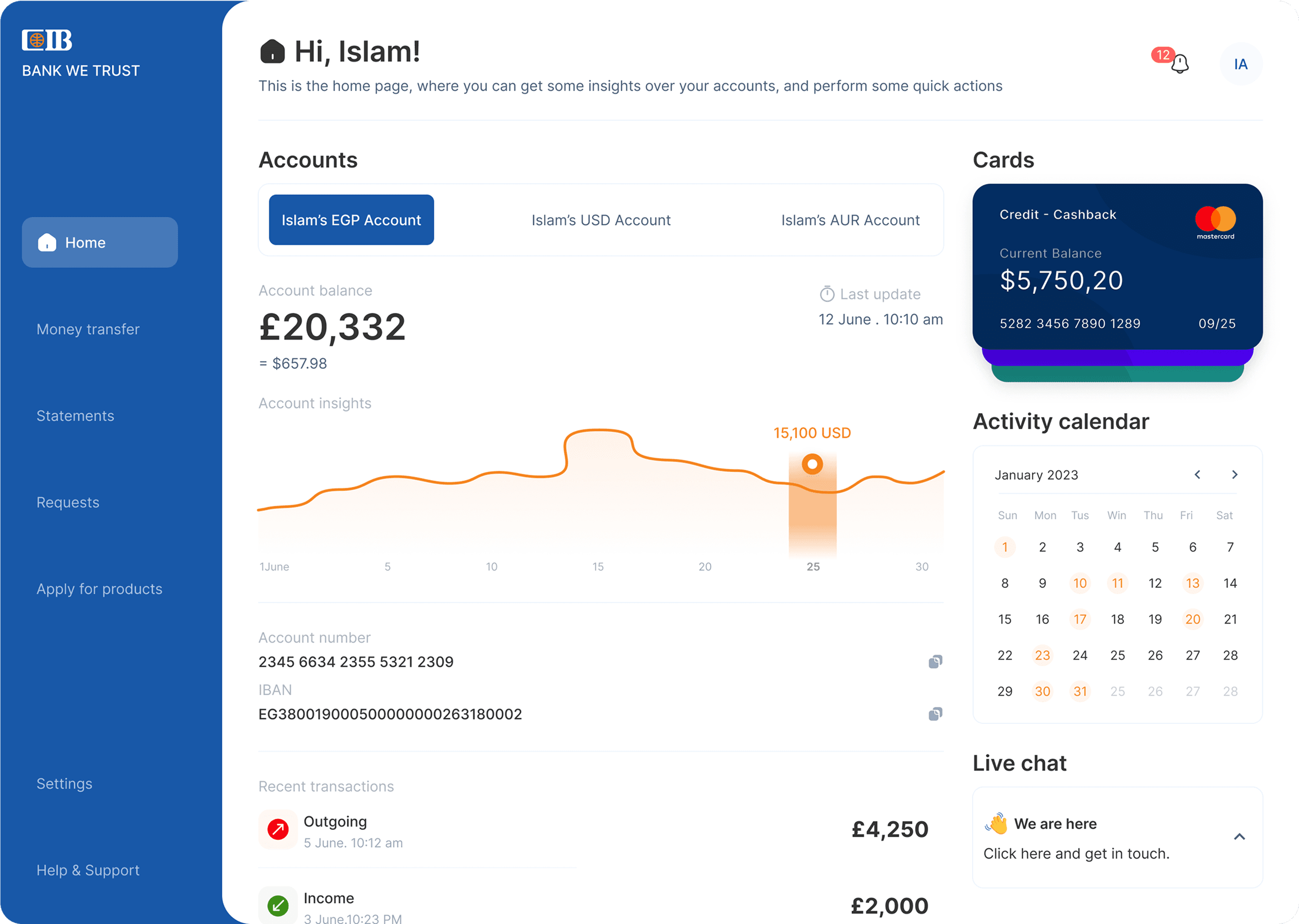
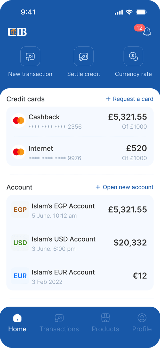
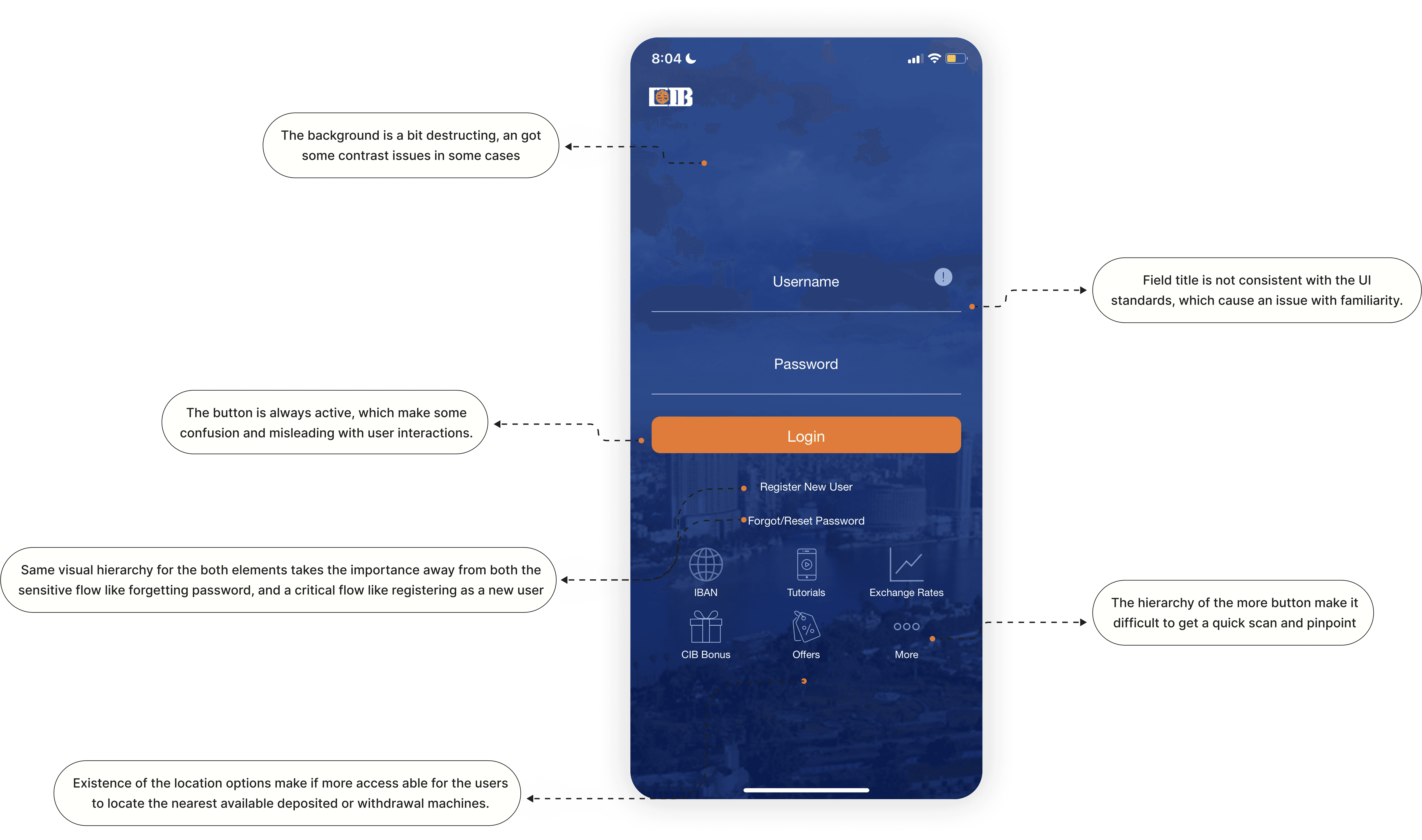
The audit found friction across interaction feedback, navigation, visual hierarchy, and UX writing. Core banking tasks, such as browsing services, transferring money, checking statements, or applying for products, required more interpretation than they should. The problem was task confidence: users needed clearer paths, clearer states, and fewer moments of uncertainty.
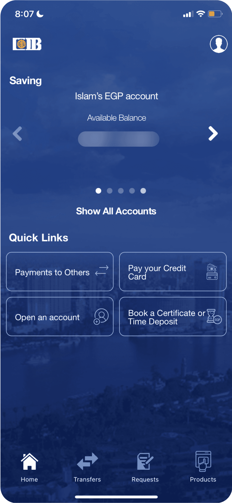
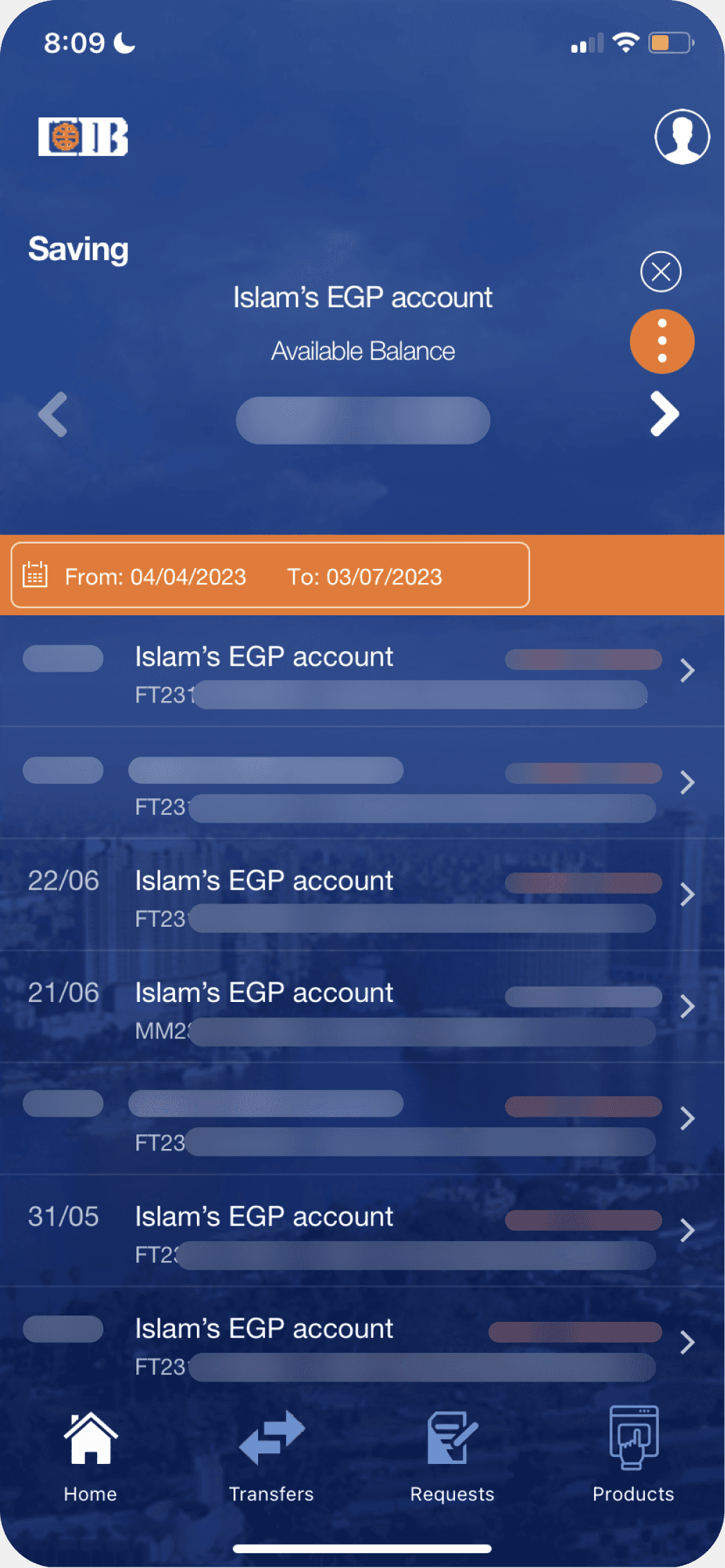
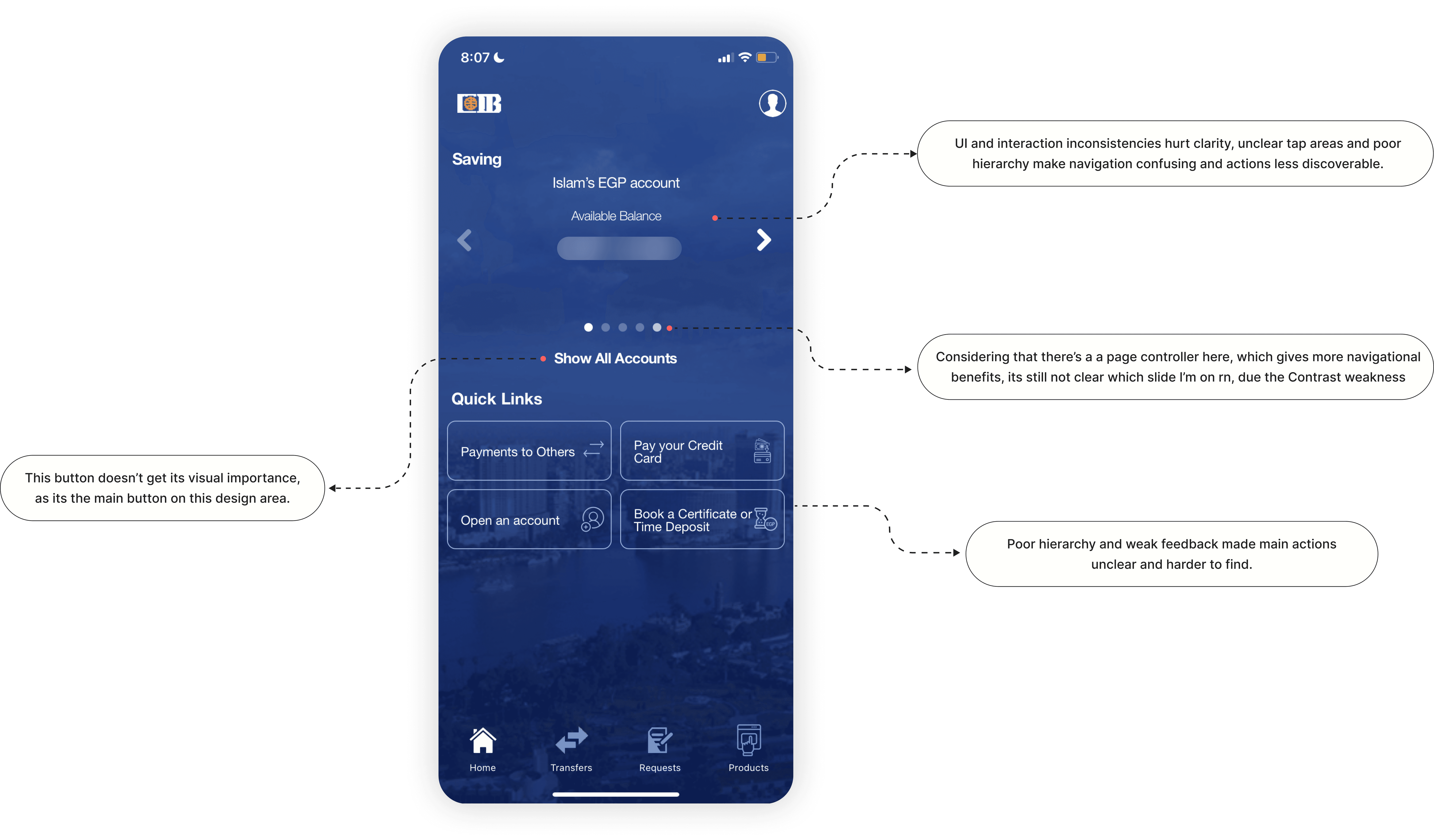
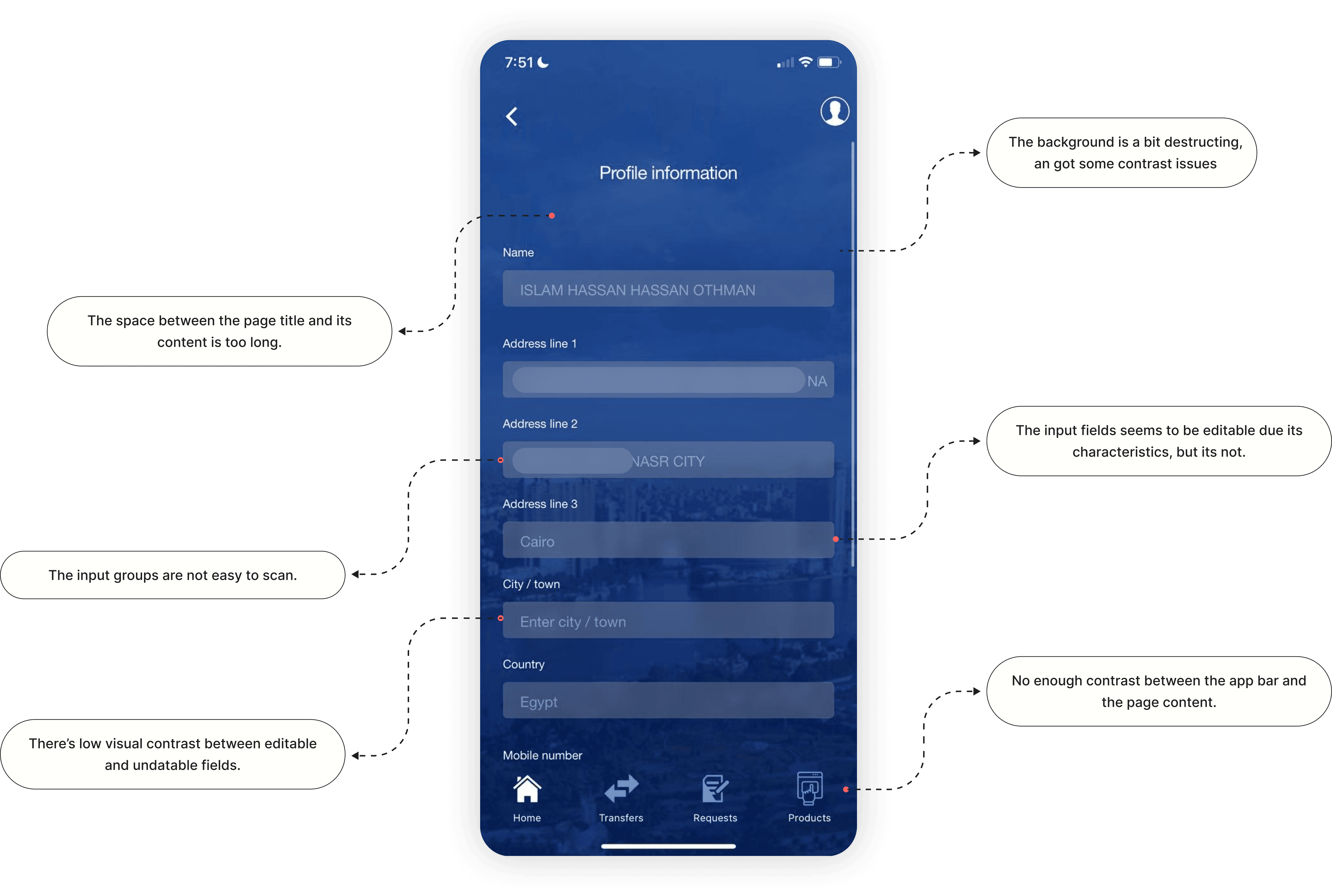
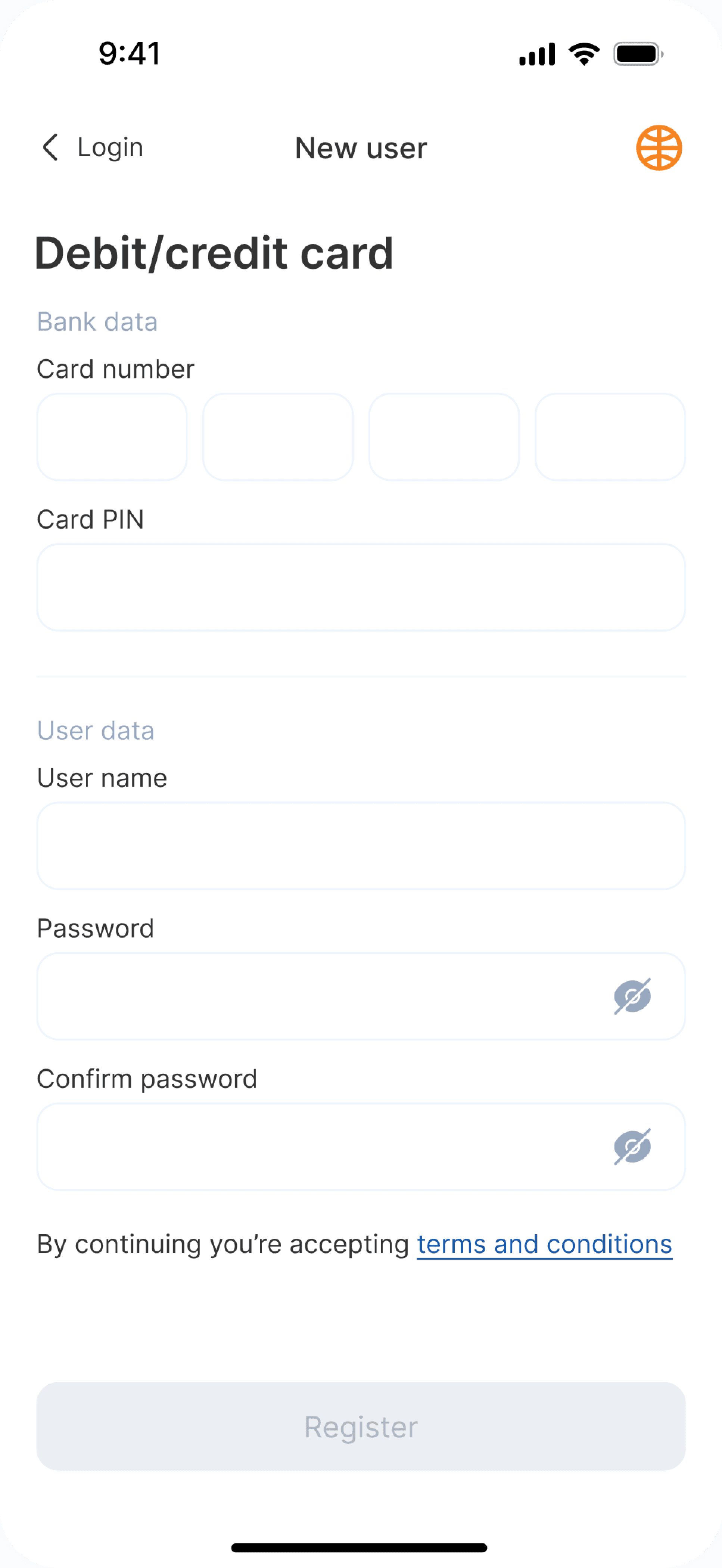
The app’s visual design had a few things getting in the way. The background image clashed with the UI, making it hard to focus. Icons weren’t always clear, which made scanning and interacting harder. The layout didn’t follow a clear grid, so spacing and hierarchy felt off. On top of that, the text contrast was low, and the font sizes weren’t consistent—making it tough to read, especially for accessibility.
The app doesn’t give clear feedback when users interact with it—whether it’s tapping a button, filling a form, or swiping through content. Things feel a bit unresponsive. Some error messages don’t really help or tell you what to do next, which adds to the confusion. Even standard elements like pickers and sliders don’t behave the way mobile users in the age of technology expect, which makes the experience feel a bit off.
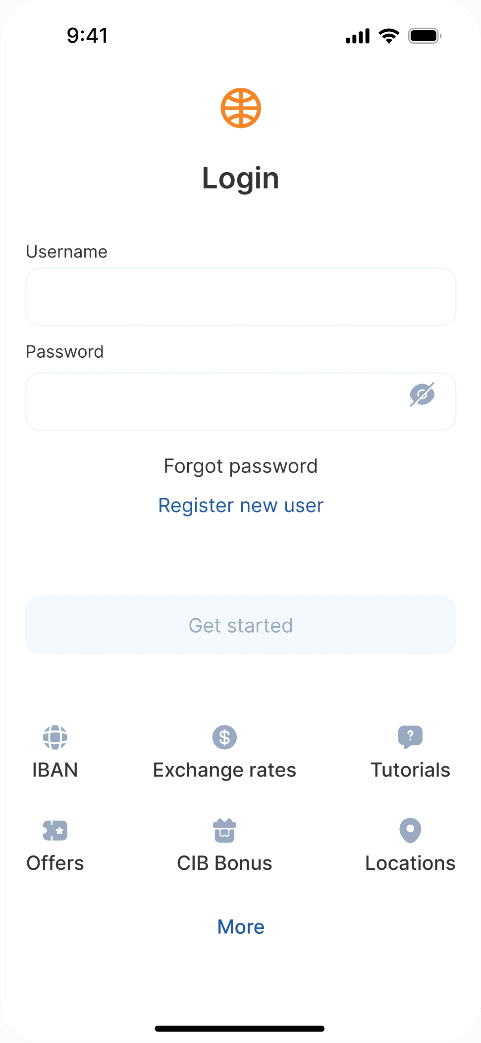
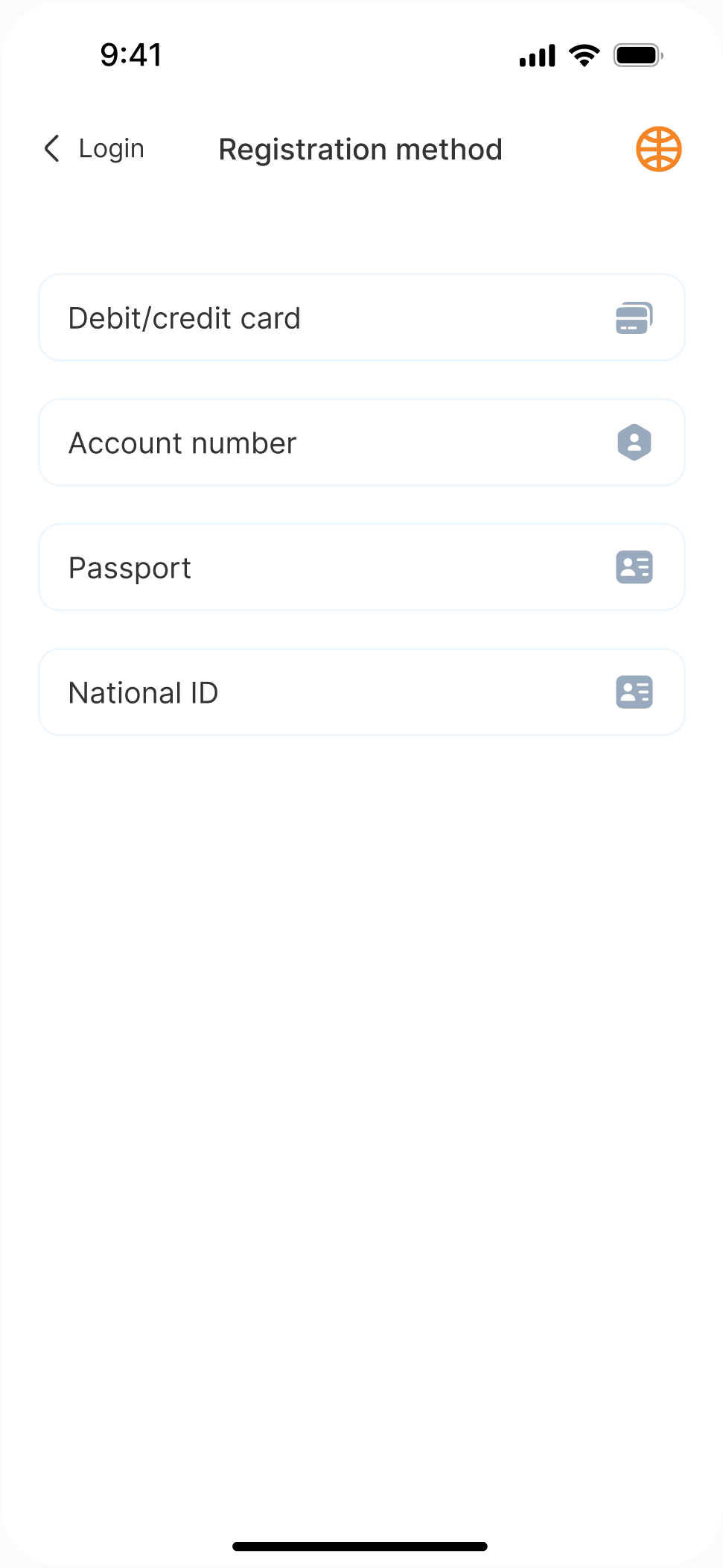
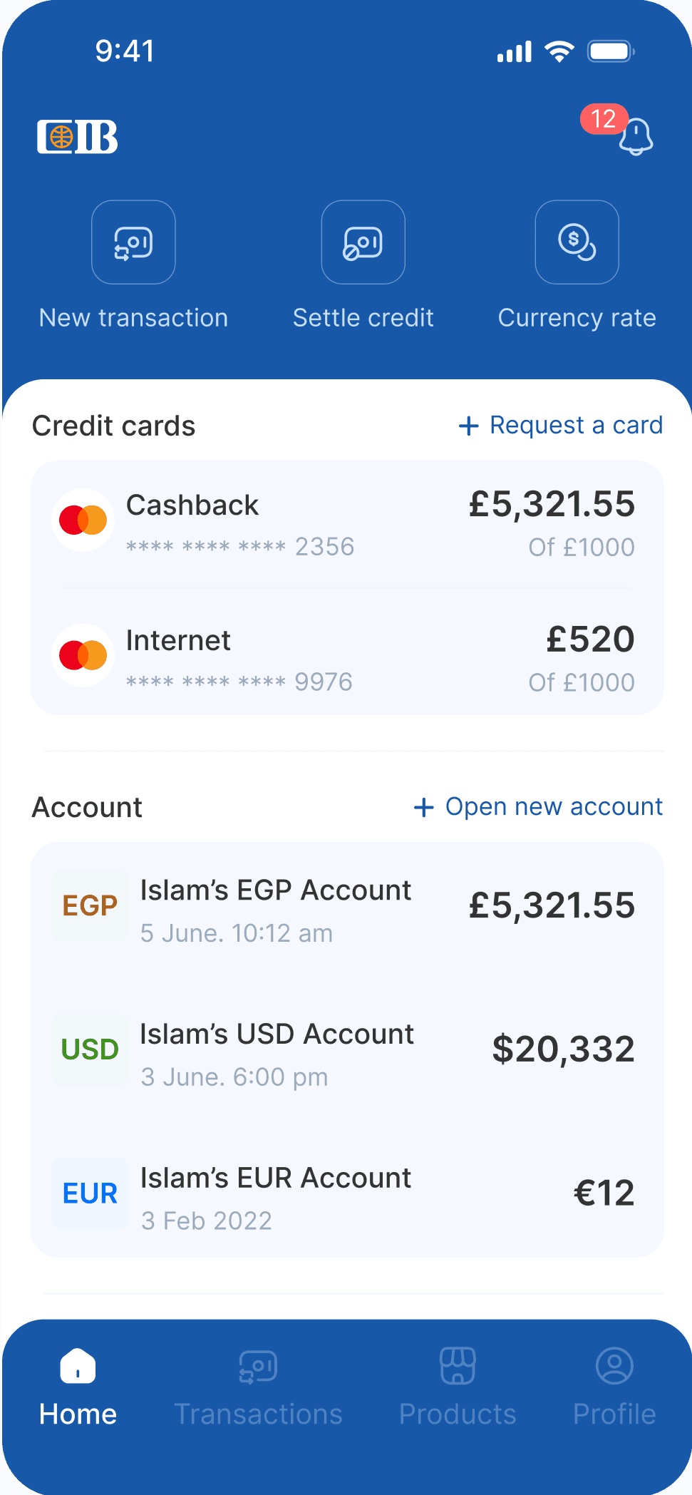
The app’s flow felt complicated. Onboarding didn’t offer much guidance, which left users unsure of where to start. The design language wasn’t consistent, which made things feel disconnected. Some key actions were hidden or hard to find, and the content layout was too dense to scan easily. All of this combined to create a scattered experience that made simple tasks, like settling credit card debt, more difficult than it should be.
I ran the redesign as a structured UX audit, reviewing navigation, visual hierarchy, interaction feedback, accessibility, and microcopy. The redesign decisions focused on making everyday banking tasks easier to predict and complete, especially for users who may not be comfortable with complex financial interfaces.
Miro
Figma
Notion
X-Mind
User interviews
UX Audit
Information Architecture
HMW
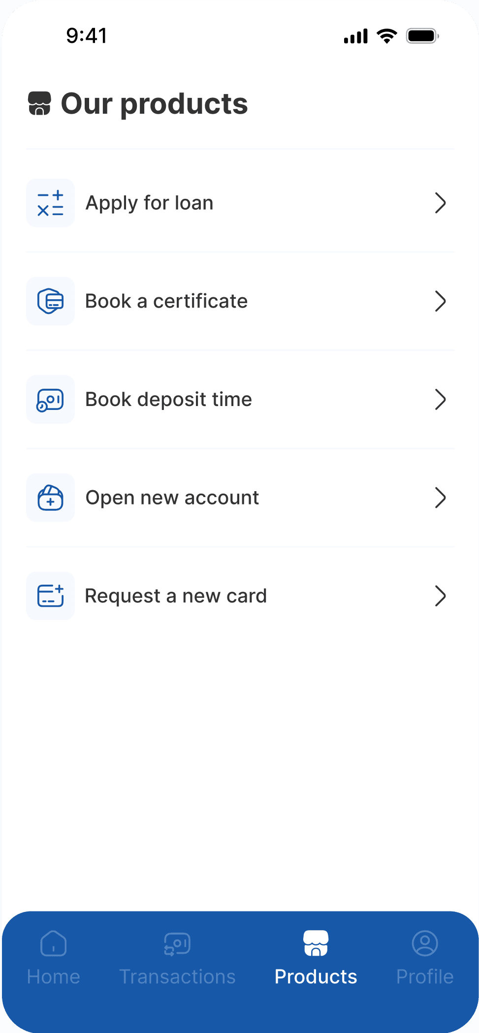
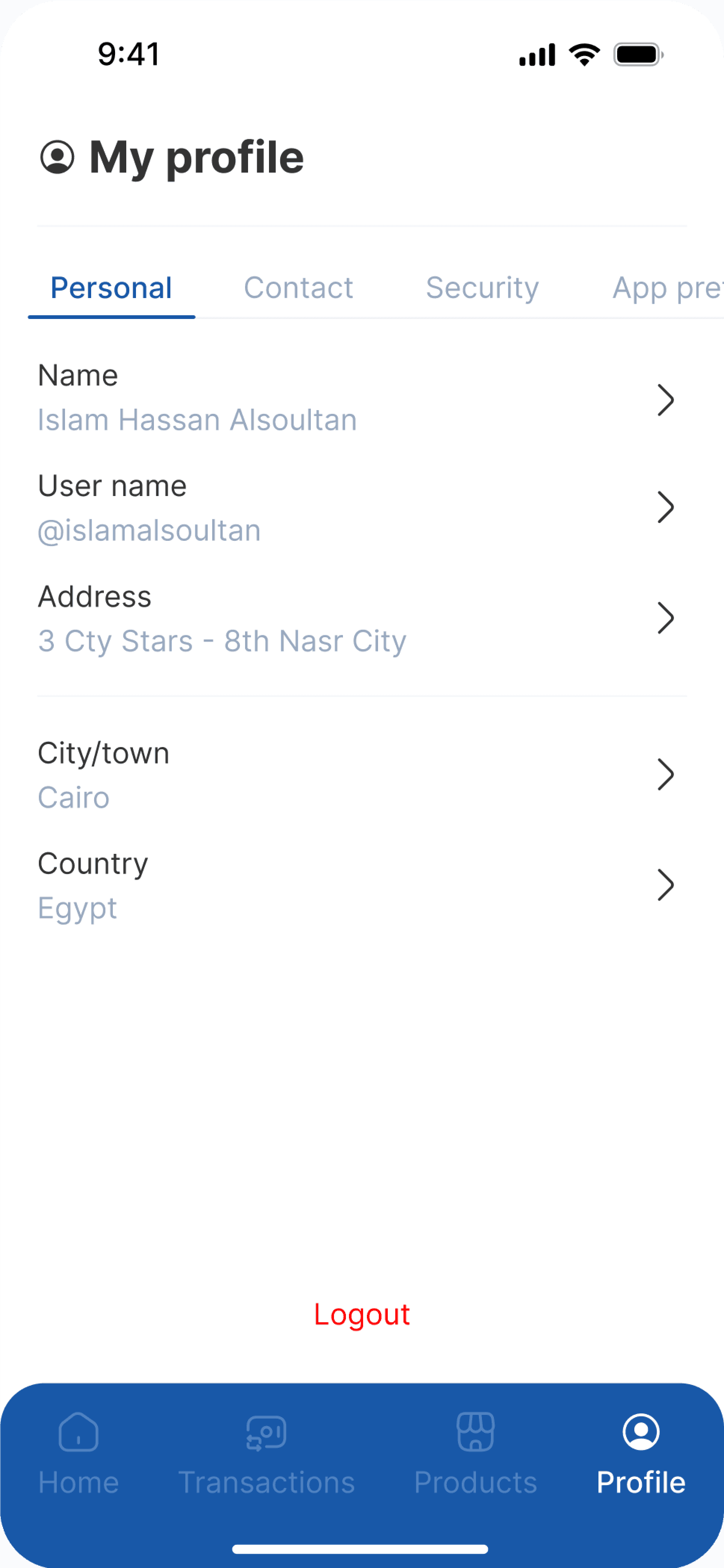
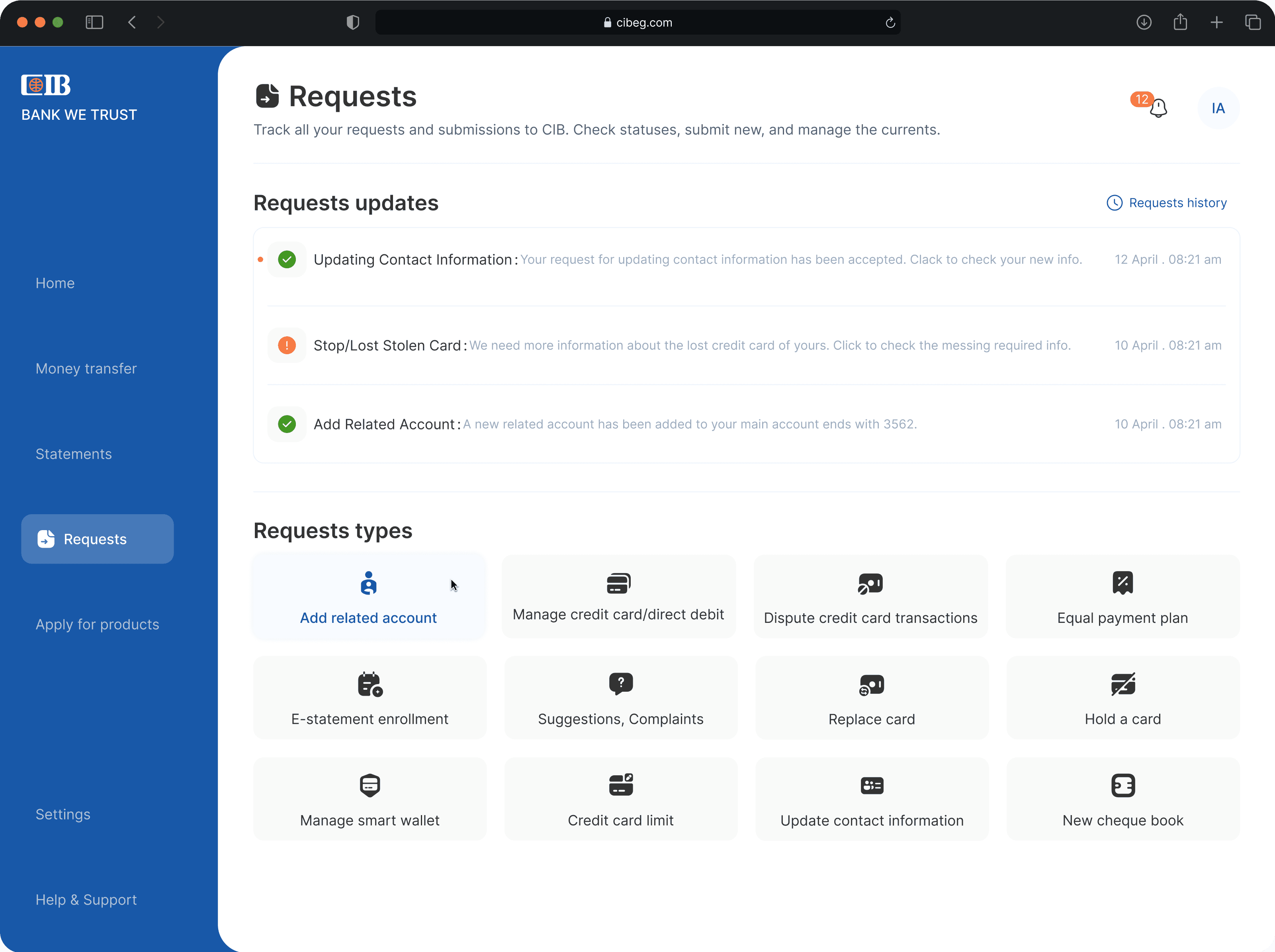
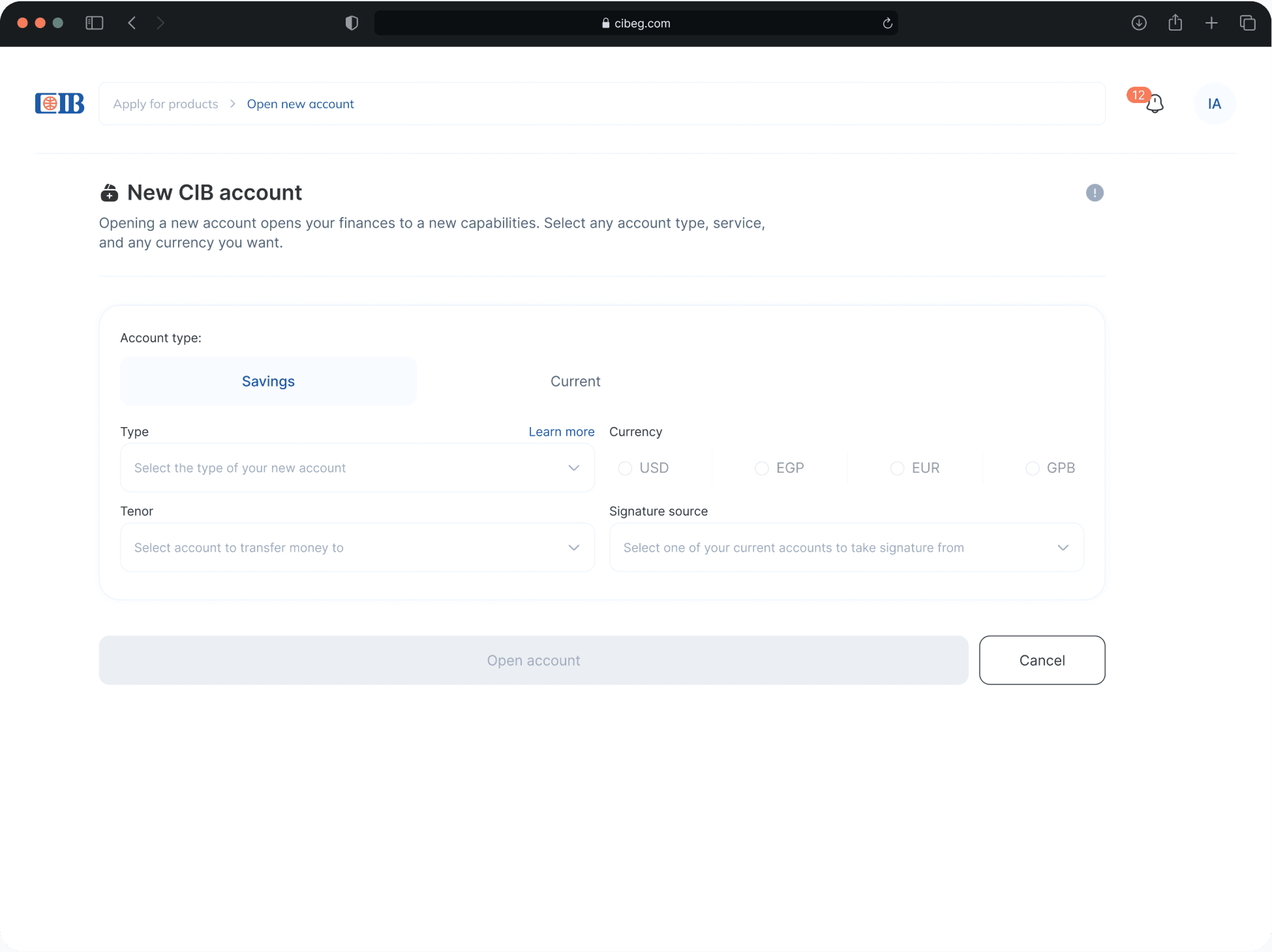
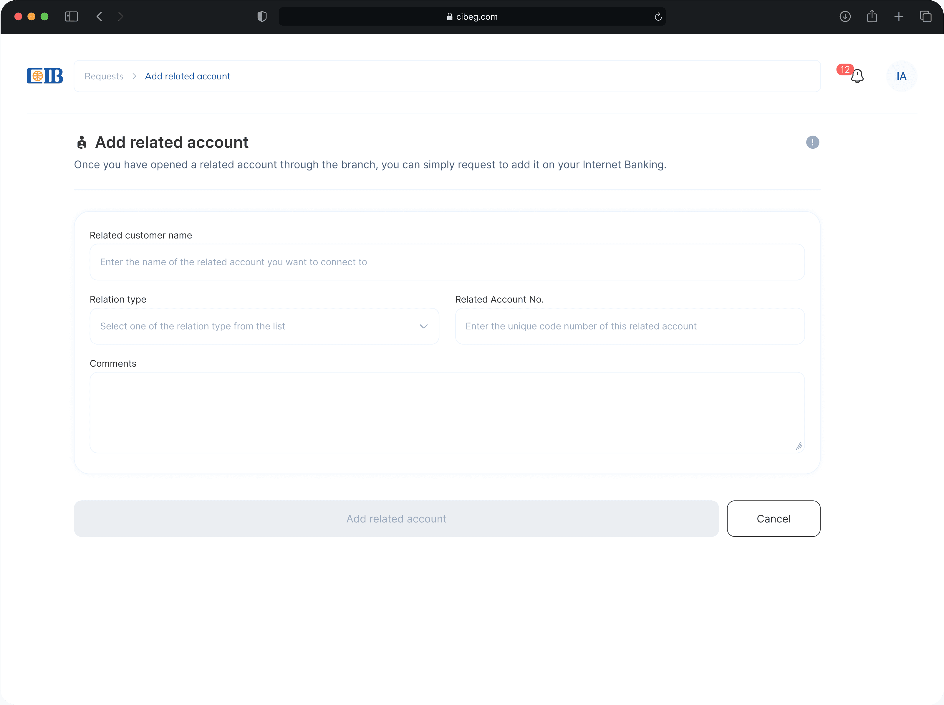
Other screens
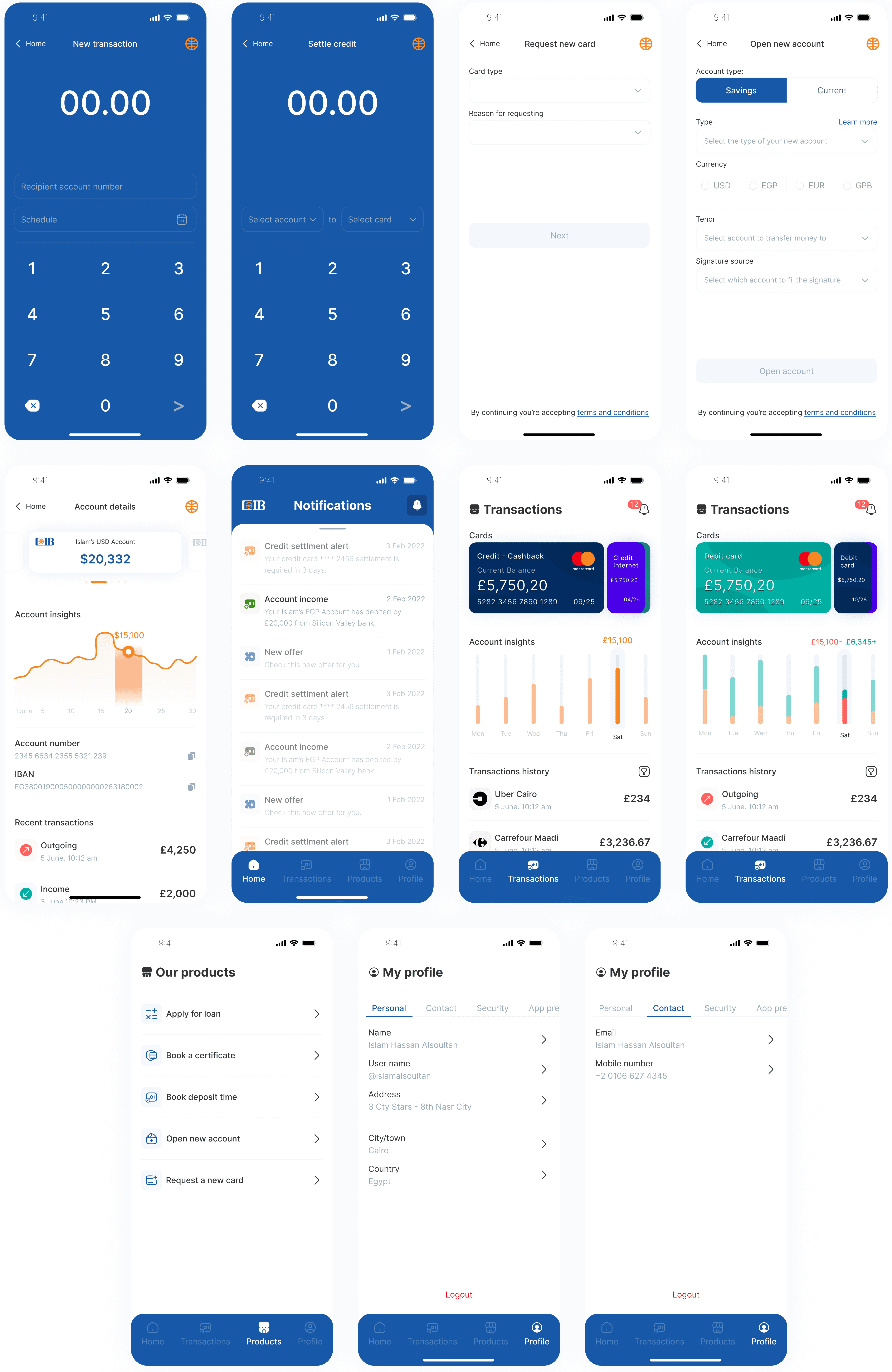
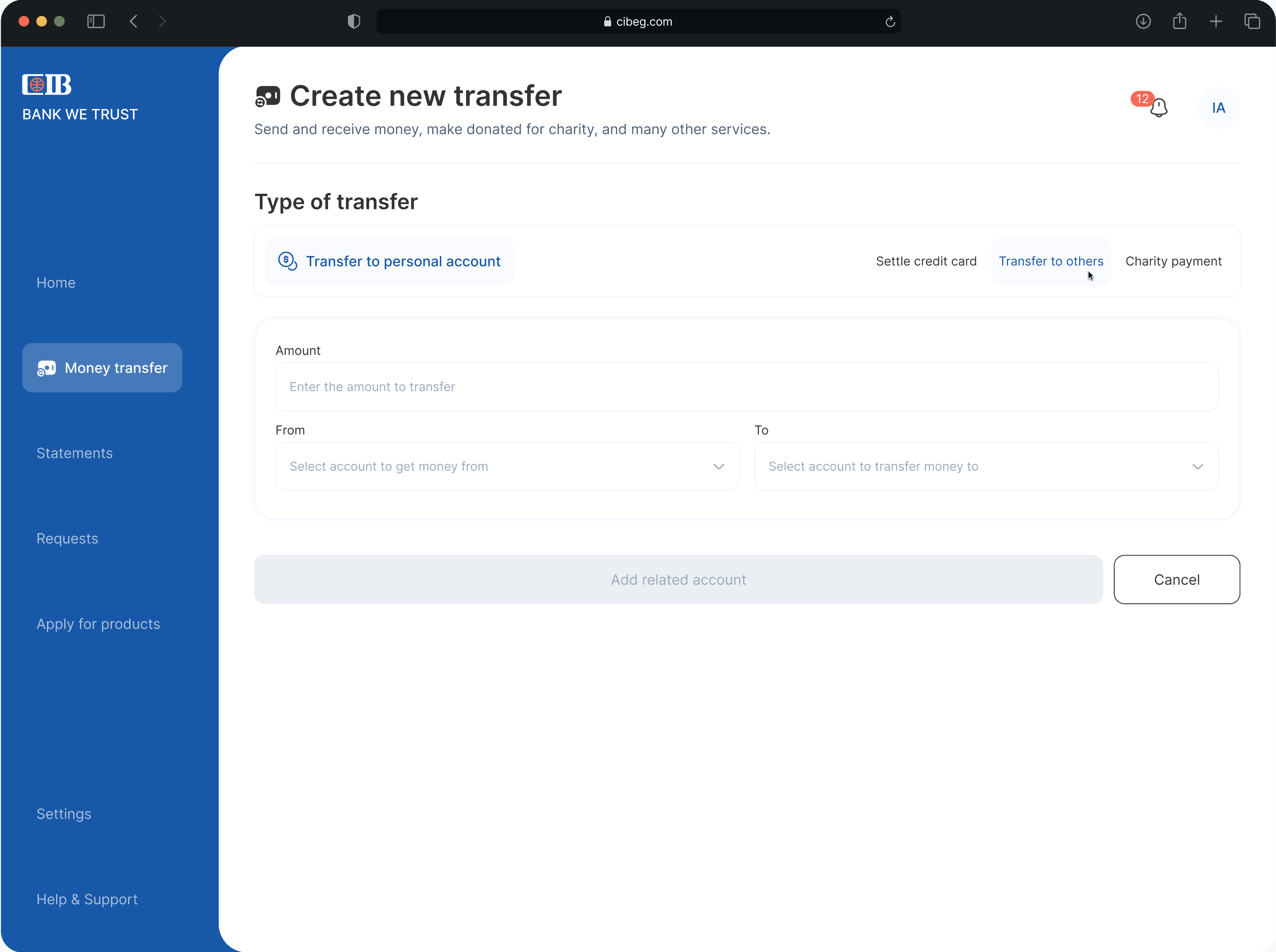
A simple yet efficient screen for transferring money between accounts. I used a custom tab component to handle multiple transfer types with more flexibility and speed.
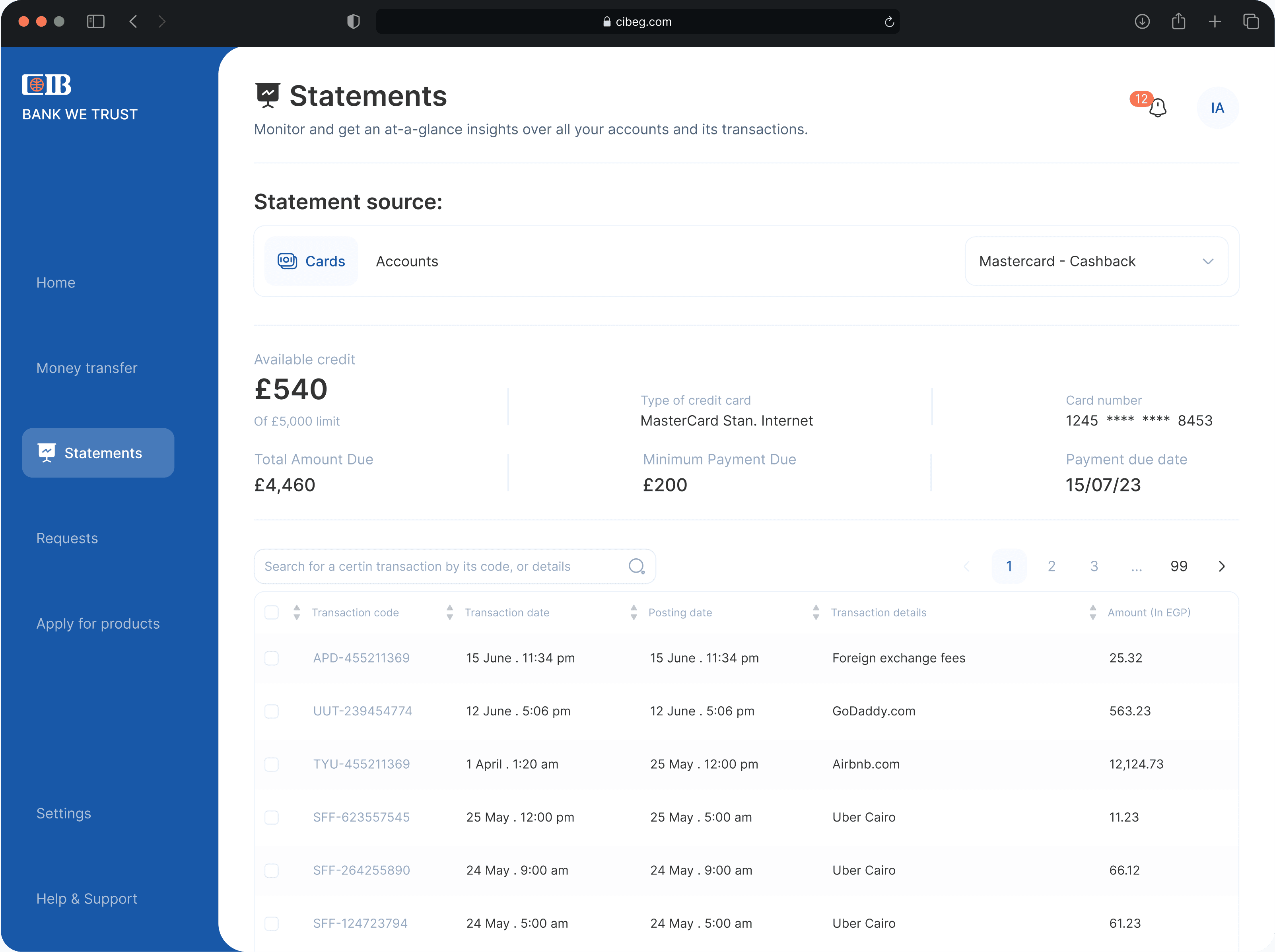
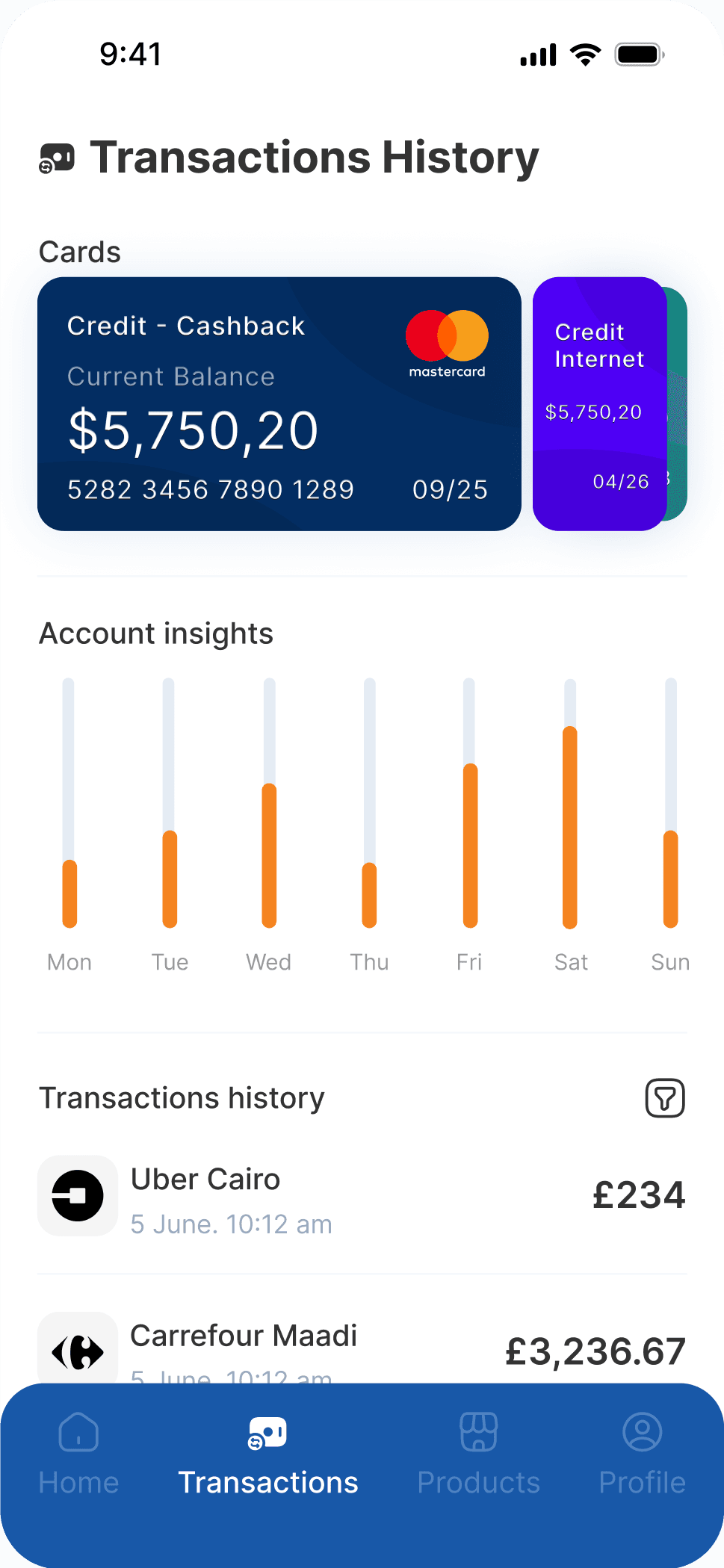
The Statements page offers a clear view of all transactions across accounts and cards. While it may exceed current banking limitations, I chose to prioritize a better customer experience over strict constraints.