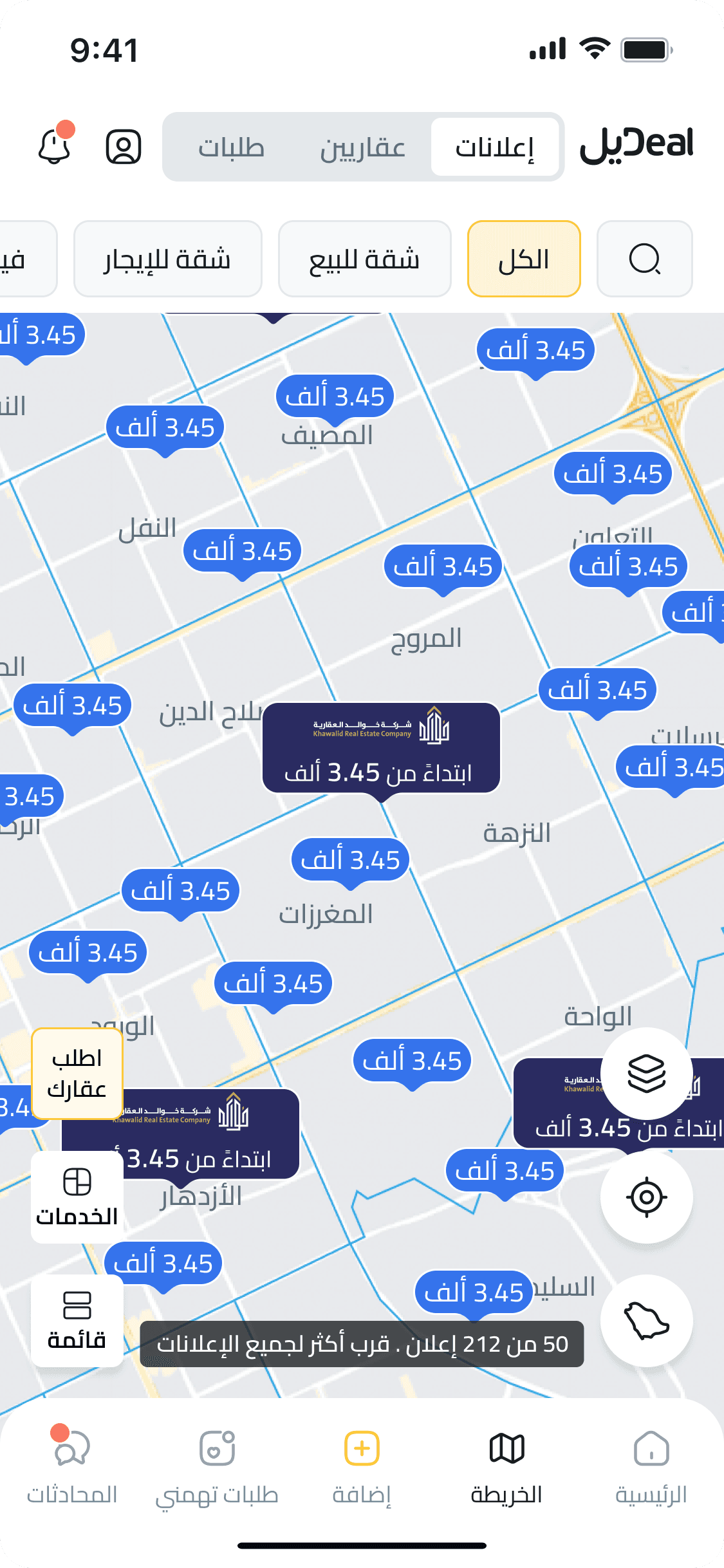
DealApp’s map was supposed to support property discovery, but it had become a scan and navigation blocker. Home seekers and agents entered the map and quickly ran into stiff navigation, unclear filters, and a lack of guidance. Instead of helping users explore listings by location, the flow pushed them into a narrow path too early. Smartlook session recordings and in-app engagement metrics revealed a consistent pattern, high bounce rates, minimal interactions, and visible friction across sessions. The issue was not only visual age; the map was failing its discovery job.
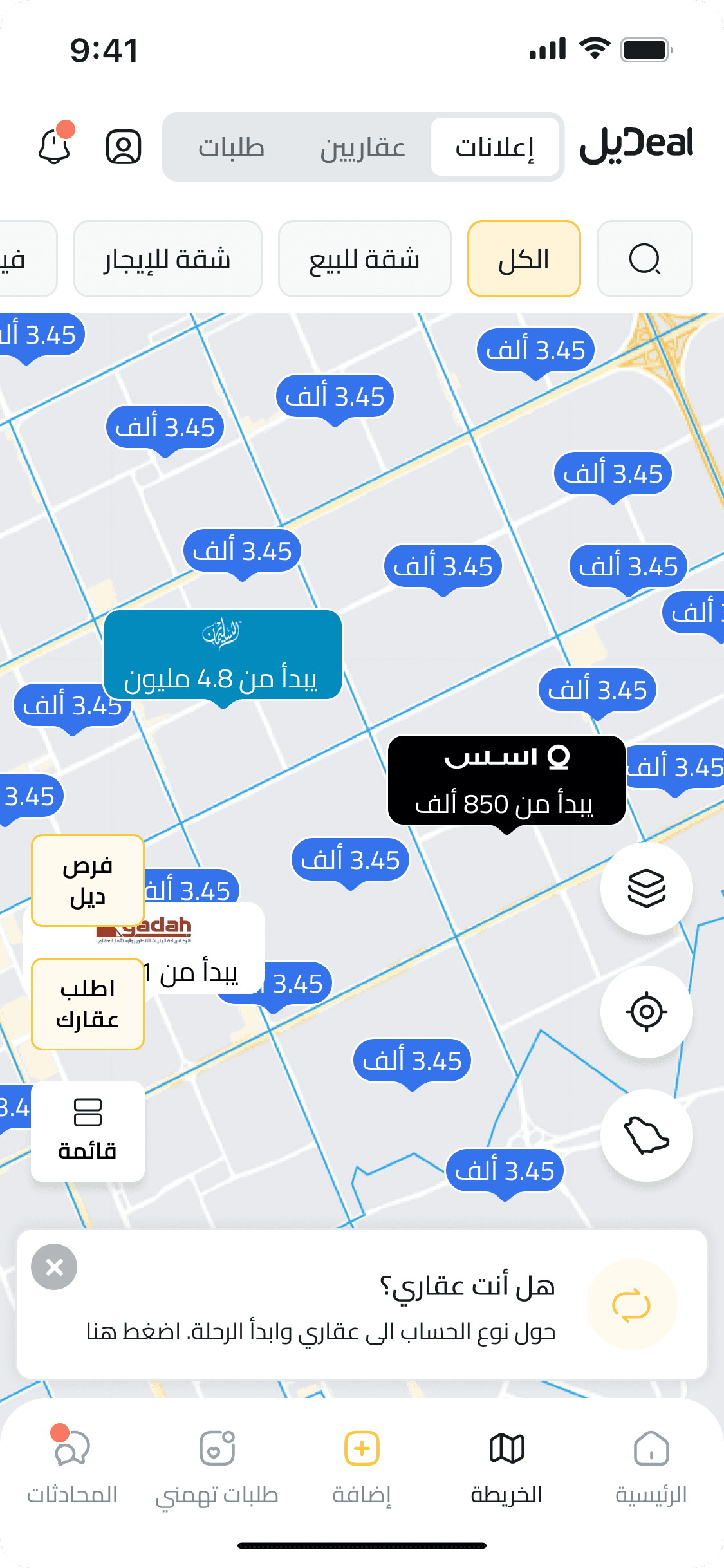
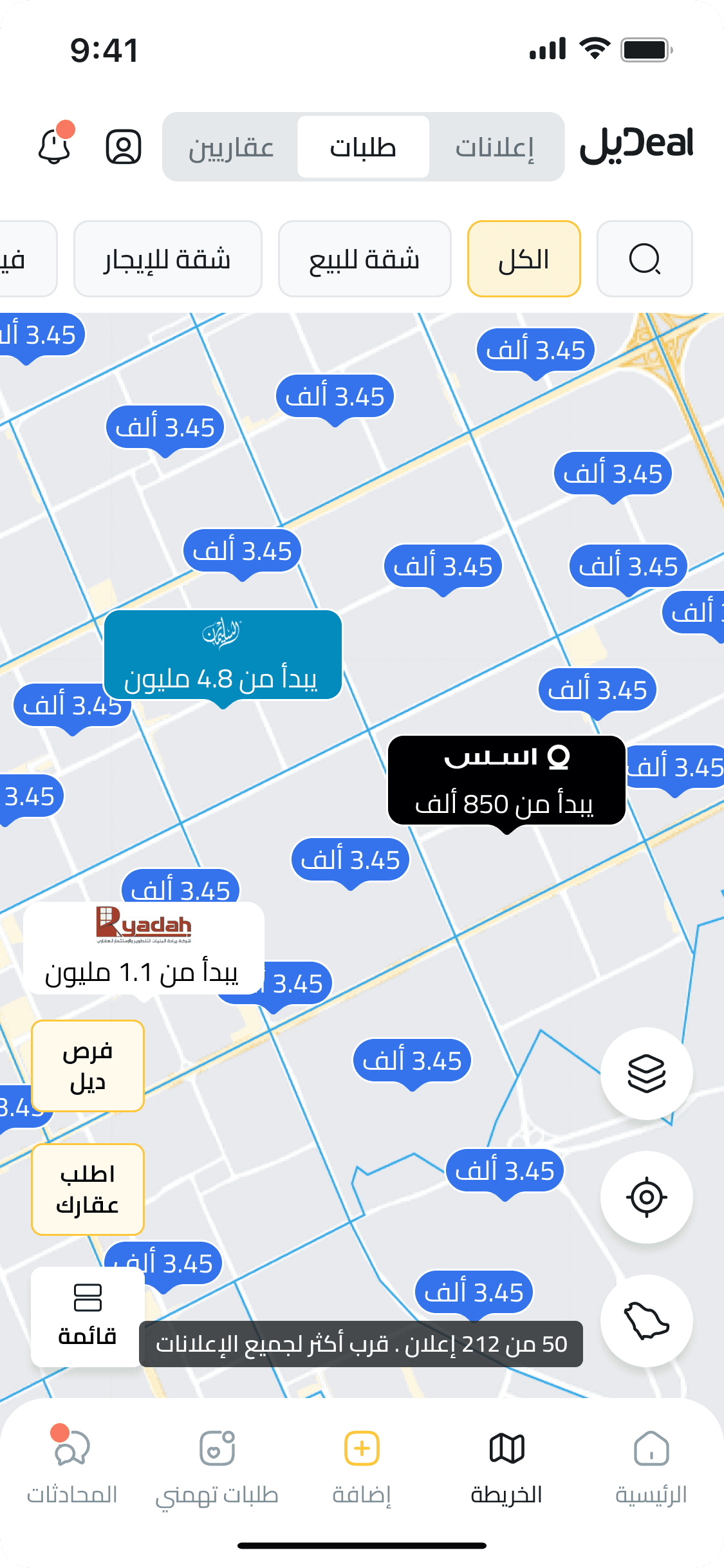
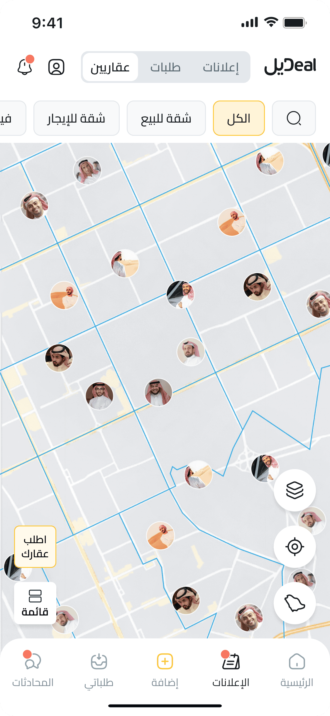
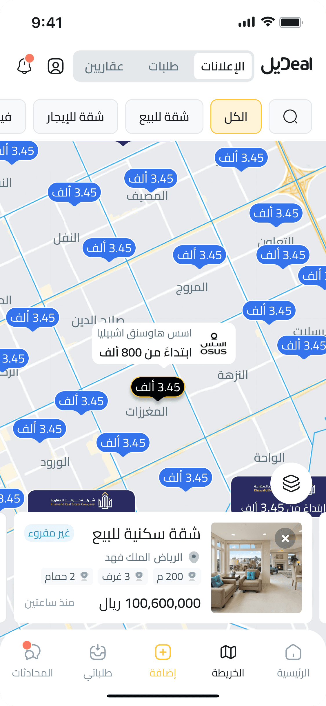
I replaced the static flow with a map-first discovery experience. Users can now zoom, pan, filter, compare listing types, and move between map and list views without losing context. The interaction model supports different discovery behaviors: browsing properties, reviewing requests, finding promoted listings, or locating agents across KSA.
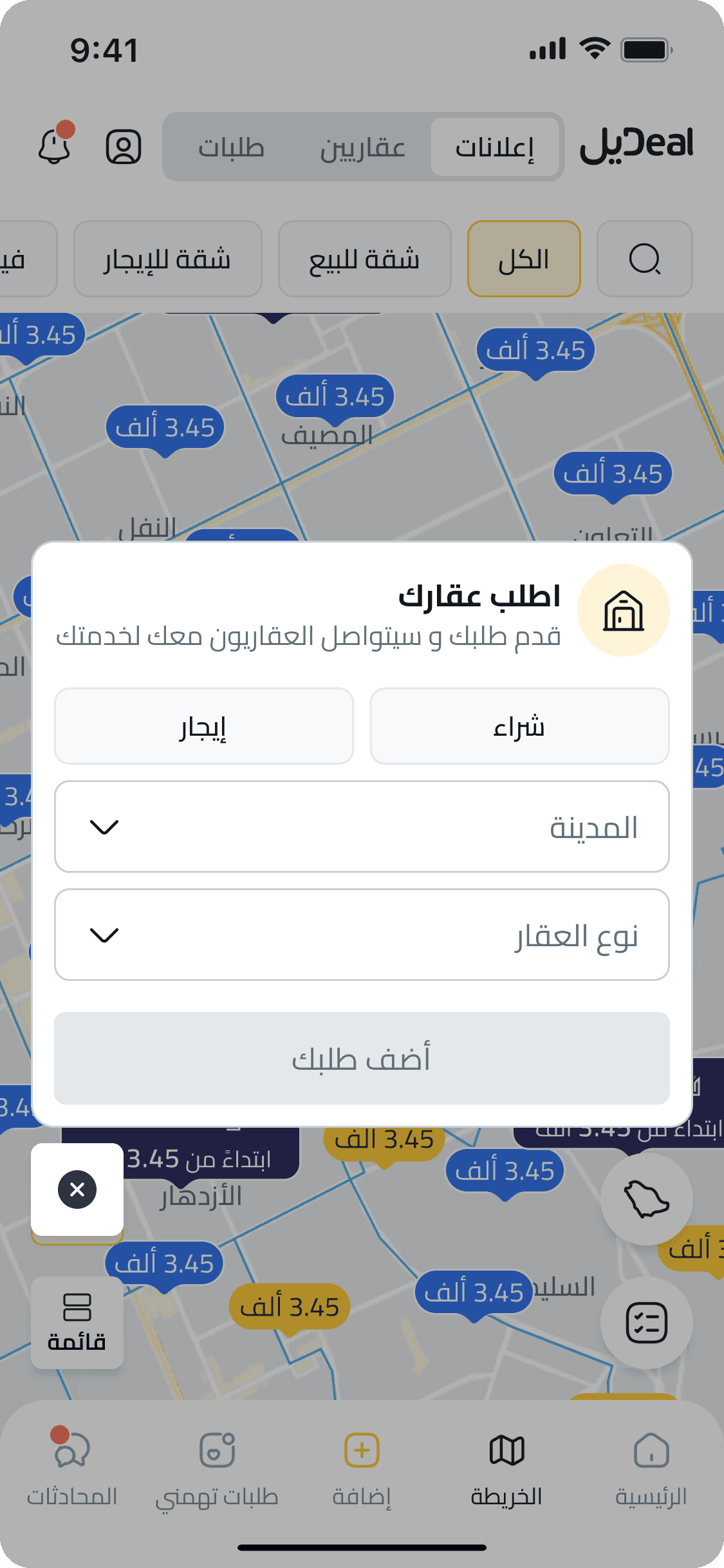
To kick off the redesign, I aligned with product and business teams to separate the different discovery behaviors behind the map. I mapped the browsing goals for clients and agents, then designed four map views: property ads by area, client-submitted requests, promoted listings, and agent locations. Each view reduced information overload by giving users a clearer category, a clearer next action, and an easier switch between spatial exploration and list-based comparison.
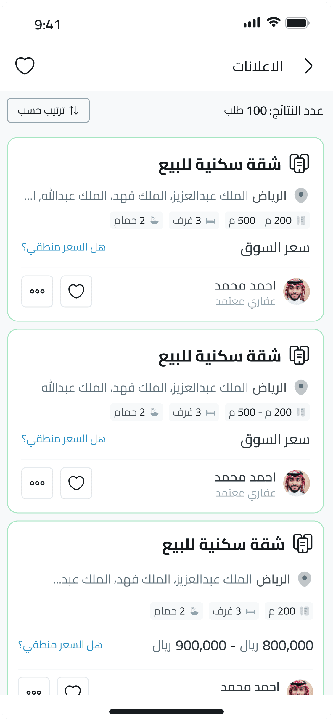
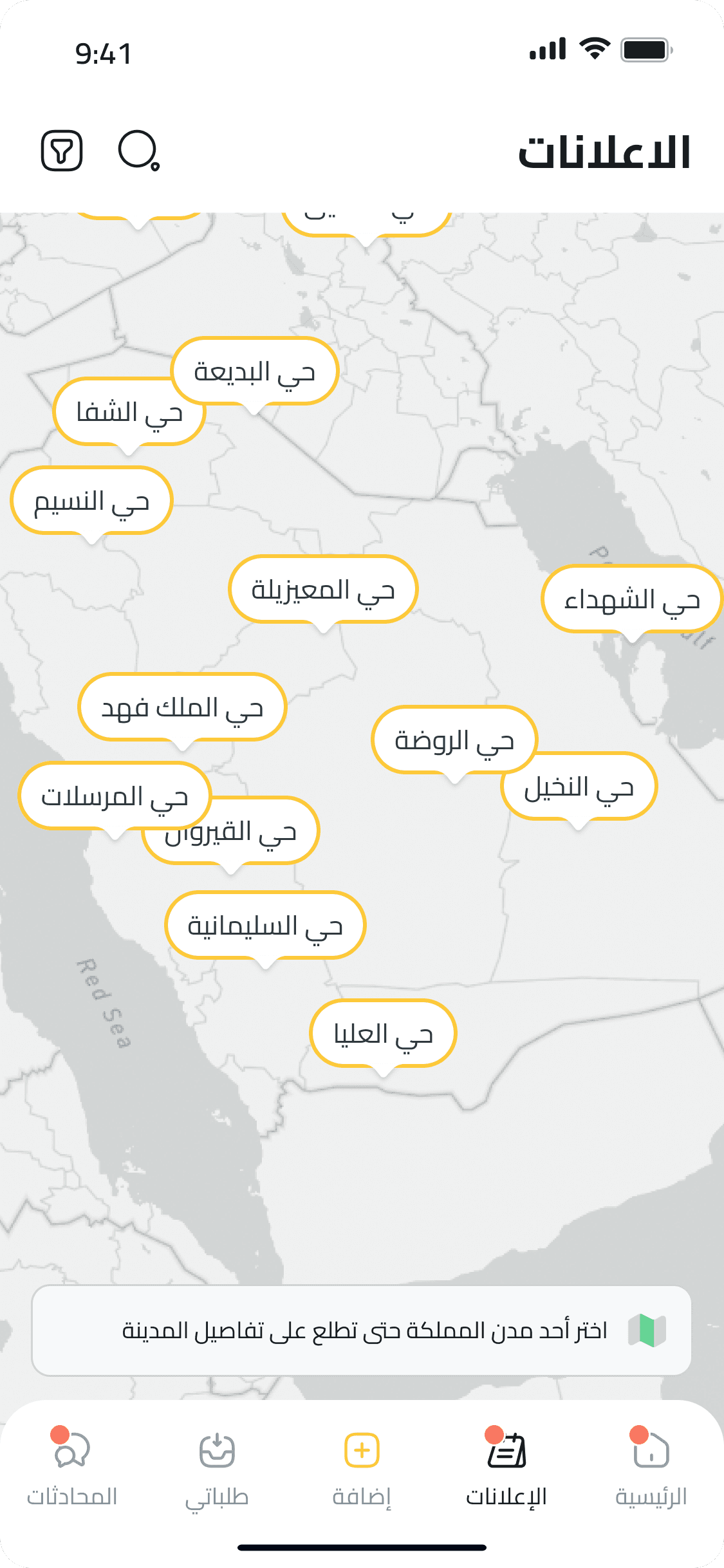
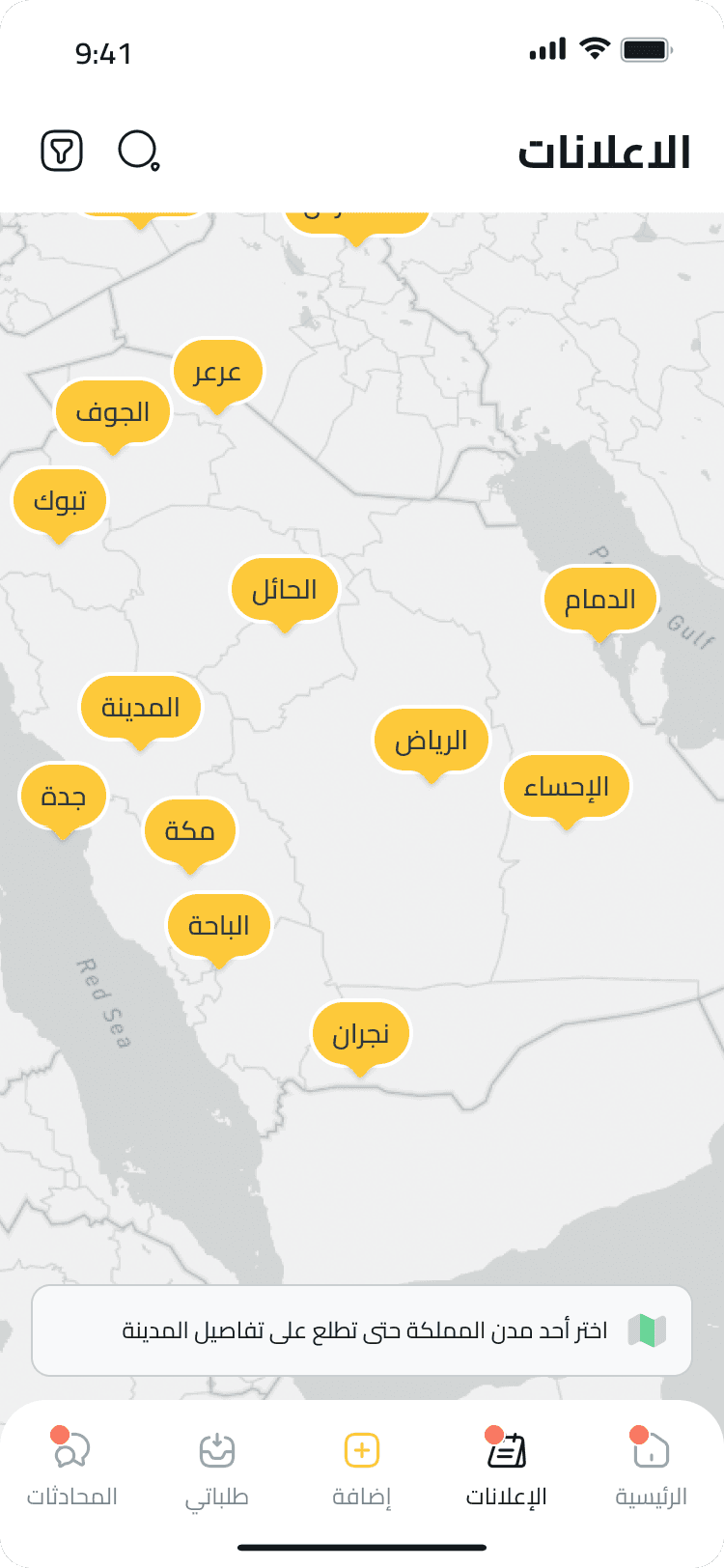
At the time, DealApp’s map feature displayed a non-interactive static map of Saudi cities. Users couldn’t zoom, scroll, or freely navigate the map. Instead, the flow was linear: tapping on a city pin opened a view of that city’s districts, and selecting a district would redirect to a property list view, with no map involved from that point on.
This wasn’t a minor UI tweak, it was a foundational UX problem dropped on my desk in my very first week at DealApp. The pressure was real. I had to quickly build context, think critically, and design solutions that didn’t just follow best practices, but made sense within users’ existing mental models. I ideated five distinct map exploration concepts, iterated fast, and aligned with stakeholders on the most promising direction. The challenge was not only about proposing a new interface, but securing buy-in for a completely new navigation logic that broke away from what users had been used to.
Location-based browsing
Intuitive navigation experience
Personalized map views
Faster access to relevant results

Jumping into a high-impact flow during my first week pushed me to balance speed with structure. I learned to design around observed behavior, not only requested features: how users scan listings, move between map and list views, and recover when they cannot find the right property. It also taught me how to keep momentum without losing clarity.
Cross-team alignment made the map redesign sharper. Product, business, and design conversations helped separate different discovery modes instead of forcing every user into one map behavior. Fast iteration gave us a clearer structure for property ads, requests, promoted listings, and agent discovery.